LIMITED WORDPOWER© AND DESIGN ACUMEN?
Most of us have limits to our talents. Sometimes we are able to increase our skills or can hire professionals who can elevate the quality of our output. One of my continuing disappointments is that while I have a good sense of design and some computer graphic skills, I have not been gifted with comprehensive skills of an artist.
ALTERING TEXT
One thing I can do is change the words and even the fonts of text. This alteration of text is usually done to maximize its appearance in the space allotted to it. Sometimes this is disappointing, as the words I initially selected were ideal to the purpose and tone of the project. Nevertheless, the goal in any written work is to create a product that is most appropriate for communicating with one’s target market.
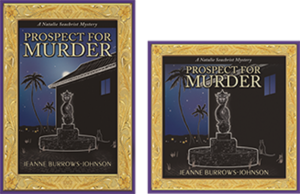
As I generated promotional materials for marketing Prospect For Murder [the first book in the Natalie Seachrist Hawaiian mystery series], I frequently had to revisit this basic activity of editing—substituting vocabulary to fit the available space. Professional Wordsmith
One of the greatest values a professional wordsmith brings to a verbal project is their knowing when and how to adjust text to maximize readability. This ability to edit within varied parameters demands the flexibility as well as the skill to replace verbiage to accommodate the allowed space.
In the past, when a client decided my composition met their needs, they usually took the text to a graphic artist and I never saw it again—at least not before the final product was printed, uploaded to a website, or sent forth in emails. Imagine my disappointment when I saw that the presentation of my work looked awkward because of justified paragraphing and/or the lack of breaking syllables at the end of paragraphs, which resulted in wide gaps or crammed lettering.
If I remained in close contact with the client, I sometimes had an opportunity to rectify the situation. At a minimum, I could alert them to the problem which was bound to recur until their process of production was changed. If I had the opportunity to work with the artist tasked with incorporating my text, I could suggest potential means for enhancing the overall layout by:
~ Changing words that were too long or short
~ Altering the paragraph structure
~ Adjusting the number of columns or their size
~ Repositioning and/or resizing artwork
Subliminal Influences
HARMONIZING PRODUCT PACKAGING AND MARKETING MATERIALS
Regardless of the sophistication of a project, balancing art and typography can truly maximize the sensory experience of your readers. It is a vital key to synchronizing a product’s packaging and the marketing materials that accompany it. As may be expected, this can help determine a reader’s initial response to the product being represented, thereby affecting whether it will be purchased or bypassed.
Even the information presented in a dentist’s pamphlet should be designed to flow in an harmonious manner. The next time you have an appointment at a professional’s office, glance through the materials in their waiting room. If you find odd looking paragraphs, it’s probably because a graphic artist took the text and simply dropped it into their design—usually without the copy writer having the opportunity to re-edit their text.
DESIGNING PROMO MATERIALS AND WEBSITES
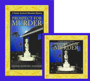
In my blog on the layout of books, I discussed the various issues I faced in the design of covers for the hardcover and audio book editions of Prospect For Murder. All of the spatial challenges I’ve just explored in this blog were applicable in both editions. I’m very grateful that my artist and typographer were the same person [you can visit www.yasaminejune.com to view her art]. This meant I was able to work with her to balance elements of concern. Of course, working in this manner requires mutual understanding and sufficient time to accomplish the necessary edits.
Shifting From Hardcover to Audio Book Format
Transforming images and text of the hardcover book jacket of Prospect for Murder into the audio book’s required more than re-positioning and resizing the many design elements. The mysterious moon above the apartment building was deleted to accommodate the titling. Also, the book synopsis and author bio were shortened to allow for book reviews.
POSTCARDS
Recently I reworked the 8.5 x 5 inch promotional postcard I am using for several purposes. As I now have a growing number of positive book reviews I wish to highlight, I needed to edit both the book’s description, as well as my bio to accommodate snippets from the four reviews I wanted to feature on the front of the card. And because I may wish to employ varied greetings, I had to allow room on the backside to place labels with personalized messages.
LETTERS
It may seem needless to mention that each letter that one sends out via snail mail or email is an entity unto itself. However, writers are just as prone as other professionals to remain wedded to verbiage for which they have an affinity. Generally, effective letters should be limited to a single page. This means that the need to resize the length of one’s text arises quite often. Sometimes simply reworking the size and location of a logo and decreasing the dimension of margins will suffice to reuse a favorite piece of composition. At other times, it’s also necessary to:
~ Combine paragraphs
~ Reduce the size of the font used for text
~ Use left justified paragraphing without indentation
~ Use a smaller dimension for line spacing between paragraphs
Wishing you the best in your creative endeavors,
Jeanne Burrows-Johnson, author, consultant, and motivational speaker
Further discussion of art is available at the following blogs:
Authors Design Dilemmas 1, April 2015
Confronted by a Fantasia of Fonts, May 2015
Rainbows of Color, May 2015
Winning Logos & Slogans, October 2015
Quality Book Production, February 2016
Harmonizing Branding Elements, August 2016
Book Promotion and Evolving Art, January 2017
Balancing Text and Space, February 2018
Successful Cover Art, December 2018
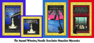
To learn more about the award-winning Natalie Seachrist Hawaiian Mysteries, including Murders of Conveyance [Winner, Fiction Adventure-Drama, 2019 New Mexico-Arizona Book Awards] and other projects, please drop in at my author’s website JeanneBurrows-Johnson.com. You’ll even find Island Recipes that might inspire your culinary creativity.
For more ideas to strengthen your Wordpower© and branding, please visit: Imaginings Wordpower and Design Consultation.
Follow Me:
Amazon, Arizona Authors Association, Apple Books
Audible, Authors Den, Barnes and Noble, Blogarama, Book Bub
Cozy Mysteries-Unlimited, Facebook, Good Reads, Hometown Reads
Book sellers may contact book distributors such as:
Baker & Taylor, Follett, IPG, Ingram, Mackin, Midpoint, TitleWave
 Confronted By a Fantasia of Fonts?