EVENT DISPLAYS

The frames of books, written and spoken, should move us all!

DESIGNING A MEMORABLE AUTHOR’S DISPLAY 

This year began with new technical and artistic challenges, ranging from the computer I mentioned in my last post to creating visual elements for events. My latest project is refining my displays for book fairs and other opportunities to visit with current and prospective readers. This has led to revisiting several artistic standards. One would think these issues had been solved at the onset of my event planning long ago…

WHERE TO BEGIN
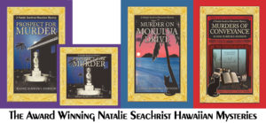
 Images of the Natalie Seachrist Hawaiian Mysteries are my starting point for most visual projects these days. Even when I’ m introducing other projects, the center of my public interaction is this series.

EVENT DISPLAY ISSUES
Most of the events in which I participate feature displays on at least one half of a rectangular luncheon size table, approximately six to eight feet in length and two feet in width. In the past, that has meant utilizing small posters, about 11 x 17 inches presented on tri-legged frames of wood, metal, and/or acrylic. These images have centered on a single book or project, which has meant an ever-growing number of items over the last few years. Even when I diligently refresh my tablescape during an event, by the end of a day there has been an accumulation of clutter.

With the current trio of titles within my mysteries, I decided that 2020 would be the year to introduce a fresh look. One that could be maintained easily throughout a day I have the opportunity to greet current and potential readers—or even organizations that might like me to present a motivational talk or seminar. With increasing emphasis on personal marketing, this seems especially prudent!

I began this undertaking by examining the books and other materials I want to present, as well as the decorative touches that visually present the Hawaiian Islands. The books themselves are offered in both hardcover and softcover editions. Accompanying signage is needed to highlight eBook and audible editions that are available at various online and brick-and-mortar locations.

FINDING DISPLAY MATERIALS
A visit to a local store fixture outlet fulfilled several of my desires.
~ Acrylic stands for over-sized postcards, bookmarks, and business cards
~ Clear plastic sales bags that display my book covers
~ Colorful bags for customers wishing to present gifts
~ A three-tier acrylic stand to hold three or more books per shelf

This last item is proving especially useful. While I am concerned about the stand’s fragile material, I find it preferable to the heavy weight of metal and wood alternatives I have been using. Properly wrapped, the stand will be easily transported to distant locales, such as the Hawai’i Book and Music Festival. Best of all, regardless of the surface on which the stand sits, my award-winning book covers shines brightly upon it!

SIGNAGE
I found myself staring at signs in every direction of the showroom. From the front door to the walls and counters, display cases and bins, text and images alerted me to the joys of an array of “toys” for introducing my products…and myself. Hmm. In the past I’ve simply enlarged book covers, matted them on gold cardstock, and laminated them.

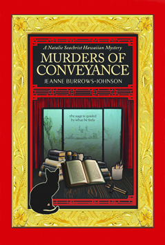
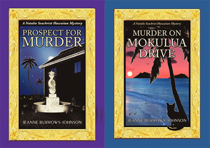
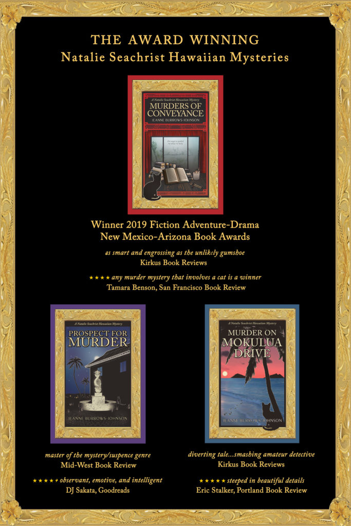
But this is 2020. Something sturdier and more elegant is desirable. With a trio of primary products, a triangle seemed most appropriate for the 18×24 poster I was planning. My next question was sequencing. Should I place the books in chronological order? Or, should I emphasize the last publication.  Because that book, Murders of Conveyance, recently won First Place of Fiction Adventure-Drama in the 2019 New Mexico-Arizona Book Awards, I opted for the latter option.

Murders of Conveyance

FINALIZING THE POSTERS
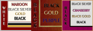
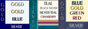
Now we turn to the details that took several days to finalize. I considered colors and textures for a background. Eventually, I realized that the jewel tones of my book jackets scream out for the classic jewelry store option of simple black. The issue of fonts also arose. In short order, my wonderful artist, Yasamine June, sent me the necessary information to present promo text in the same font as that on the book jackets.

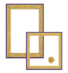
Initially, I was delighted with my creation. The image of each book sat on a black background with harmonizing text in gold. But somehow the overall image was incomplete. Then, as I stared at each volume in the series, I experienced an ah-ha moment. What was missing was the lovely gold framing I had had Yasamine design for me. It is based on Hawaiian heirloom jewelry, and features a hibiscus flower in each corner!

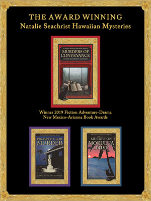
After a wonderful feeling of accomplishment, I remembered there might be events for which a larger poster [22×36 inches] might be appropriate. So, I increased the size of my images and text and added book reviews!   

INTRODUCING MY NEW DISPLAY
On March  14-15, 2020, I had planned to unveil my new look at the Tucson Sisters in Crime Booth at the Tucson Festival of Books. I envisioned the larger poster mounted on a grid at the back of the tent, with the smaller one being positioned on the top tier of my acrylic stand, with the series’ books framing it. I would complete the new tablescape with a few battery-operated lights, shell leis, and a gold palm tree! Unfortunately, due to the cancellation by leading authors facing travel challenges caused by the Coronavirus, the Festival was cancelled…

Fortunately, on Sunday, March 22, I’ll be introducing myself at a Meet & Greet at the front of the Tucson East-side Barnes & Noble Store [5130 E. Broadway Boulevard] from Noon – 4:00 p.m., WHICH SHOULD BE RELATIVELY SAFE, AS IT’S NEAR FRESH AIR. I’d love to meet you if you’re in the area…otherwise you will find pictures on my Facebook personal and professional pages, as well as my next blog…UPDATE: THE MEET & GREET WAS ALSO CANCELLED…

Wishing you the best in your creative endeavors,
Jeanne Burrows-Johnson, author, consultant, and motivational speaker

To learn more about the award-winning Natalie Seachrist Hawaiian Mysteries, including Murders of Conveyance [Winner, Fiction Adventure-Drama, 2019 New Mexico-Arizona Book Awards] and other projects, please drop in at my author’s website JeanneBurrows-Johnson.com. You’ll even find Island Recipes that might inspire your culinary creativity.

For more ideas to strengthen your Wordpower© and branding, please visit: Imaginings Wordpower and Design ConsultationYou might also want to check out some of the items mentioned in the post blog on book promotion and evolving art.

Follow Me:
Amazon, Arizona Authors Association, Apple Books
Audible, Authors Den, Barnes and Noble, Blogarama, Book Bub
Cozy Mysteries-Unlimited, Facebook, Good Reads, Hometown Reads

Book sellers may contact book distributors such as:
Baker & Taylor, Follett, IPG, Ingram, Mackin, Midpoint, TitleWave

COLORATION FOR AUTHORS

EFFECTIVELY USING COLOR

What visions dance in your dreams?

A shorter version of this blog was originally published on the Hometown Authors website on November 5th, 2019…

An artist’s sense of color is normally reflected in their creations, so today’s discussion may be most appropriate to authors, especially those launching their first book or moving into a new series, genre, or nom de plume which may produce new design dilemmas. Even if you are an author under contract to a publisher who controls the art for your books, you may be able to offer input regarding the ambiance you wish to see projected. Therefore, I suggest you contemplate artistic issues like color in advance of signing with a publisher. In fact, you may find that analyzing their artistic taste will help you select an appropriate publisher. I’m fortunate to have had the liberty of working regularly with an artist of my choice [Yasamine June] to develop the rich covers of the Natalie Seachrist Hawaiian Mysteries.

As a writer and design consultant, I often focus on color. One of my favorite questions for clients seeking branding advice is, “Have you had your color today?” On the surface, this seems like a simple question, perhaps referencing a bright scarf or sales banner. However, my question is directed at the person’s preferences in coloration.

If you are an author, the question addresses your approach to color in both the art and science of your writing…and how you are envisioning the images that may accompany your text. If your writing reflects your personal voice and style, choosing artistic elements may be straightforward. If not, research can ensure colors appropriate to your genre and writer’s voice. [For technical information on coloration such as color theory, colorimetry, tetrachromats, etc., visit Rainbows of Color.

COLOR SAMPLES
Please note that despite how I’ve planned for these samples to appear, your hardware/software will alter the experience…

FANTASIAS OF COLOR
To help you consider more than your personal preferences in color, let’s explore classical and traditional interpretations of basic colors and shades. In my latest Hawaiian mystery, Murders of Conveyance, the cover features my usual frame with the carved gold of Hawaiian heirloom jewelry and the classic red of ancient and modern China.

RedThis color is traditionally linked to sunsets, fire, blood, Mars the planet and Mars the Roman god of war. Red is now often associated with signature holidays like New Year’s, Christmas, and St. Valentine’s Day, as well as certain nations like China. This vibrant color calls attention to anything depicted in it. Philosophically, it has been associated with licentiousness and the concept of Satan.

Yellow and OrangeAssociated with the sun and gold, these happy and bright colors are used for many attention-getting purposes. Depending on their tone, they may announce deeply discounted items, or conversely, the richest and most valued products.

GreenRepresentative of nature, green is often used for health and environmental topics, products, and services. Green colors are also used for military uniforms and equipment.

BlueIn daily conversation, blue ideally speaks of clear and serene waters and skies. In many philosophical traditions, it has been associated with purity and loyalty. Today, the color is often utilized by financial and insurance institutions wanting to declare their honesty, and by healthcare providers wishing to project their dedication to the well-being of their patients and clients.

Violet and PurpleAlthough these colors are not adjacent on the color wheel, humans perceive them as related to one another. Located at the end of the visible spectrum of light [literally next to ultraviolet], violet is a spectral color that is less saturated [intense] and displays more blue. Purple is more saturated [intense, pure] and balances two spectral colors, red and blue. With both colors perceived as blends of blue and red, these rich colors remain linked to ancient concepts of royalty, power, and wealth.

WhiteWhite is an achromatic color [without hue], embodying all wavelengths of visible light. It is historically linked to purity, cleanliness, goodness, and perfection. Like black, it is a good background for highlighting all colors.

BlackAbsorbing all colors of light, this achromatic color [without hue], is the absence of all visible light and therefore color. Obtained by the mixing of all primary colors, black is linked to darkness, night and evil in historical religious written materials. It is an excellent background for both vibrant and subtle colors.

White and black are often paired for the expression of opposites, as in good and evil, the white hats of the good cowboys vs. the black hats of rustlers, the white dress of the bride and the black of a widow in mourning.

 Gray Also an achromatic color, gray is created by the mixing of white and black. Being neutral, this color is most often associated with somberness, dullness, boredom, uncertainty, and advanced age.

SELECTING COLOR
Scientifically, colors [hues] are specific wavelengths of visible light. When considering coloration in your writing and for book jackets, one of the first questions you might ask yourself is, “What is my design aesthetic?” Also, “Does the style of my writing reflect my taste in art?” Do you like the detail of classicism or the sharp clean lines of modern art? Do you prefer bright primary colors or muted tones? Like an artist, the author draws on a rich palette of images within their mind’s eye. But to effectively communicate, this must be tempered by the expectations of the readers of the genre in which one works.

~  Lighting. The intensity and type of lighting affects one’s perception of tone [intensity of color] and shade [a mixture of black with color which determines how bright the color is].

~  Layering. The layering of color also affects our view of it. For instance, putting a red color on an ivory background will produce a color that has hints of orange.

~  Tint. The tint of a color is determined by the amount of white it may have, which lightens the color.

~  Region. Through the dialect[s] of your characters, as well as the scenes you describe, your text may indicate colors distinctive to the locale of your work. Within my work, I’ve found the greens of trees and plants growing along the shorelines of the Hawaiian Islands [the setting of the Natalie Seachrist Hawaiian Mysteries] to be lighter than those of the hills of `Ulupalakua, Maui. So, which greens are most appropriate to your project? And what about the clarity and tones of blue in the waters and skies you describe?

~  Perceived Gender. This may sound like a dated, or even prejudiced, approach to design. But examining perceptions of your writer’s voice or protagonist may help define appropriate book jacket colors. Consider the differences between romance novels and police procedurals. In the first example, you may have established an ambience that is classically feminine with soft, gentle, and elegant notes. In the second, you may have described a hard-nosed undercover police officer [male or female] who wears black, employs harsh street slang, and fiercely responds to violence. While black is an excellent background for both genres, the artist’s treatment may vary considerably. The romance book often invites the reader to wonder what lurks behind subtle gradations and soft brush strokes of mystical colors and tones. In contrast, the police procedural usually pairs bold primary colors with dark shading set within sharp modern lines.

Once you’ve completed your research and contemplation of coloration for your project, I suggest you write a paragraph outlining the elements you desire with a sample color palette. With colors identified by number in your art or text software program, this will facilitate communication with publishers and artists [should you decide to self-publish].

I should caution you that identifying the colors you wish to see on a book jacket is no guarantee of how the printed work will arrive at your doorstep. Even two editions of the same book, printed by the same company following the same instructions can yield variations in color because of differences in batches of ink or toner, the moisture content of the paper used, and production executed on innumerable types and conditions of equipment.

Wishing you the best in your creative endeavors,
Jeanne Burrows-Johnson, author, consultant, and motivational speaker

For more ideas to strengthen your Wordpower© and branding, please visit: Imaginings Wordpower and Design Consultation. For an in-depth discussion of the nature of color, go to Wearing Your Brand.

You may also wish to check out: 
Rainbows of Color, May 2015
Harmonizing Branding Elements, August 2016
Book Promotion and Evolving Art, January 2017

To learn more about the award-winning Natalie Seachrist Hawaiian Mysteries, including Murders of Conveyance [Winner, Fiction Adventure-Drama, 2019 New Mexico-Arizona Book Awards] and other projects, please drop in at my author’s website JeanneBurrows-Johnson.com. You’ll even find Island Recipes that might inspire your culinary creativity.

Follow Me:
Amazon, Arizona Authors Association, Apple Books
Audible, Authors Den, Barnes and Noble, Blogarama, Book Bub
Cozy Mysteries-Unlimited, Facebook, Good Reads, Hometown Reads

Book sellers may contact book distributors such as:
Baker & Taylor, Follett, IPG, Ingram, Mackin, Midpoint, TitleWave