EMPOWERING BIOS

Jeanne Burrows-Johnson

WHO NEEDS A POWERFUL BIO?

With 2019 quickly unfolding, authors and artists face a multitude of challenges and opportunities. Beyond financial planning and tax preparation, this is the ideal time to strategize and schedule events, design and/or revise our websites and social media outreach, and shape marketing materials to support these endeavors. While professional service providers can address many of these issues, there are expenditures that can be avoided if we are able to do some of the work ourselves. The essential question is whether we possess the skills and artistic vision to do so…as well as the time that will be required. Fortunately, like book synopses, several elements of biographies can be utilized repeatedly. Your picture, logos and slogans, descriptions of your work, and biographies of varying lengths and emphasis will all prove useful eventually. Today, I will suggest requisite elements of effective biographies.

WHEN WILL YOU NEED AN EMPOWERING BIOGRAPHY?
You are invited to view points raised in a humorous discussion of the need for biographies at imaginingswordpower.com/bios-to-empower-you.html. The gist of the piece is that everyone, both in and out of public view, has a need for one or more biographies…ranging from single sentences of self-introduction, to paragraphs for professional publications, and even a lengthy eulogy that will enumerate key aspects in one’s life.

WHERE TO BEGIN SHAPING YOUR BIOGRAPHY
By reviewing hardcopy and electronic files that contain materials addressing your life and work, you can gather facts, as well as previous stylistic choices from which you can draw. In addition, I suggest you create files of bios that have impressed you. These can include materials from colleagues and co-authors, as well as the brochures of professionals whose offices you visit.

Regardless of whether you work on a computer, or with pen and paper, begin listing words, phrases and other verbal images that you find attractive and worthy of positive public attention. At this point, do not be concerned about the length of your notes, their chronology, or even the vocabulary you are utilizing. For example, if you were writing a physical description of yourself, you might begin with the basics of hair and eye color with simple words like “brown” and “black.” You can add interest later by replacing “brown” with more dynamic words like coffee, chestnut, or charcoal.

IS THERE AN IDEAL LENGTH FOR A BIOGRAPHY?
If you are a professional, you will interact with colleagues and the general public in differing ways. Each time you are required to produce a new bio, you will face varying requirements in length and style.

~ A casual meeting or elevator speech requires a single sentence of self-introduction in a first-person voice

~ Casual reference by another person requires similar length, but should be written in a third-person voice

~ Your brief self-introduction, should be about three sentences in a first-person voice

~ A brief introduction by another person requires similar length, but should be written in a third-person voice

~ Detailed self-intros often range from a paragraph to a page, written in a first-person voice

~ Complex intros that are to be delivered by someone else should be similar in length, written in a third-person voice

~ Anything longer can be used for slow elevators or tall buildings 

BIOGRAPHY ELEMENTS
Regardless of usage, I recommend you utilize verbiage that expresses your personality, as well as the products or services you offer. This allows readers or listeners of your promotional materials [especially prior to an event] to feel they have actually met you. You should consider including the following.

~ Education and training
~ Career highlights and focus of work
~ Professional accreditation and affiliations
~ Photographs are optional and may be appropriate to only some uses. Authors can be photographed holding one of their books and artists may wish to show a sample of their art. Head and bust shots, as well as images of you standing on a stage or at a podium will all prove useful someday. If you have action shots featuring other people, you should obtain a signed release from them.

BIOGRAPHY LAYOUTS
Biographical layouts vary with length and purpose. To maximize harmony with other promotional materials, your biography should utilize elements from your style sheet with your signature font[s], colors, logos, slogans, etc.!

USAGE OF BIOGRAPHIES
Once you have created biographies of varying length and style, you can utilize them in numerous places. Bios can be placed in several places on the internet, including: One or more pages of your website[s], your blog; Facebook and other social media sites; a framed copy can face visitors to your office or studio.

I send copies of appropriate bios to organizers of public speaking engagements twice; once when arrangements have been confirmed, and just prior to the event. I also carry copies to the event in case the host does not have one. Depending on the purpose of the engagement, the bio/intro may be short or long. If short, I print it on cardstock, as well as 8.5 x 11- inch stationery. I also carry a copy with bulleted key points in a non-glare archival quality sleeve in my presentation folder…for those unexpected occasions when I end up having to introduce myself. [With bulleted data, I can choose to add or delete points that I may decide are, or are not, appropriate to the day’s audience.]

FYI: I recently received a call from a radio personality wanting to interview me. For a mere $125 per quarter of an hour, I can be featured on a drive-time radio show…This has reminded me of other [free] opportunities I have had. Not only am I glad to have varied bios at the ready for those I choose to pursue, but I’m thinking about preparing a series of questions that I might want an interviewer to ask…

Wishing you the best in your creative endeavors,
Jeanne Burrows-Johnson, author, consultant, and motivational speaker

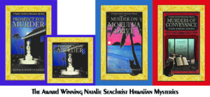
To learn more about the award-winning Natalie Seachrist Hawaiian Mysteries, including Murders of Conveyance [Winner, Fiction Adventure-Drama, 2019 New Mexico-Arizona Book Awards] and other projects, please drop in at my author’s website JeanneBurrows-Johnson.com. You’ll even find Island Recipes that might inspire your culinary creativity.

For more ideas to strengthen your Wordpower© and branding, please visit: Imaginings Wordpower and Design Consultation.

Follow Me:
Amazon, Arizona Authors Association, Apple Books
Audible, Authors Den, Barnes and Noble, Blogarama, Book Bub
Cozy Mysteries-Unlimited, Facebook, Good Reads, Hometown Reads

Book sellers may contact book distributors such as:
Baker & Taylor, Follett, IPG, Ingram, Mackin, Midpoint, TitleWave


PUBLIC SPEAKING, 3

PREPARATION FOR PUBLIC SPEAKING ENSURES QUALITY BRANDING! 

A shortened version of this third blog on using public speaking as a means for enhancing your branding identity first appeared on the website https://hometownauthors.com, which offers a variety of articles from guest authors of who are members of Hometown Reads. Before reading this blog, you may wish to review Effective Materials for Public Speaking and All the World’s a Stage. Today we’ll explore making these events more than a presentation of an author’s books, for public speaking can be one of the most important aspects of any creative professional’s branding program

FINAL PREPARATIONS FOR PUBLIC SPEAKING
It’s time to hit the road!  You’ve prepared for speaking opportunities by shaping marketing materials, bios, introductions, and handouts for varied audience.  Your media releases require only the details of Who, What, When, and Where You’ve verified venue features and obtained equipment necessary for this and future appearances.  

All you have to do is pack everything and hit the road…right?  Not quite.

PREPARING TO BE A STELLAR PUBLIC SPEAKER
I hope you’ve been vocalizing daily—in song [for those who can], vocal exercises, and oral readings.  Many events place a time limit on speakers, so timing readings can ensure completing your presentation with a generous Question and Answer segment.

Next, consider your appearance. You can’t lose weight quickly, but how are your hair, skin, and nails?  Do your clothing and accessories look good on you…and travel well? Perhaps you’ve worked with a stylist to determine your optimal color palette, hairstyle, clothing designs, and accessories to maximize expressing your personality…

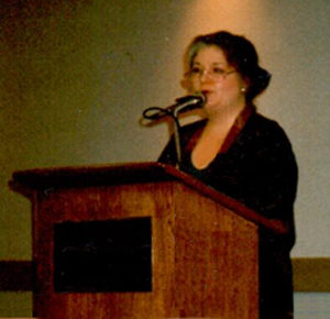
Look professional, knowing you can remove a tie, loosen a collar, or remove a jacket. [See Resume and Career Tips.  Because my work centers on Hawai`i [especially with the Natalie Seachrist Hawaiian Mysteries], I wear dresses in tropical greens and jackets with Asian or floral designs.  Depending on the neckline, I affix a name badge (with magnet) and avoid necklaces (which can become uncentered).  To minimize distraction and sound interference, I don’t wear dangling earrings or loose bracelets.  I complete my theme with an artificial orchid for my hair—since fresh flowers don’t last through multi-hour events. 

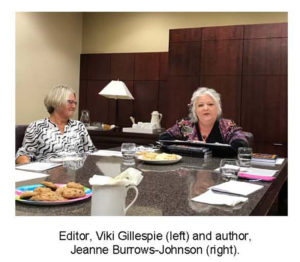
So lovely to have my editor Viki Gillespie join me at a speaking engagement!

MULTIPLE PRESENTERS
Panel discussion speakers are usually seated at a table or in a semi-circle or line of chairs. Whenever you’re in plain view, be aware of your attire and stance…to insure you’re not providing a less-than desired floor show! A dress that looks lovely when I’m standing, may not look professional when I’m seated. Male or female, check out other participants’ attire to harmonize overall appearance. For samples of color combinations, please visit Plays on Color.

CALLING FOR ATTENTION
~ Event organizers may generate Media Releases, as can you—in your hometown and locales where you’ll appear. Consider also sending out event follow-up releases, to encourage members of the media to seek you out.
~ Add a news page to your author website and blogs that highlights your travel.
~ Social media can be more important than traditional media.  Publicize where you’ll appear with contact information. If your events aren’t open to the public, announce cities where you’ll be.
~ Take event pictures [book in hand] for immediate release and future marketing materials—asking permission to use images featuring other people.

TRAVEL CONSIDERATIONS
~ Ship books and marketing materials in advance when possible.
~ Allow one day for rest and preparation prior to your event.
~ Purchase travel tickets permitting change of schedule.
~ Plan ground transportation minimizing strain on you, as well as cost.
~ Hotels often provide airport transport, valets, safes, and restaurants. Private hosted accommodations lessen privacy.  A B&B may be appropriate when driving.
~ Financially, notify credit card institutions you’re travelling. Obtain cash for tips. Determine if you need a tax or sales license. Decide whether to accept credit cards, electronic payment, and/or cash for sales.
~ Carry emergency clothing, accessories, medicines, and toiletries in hand-held luggage, in case checked bags fail to arrive.
~ Personally carry hardcopy masters and electronic files for reproduction.
~ Dress to attract attention while travellingname badge, book image, and business cards at the ready!

SET YOUR STAGE…WHEN YOU CAN
~ Place a banner or picture on podium front.
~ Check equipment–lights, sound, and projection.
~ Position supplies for speech–large watch, laser pointer, pen, props, travel mug with slightly warm water.
~ Set up display near front of entrance–signage, marketing materials, books, handouts, and sign-up sheet for future event notifications. Man display when possible.
~ Be aware that electronic projections often fail because of file format incompatibility between source and venue operating systems and versions of software.
~ Maximize visibility of necessary folders and files on or near podium.
~ Carry backup hardcopy of your presentation for you and handouts of primary points for your audience.

BEFORE, DURING & AFTER PERFORMANCES
~ Warm up vocally and physically.
~ Provide your bio and a short introduction to event organizers.
~ Pace yourself…allow time for Q&A to maximize audience interaction.
~ Conclude with an inspiring thought. I often hold up a pin with a single word appropriate to my message…
~ Make periodic eye contact with your audience. Let attendees feel you care about them individually.
~ Sending gracious Thank You cards/gifts helps maximize an event’s long-term branding value. Carry mailing labels, packing supplies, and postage.

Wishing you the best in your creative endeavors,
Jeanne Burrows-Johnson, author, consultant, and motivational speaker

Suggestions for Dynamic Public Appearances are available at:
Author Appearances, December 2015
Promo Materials for Public Speaking, July 2018
All the World’s a Stage, August 2018
Final Preparations for Public Speaking, September 2018

For more ideas to maximize being memorable and other marketing tips, see Wearing your Brand. For further information on branding and strengthening your Wordpower© please visit: Imaginings Wordpower and Design Consultation.

To learn more about the award-winning Natalie Seachrist Hawaiian Mysteries, including Murders of Conveyance [Winner, Fiction Adventure-Drama, 2019 New Mexico-Arizona Book Awards] and other projects, please drop in at my author’s website JeanneBurrows-Johnson.com. You’ll even find Island Recipes that might inspire your culinary creativity.

Follow Me:
Amazon, Arizona Authors Association, Apple Books
Audible, Authors Den, Barnes and Noble, Blogarama, Book Bub
Cozy Mysteries-Unlimited, Facebook, Good Reads, Hometown Reads

Book sellers may contact book distributors such as:
Baker & Taylor, Follett, IPG, Ingram, Mackin, Midpoint, TitleWave

Drawing on Sense Memories

What visions dance in your dreams?

HAVE SENSE MEMORIES IMPACTED YOUR WRITING? 

What are your earliest and favorite sense memories? Most of us think of the five physical senses as we are experiencing them. The toast looks and tastes all right, but it has a slightly burnt smell… I wish the kids would stop screaming, my ears are starting to hurt… I love this faux fabric, it almost feels like my cat’s fur…

THE CREATOR’S SENSORY PERCEPTION
As a writer, or other creative person, sensory perception can be an important element in preparing a stimulating picture via words or graphic images. We may not be aware of it, but the way an image or scent impacts us personally can greatly impact or work. One of the most effective devices for creating believable images is by consciously drawing on our memories. This is because referencing something we’ve encountered personally provides a depth of authenticity in whatever work we are undertaking.

THE TRUTH OF ONE’S EXPERIENCE
This does not mean that we have to reveal our personal circumstances in order to truthfully share a sensory experience. Of course, that may not be true if we are presenting a work that is a memoir or similar personal expression, for which we are obligated to reveal this aspect of our lives. The truth of our sensory experiences can be shared without revelation of the circumstances in which they occur.  Isolating the experience from its original circumstances, can encourage us to revisit the specifics of what we saw, smelled, heard, touched, and/or tasted with greater accuracy.

For example, while we may wish to describe the beauty of a star-lit night from our honeymoon, we do not need to provide details of the circumstances in which we viewed it. Even when we need to describe something we have not experienced, it’s good to seek out the concrete memories of those who have. In describing Shanghai in the 1920’s for Prospect for Murder, I drew on images shared by people whose fascination with the city transcended the actual era in which they traveled. And despite their degree of positive or negative reactions, I was able to utilize their perspectives to provide images of the bustling streets and even the scents they encountered in their sojourns.

In Murders of Conveyance, the third book in the Natalie Seachrist Hawaiian Mysteries [Winner for Fiction Adventure-Drama in the 2019 New Mexico-Arizona Book Awards], my heroine overhears a conversation in Chinese from outside of the building in which she stands. I’m sure we can all think of times when we’ve  accidentally overheard a conversation, whether in a language we speak or not. When I moved to Honolulu at the beginning of the 1970s, there were many occasions in which I heard languages I couldn’t understand, nor even identify. Because I needed my heroine to feel connected to foreign dialogue, I inserted phonetic sounds that allowed Natalie to guess the speakers might be referencing someone she knew.

STIMULATING VOCABULARY
Sometimes we are fortunate to be able to utilize vocabulary or pictures that effectively mimics the images we wish to share.  I find the following words and phrases can bring clarity to a description, sometimes reaching beyond a single sense: wispy; screech; a snapping branch; wrinkled; razor’s edge; staccato; fragmented; shrunken; glassy; whispered; fiery.

The perception of other words often relies on those who read or hear them. Reference to an Upscale dining experience may arouse the taste and ambiance of a five-star restaurant to one person, and a fast-food joint to another. While the phrase Opulent jewelry signifies a strand of synthetic pearls with rhinestones to one reader, someone else may envision weighty crown jewels. Vintage clothing could generate a disco scene from the 1970s for a millennial, whereas someone my age may picture a flapper dress from the roaring twenties—the 1920’s that is. Similar variances can arise with an author or artist’s use of color and shape, as well as a composer’s insertion of pauses, changing rhythms, and escalating tones.

I’m fortunate that many of the images I wish to share in the O`ahu setting of the Natalie Seachrist mysteries practically write themselves: the sparkle and whooshing sound of incoming surf on a moonlit night; the stickiness of teriyaki sauce on a barbecued chicken thigh; the fresh fragrance of a flower lei, the stench of rotting plumeria blooms beneath an aging and neglected tree. But although I bring personal insight to such images, I must avoid cliché verbiage that will bore the veteran traveler. 

YOUR TARGET AUDIENCE
This brings us to a brief discussion of one’s audience…one’s target market. If you’re working within a recognized genre of literature, art, or music, there may be standards to which the majority of your audience will expect you to adhere. If you are striking out on your own to create a variant or wholly new artistic expression, you can move in any direction you wish…keeping in mind that you will need to attract some degree of a following in order to achieve any degree of success.

Accordingly, I sprinkle snippets of pan-Pacific and world history across my mystery plot-lines.  And while I present a fair number menu items within each book, I place actual recipes on my author website, rather than completely bogging down a story.  As to the cast of characters, folio art framing page numbers, chapter aphorisms, and linguistically and historically detailed glossaries, the reader can choose to appreciate or ignore them…

Wishing you the best in your creative endeavors,
Jeanne Burrows-Johnson, author, consultant, and motivational speaker

Tips to enhancing your writing may be found in:
Empowering Your Words, February 2015
Creating Fictional Characters, March 2015
Sidestepping Writer’s Block, April 2015
Communicating with Every Sense, May 2015
Energizing Narrative Passages, September 2015
The Author Recycles, July 2017
Balancing Text & Space, February 2017
Book Series Adventures, April 2018
Drawing on Sense Memories, July 2018

To learn more about the award-winning Natalie Seachrist Hawaiian Mysteries, including Murders of Conveyance [Winner, Fiction Adventure-Drama, 2019 New Mexico-Arizona Book Awards] and other projects, please drop in at my author’s website JeanneBurrows-Johnson.com. You’ll even find Island Recipes that might inspire your culinary creativity.

For more ideas to strengthen your Wordpower© and branding, please visit: Imaginings Wordpower and Design Consultation.

Follow Me:
Amazon, Arizona Authors Association, Apple Books
Audible, Authors Den, Barnes and Noble, Blogarama, Book Bub
Cozy Mysteries-Unlimited, Facebook, Good Reads, Hometown Reads

Book sellers may contact book distributors such as:
Baker & Taylor, Follett, IPG, Ingram, Mackin, Midpoint, TitleWave
THE AUTHOR RECYCLES

Is your pen always at the ready?
NEW CREATIONS FROM PAST WORK

Is your pen at the ready at all times? In past blogs I’ve talked about examining your previous work as a writer.  Not only does this allow you to measure your progress, it also provides a pool of sources for new directions in content and style.  I am a member of the National Writers Union and the local chapter recently asked me to be their featured speaker at a monthly meetingOften, their speakers read from current projects, but since I’d help to fill in the previous month with a reading of both the Prologue and Epilogue from PROSPECT FOR MURDER [the debut title of the Natalie Seachrist Hawaiian Mysteries], I decided to give a talk on how I’ve recycled parts of past projects.  While there’s nothing novel in this concept, I thought that in detailing how I’d used pieces I’d created during my years in Arizona, I might stimulate my listeners to consider the ways in which they might draw upon works in their own files…

Wordsmiths Don’t Fall into a Single Demographic Description
When you look around any gathering of writers, you’ll find that we’re: Young and old; formally educated and barely literate in the grammatical sense; gifted melodious speakers and hoarsely halting readers; technical prodigies and flawed yet persuasive explorers of every topic imaginable.  The breadth and depth of our compositions are as varied as we are.  And usually, if we’re old enough, such variety will be found spread throughout our individual bodies of work.  

In projects of both fiction and non-fiction, I draw on a background in business, education, and the performing arts.   As might be expected, there is no consistent pattern to my output—except for the decades of public relations, marketing, and design consultation I’ve performed for executives and their profit and non-profit entities. 

Forms from the Past…
In preparing for my talk, I looked over previous work I had drawn upon for recent print, audio, and Internet projects.  Not all were inspirational gems of form, content, or style, but each item I had chosen to re-purpose fulfilled a specific need.  With every new project, I contemplate how the assignment fits within the scope of my professional history.  Not only do I look for concepts, data, and text that may yield something I can reuse, but also the bits and pieces that should be moved to the recycle bin.

…Reshaping for Today and Beyond
This year’s springtime file pruning produced some of everything.  I found business cards, ads, and brochures that could be used for marketing workshops. As I continued my file and closet clearing, I eyed posters and signage that could be augmented with a large artistic label for some future event.  I quickly dismissed them as ineffective for a speech delivered from a podium.  There was, however, one item I could share:  a copy of Stephen Covey’s famous matrix of time and productivity management The gist of this true jewel of philosophy is that if we focus on aspects of both our personal and professional lives that are important but not critical, we’ll be better prepared for challenges that may arise.

After a brief introduction of this principle to open my talk, I noted how elements of past writing had been folded into my writer’s blog [for samples, please visit https://www.Blog.ImaginingsWordpower.com].  From project inspiration to background research, through the phases of writing and editing, production, and marketing, I discussed how I select issues that may be of interest to other authors and artists.  In addition to mentioning a few of those blog topics, I provided examples of material I’d chosen to use in recent book projects.

~  When I joined with five other authors to publish UNDER SONORAN SKIES, Prose and Poetry from the High Desert,  I contributed both fiction and non-fiction.  With new and as well as re-shaped pieces, we all expanded our repertoire.  Knowing that publication of  Prospect For Murder was approaching, I included its prologue.   I also featured historical articles such asThe Holidays in Tucson, 1878,” which I read at the NWU meeting.   

~  In  Murder on Mokulua Drive [the second book of the mystery series], I’ve drawn on notes from my studies in history, plus a series of oral history interviews I conducted many years earlier.  This has allowed me to mention the first woman registered to vote in the Territory of Hawai`i in 1920, and to place a major scene in the historic and ecologically significant site of Kawai Nui Marsh.  

~  The compilation of the oral history interviews, Conversations with Caroline Kuliaikanu`ukapu Wilcox DeLima Farias has indeed proven to be an invaluable resource.  Carol was a dear friend seeking to preserve her family’s history, library and other artifacts.   Descended from Hawaiian nobility, her recollections of life in upcountry Maui in the early twentieth century and dancing hula in Waikīkī on December 6th, 1941, delight both readers and listeners.  In reshaping the layout for a book of the seven interviews and an audio edition comprised of the original recordings, I described how this resurrected project is benefiting from the comprehensive glossaries I’ve constructed for the Hawaiian and other non-English vocabulary included in the Hawaiian mysteries. 

~  Finally, I referred to the fourth mystery, A Yen For Murder, for which I examined promo materials I wrote for Highland Games and the Hilo International Festival on the island of Hawai`i during the 1970s.  This led to having Natalie reminisce about hearing a remarkable young woman play the Japanese koto at the Festival…and decades later having that woman, then a Buddhist priestess, become the victim.

In the future, I anticipate giving talks on the authorship process, for which many of these examples will be useful.  Of course, there will also be samples of flawed book covers, changing email addresses, and evolving reviews to reference.  How does all this relate to your work?  Well, I wonder what awaits you when you dive into your own files.  Will you choose to build on your dramatic successes?  Or will you determine that what was once viewed as a failed project may rise to the realization of full and positive fruition?

Wishing you the best in your creative endeavors,
Jeanne Burrows-Johnson, author, consultant, and motivational speaker

To learn more about the award-winning Natalie Seachrist Hawaiian Mysteries, including Murders of Conveyance [Winner, Fiction Adventure-Drama, 2019 New Mexico-Arizona Book Awards] and other projects, please drop in at my author’s website JeanneBurrows-Johnson.com. You’ll even find Island Recipes that might inspire your culinary creativity.

For more ideas to strengthen your Wordpower© and branding, please visit: Imaginings Wordpower and Design Consultation.

Follow Me:
Amazon, Arizona Authors Association, Apple Books
Audible, Authors Den, Barnes and Noble, Blogarama, Book Bub
Cozy Mysteries-Unlimited, Facebook, Good Reads, Hometown Reads

Book sellers may contact book distributors such as:
Baker & Taylor, Follett, IPG, Ingram, Mackin, Midpoint, TitleWave
BALANCING TEXT AND SPACE

LIMITED WORDPOWER© AND DESIGN ACUMEN?

Most of us have limits to our talents. Sometimes we are able to increase our skills or can hire professionals who can elevate the quality of our output. One of my continuing disappointments is that while I have a good sense of design and some computer graphic skills, I have not been gifted with comprehensive skills of an artist.

ALTERING TEXT
One thing I can do is change the words and even the fonts of text. This alteration of  text is usually done to maximize its appearance in the space allotted to it.  Sometimes this is disappointing, as the words I initially selected were ideal to the purpose and tone of the project.  Nevertheless, the goal in any written work is to create a product that is most appropriate for communicating with one’s target market.

As I generated promotional materials for marketing Prospect For Murder [the first book in the Natalie Seachrist Hawaiian mystery series], I frequently had to revisit this basic activity of editing—substituting vocabulary to fit the available space. Professional Wordsmith
One of the greatest values a professional wordsmith brings to a verbal project is their knowing when and how to adjust text to maximize readability.  This ability to edit within varied  parameters demands the flexibility as well as the skill to replace verbiage to accommodate the allowed space.

In the past, when a client decided my composition met their needs, they usually took the text to a graphic artist and I never saw it again—at least not before the final product was printed, uploaded to a website, or sent forth in emails.  Imagine my disappointment when I saw that the presentation of my work looked awkward because of justified paragraphing and/or the lack of breaking syllables at the end of paragraphs, which resulted in wide gaps or crammed lettering.

If I remained in close contact with the client, I sometimes had an opportunity to rectify the situation.  At a minimum, I could alert them to the problem which was bound to recur until their process of production was changed.  If I had the opportunity to work with the artist tasked with incorporating my text, I could suggest potential means for enhancing the overall layout by:

~  Changing words that were too long or short
~  Altering the paragraph structure
~  Adjusting the number of columns or their size
~  Repositioning and/or resizing artwork
Subliminal Influences

HARMONIZING PRODUCT PACKAGING AND MARKETING MATERIALS
Regardless of the sophistication of a project, balancing art and typography can truly maximize the sensory experience of your readers.  It is a vital key to synchronizing a product’s packaging and the marketing materials that accompany it.  As may be expected, this can help determine a reader’s initial response to the product being represented, thereby affecting whether it will be purchased or bypassed. 

Even the information presented in a dentist’s pamphlet should be designed to flow in an harmonious manner.  The next time you have an appointment at a professional’s office, glance through the materials in their waiting room.  If you find odd looking paragraphs, it’s probably because a graphic artist took the text and simply dropped it into their design—usually without the copy writer having the opportunity to re-edit their text.

DESIGNING PROMO MATERIALS AND WEBSITES
In my blog on the layout of books, I discussed the various issues I faced in the design of covers for the hardcover and audio book editions of Prospect For Murder.  All of the spatial challenges I’ve just explored in this blog were applicable in both editions.  I’m very grateful that my artist and typographer were the same person [you can visit www.yasaminejune.com to view her art].  This meant I was able to work with her to balance elements of concern.  Of course, working in this manner requires mutual understanding and sufficient time to accomplish the necessary edits.

Shifting From Hardcover to Audio Book Format
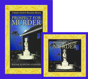
Transforming images and text of the hardcover book jacket of Prospect for Murder into the audio book’s required more than re-positioning and resizing the many design elements. The  mysterious moon above the apartment building was deleted to accommodate the titling.  Also, the book synopsis and author bio were shortened to allow for book reviews.

POSTCARDS
Recently I reworked the 8.5 x 5 inch promotional postcard I am using for several purposes.  As I now have a growing number of positive book reviews I wish to highlight, I needed to edit both the book’s description, as well as my bio to accommodate snippets from the four reviews I wanted to feature on the front of the card.  And because I may wish to employ varied greetings, I had to allow room on the backside to place labels with personalized messages.

LETTERS
It may seem needless to mention that each letter that one sends out via snail mail or email is an entity unto itself.  However, writers are just as prone as other professionals to remain wedded to verbiage for which they have an affinity.  Generally, effective letters should be limited to a single page.  This means that the need to resize the length of one’s text arises quite often.  Sometimes simply reworking the size and location of a logo and decreasing the dimension of margins will suffice to reuse a favorite piece of composition.  At other times, it’s also necessary to:

~  Combine paragraphs
~  Reduce the size of the font used for text
~  Use left justified paragraphing without indentation
~  Use a smaller dimension for line spacing between paragraphs

Wishing you the best in your creative endeavors,
Jeanne Burrows-Johnson, author, consultant, and motivational speaker

Further discussion of art is available at the following blogs:
Authors Design Dilemmas 1, April 2015
Confronted by a Fantasia of Fonts, May 2015
Rainbows of Color, May 2015
Winning Logos & Slogans, October 2015
Quality Book Production, February 2016
Harmonizing Branding Elements, August 2016
Book Promotion and Evolving Art, January 2017
Balancing Text and Space, February 2018
Successful Cover Art, December 2018

To learn more about the award-winning Natalie Seachrist Hawaiian Mysteries, including Murders of Conveyance [Winner, Fiction Adventure-Drama, 2019 New Mexico-Arizona Book Awards] and other projects, please drop in at my author’s website JeanneBurrows-Johnson.com. You’ll even find Island Recipes that might inspire your culinary creativity.

For more ideas to strengthen your Wordpower© and branding, please visit: Imaginings Wordpower and Design Consultation.

Follow Me:
Amazon, Arizona Authors Association, Apple Books
Audible, Authors Den, Barnes and Noble, Blogarama, Book Bub
Cozy Mysteries-Unlimited, Facebook, Good Reads, Hometown Reads

Book sellers may contact book distributors such as:
Baker & Taylor, Follett, IPG, Ingram, Mackin, Midpoint, TitleWave

BOOK PROMOTION AND EVOLVING ART


THE NEVER ENDING ART & SCIENCE OF WRITING

As I examine the months since the launch of Prospect For Murder [the first book in the Natalie Seachrist Hawaiian mystery series], I realize I have not posted a blog regarding the never-ending art and science of writing for a long time.  I’ve started several, but details of the publishing and promotional processes have interfered with my sharing new author strategiesSince addressing the topic of my artistic vision for the book layout for Prospect For Murder in a previous blog, it has been released in hardcover, downloadable audio and ebook formats, and a 9-CD as well as downloadable audio book. Preparing for the promotion of each version has required re-examination of artwork and descriptive text, as each format varies in size and may appeal to a different target market. successful advertising and branding

EVOLVING BOOK SERIES
Authors may separate their work into categories of writing, publishing, and marketing, but each of these activities should unite under a shared roof of unified branding.  And while today’s book marketplace includes many self-publishing authors choosing to offer downloadable rather than printed books, such works must still be accompanied by attractive art and typography to maximize their appeal to the sensory experience of potential readers.

There are many ways to make the appearance of a book pop within the massive listings of any genre.  As mentioned in my discussion of art for PFM, I have chosen to use an Island-themed gold frame based on Hawaiian heirloom gold jewelry to distinguish my book and the promotional materials with which I market it.  

HARDCOVER BOOKS
Book jacket art
for the hardcover edition of PFM was the first design project I undertook.  After the evocative gold frame was completed, I realized it could be utilized for the entire mystery series.  And, with changes in the metallic color, it will be ideal for other book projects as well. Below is the first version of the book jacket, which was clearly too dark!

Prospect for Murder...in written and audio editions...the first Natalie Seachrist Hawaiian Mystery

ORIGINAL 9-CD AUDIO BOOK ALBUMS
After I completed recording the 9-CD audio book, it was time to modify the book jacket art.  For the CD albums, my job was to shorten text describing the book and me, as well as the snippets of reviews.  My artist and typographer Yasamine June [you can view samples of her work at www.yasaminejune.com] then adjusted the size and proportion of her original artwork and dropped in my edits.

EBOOK AND AUDIO EDITIONS
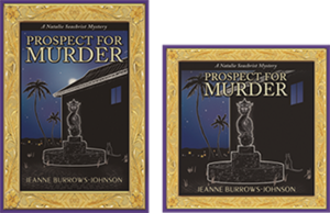
The next task was designing website icons for sites offering the downloadable audio and eBook editions.  Our goal was to enhance a visitor’s recognition of the products being offered.  Therefore we created a conjoined image of the hardcover book jacket and a square edit resembling a CD case.  Wherever possible, this paired image is used to signify that Prospect For Murder is available in multiple formats.

I should mention that during this process, I realized that the original art image was too dark. Consequently, I had Yasamine brighten the cover, especially the dragon fountain. Subsequent to these changes, I was thrilled when Prospect for Murder won cover art design in the New Mexico-Arizona Book Awards in 2017.

DESIGNING PROMO MARTERIALS & YOUR WEBSITE

The art of communication is one of the most vital skills a professional in any field can develop to help them in achieving goals and objectives in both their public and private living.  The following tools can be refined to maximize messages to colleagues, friends and the general public.

ARTWORK
I use the iconic paired image of the print and audio editions of PFM as artwork for both printed promotional materials and my author website.  Without intention, the colors for Prospect For Murder and Imaginings Wordpower were nearly the same, which has greatly simplified my choice in color palette. I am still contemplating where and how I will utilize the gold frame.

TITLING
I have used the Peignot font for my promotional business, Imaginings Wordpower [www.ImaginingsWordpower.com] for many years.  Therefore, I chose to use it for the titling of book jackets, my author website, and all promotional materials for the Natalie Seachrist series.  This decision is especially appropriate since many of the historical details used in the series predate World War II.  The Peignot font is an art déco [or style moderne dating from the 1920s], sans-serif display typeface designed by A. M. Cassandre in 1937 for the Deberny & Peignot Foundry in France.  While this font is too stylized for lengthy text, it makes a viable statement for titling and headings.

BUSINESS CARDS
Unexpectedly, I discovered that the standard size of a business card and the dark haunting color of the hardcover and audio book art was not suitable to my new double-sided author business card.  To resolve these problems, I created a new image.  I did this by overlapping the frame of the hardcover edition with that of the downloadable audio edition.   In the lower right-hand corner, I inserted the gold hibiscus found in the corners of the frames.  This has proven effective, since the image is always accompanied by text providing my name and the title of the book.

STATIONERY & FORMS
With use of the paired image of the print and audio books, plus the Peignot font, there were few decisions to make in creating my author letterhead stationery.  For most purposes, I place the iconic art image in the top left hand corner of the page and all contact information centered at the bottom.  This layout works for both letters and business forms [such as invoices]. 

LOGO NOTECARDS
For many years I’ve used what I call logo notecards to extend invitations, express gratitude, and confirm appointments.  For both portrait and landscape layouts, I place a logo in one quadrant of an 8.5 x 11 inch layout, with text positioned diagonally and upside down from the artwork.  The printed result is a sheet of paper that can be folded into a 5.5 x 4.5 notecard that will fit an invitation-sized envelope. 

POSTCARDS
After discovering that postage was the same for a couple of sizes of postcards, I chose a dimension of 8.5 x 5 inches for my author’s promotional postcard.  Beyond displaying recognizable book cover art, this ensures sufficient space for a synopsis and book reviews, plus purchasing options.  The art and descriptive text pop against a simple white background, with a high gloss finish on the front side for durability and flat finish on the back, which facilitates use of a pen for personal messages. 

Sadly, I discovered a typo after receiving an initial order of the postcards.  And having continued to receive positive reviews, I realized I should have printed a small number of the cards initially, to allow for subsequent corrections and additions.  As my publisher has declined to reprint book jackets with the latest reviews, I’m glad my second run of postcards allows me to send out books as samples, or for review or sale with up-to-date information.

OTHER PROMOTIONAL CONSIDERATIONS

COMMUNICATING THROUGH EMAILS
Every piece of communication you generate is a marketing opportunity.  And while you may not use an outgoing email layout paralleling your letterhead stationery, you can strategically position artwork, logos, and other information to draw the recipient’s eye.  I put the paired book image and purchasing information in the top left-hand corner of each outgoing email.  For the signature section for all outgoing emails, I have added a link to my author website [JeanneBurrows-Johnson.com],   my Imaginings Wordpower website [ImaginingsWordpower.com], and this blog [Blog.JeanneBurrows-Johnson.com].

WEBSITES DISPLAYING NEWLY RELEASED BOOKS
As the release date for PFM neared, the number of websites featuring the book increased.  Unfortunately, some had received galleys displaying artwork devised as a placeholder for the book jacket art that was to come.  Without proper notification, these sites would continue to display the galley image as being representative of the published book.  Therefore, I suggest that authors releasing books through publishers or on their own, remain vigilant in cruising the Internet to ensure that the words and images describing them, as well as their work appear as they intend!

In addition, authors need to be aware that many popular websites selling and promoting books do NOT offer an easy means for having books reviewed or even displayed in categorical listings.  Most of the time, an author’s work is only visible if the visitor to a site knows the author’s name or book title.  I strive to see Prospect For Murder displayed under the following categories for each of its several editions:  Hawai`i; Hawaiian mysteries; cozy mysteries; cat mysteries; female authors; female detectives; female sleuths. If you have any tips to help me with this situation, please drop me a note through the contact form on one of my websites…

Wishing you the best in your creative endeavors,
Jeanne Burrows-Johnson, author, consultant, and motivational speaker

Further discussion of art is available at the following blogs:
Authors Design Dilemmas 1, April 2015
Confronted by a Fantasia of Fonts, May 2015
Rainbows of Color, May 2015
Winning Logos & Slogans, October 2015
Quality Book Production, February 2016
Harmonizing Branding Elements, August 2016
Book Promotion and Evolving Art, January 2017
Balancing Text and Space, February 2018
Successful Cover Art, December 2018

To learn more about the award-winning Natalie Seachrist Hawaiian Mysteries, including Murders of Conveyance [Winner, Fiction Adventure-Drama, 2019 New Mexico-Arizona Book Awards] and other projects, please drop in at my author’s website JeanneBurrows-Johnson.com. You’ll even find Island Recipes that might inspire your culinary creativity.

For more ideas to strengthen your Wordpower© and branding, please visit: Imaginings Wordpower and Design Consultation.

Follow Me:
Amazon, Arizona Authors Association, Apple Books
Audible, Authors Den, Barnes and Noble, Blogarama, Book Bub
Cozy Mysteries-Unlimited, Facebook, Good Reads, Hometown Reads

Book sellers may contact book distributors such as:
Baker & Taylor, Follett, IPG, Ingram, Mackin, Midpoint, TitleWave
TAMING CLUTTER

The peaks of your developing power

THINNING THE FOREST OF FILES


You may have stumbled into this blog without an apparent need to address the topic.  You may not be part of a group planning to generate an anthology.  And, regardless of whether you are an amateur or professional writer, you may not think you would ever wish to publish a collection of your individual pieces.  Yet over time, a number of works, large and small, may have accumulated in your electronic as well as hardcopy files. It’s simply part of the life of a wordsmith. And whether you realize it or not, handling your files is part of the editorial process!

REVIEWING PREVIOUSLY COMPOSED WORKS
It might be relatively simple to assemble a publishable collection of your various works, if you find a repeating theme.  Sadly, it’s more likely that you’ll find disparate pieces lacking a common unifying thread.  In such cases, cobbling together a publishable piece may seem a remote idea. However, periodic and systematic review and notation of your existing materials may reveal something of publishing value.  You’ll never know unless you take the time and energy to explore the possibility.  Projects like this demonstrate the technical side of the art and science of effective writing and should be one element in your authoring strategies

SYSTEMATIC REVIEW OF YOUR FILES
Having a comprehensible writer’s filing system can prove to be invaluable.  As a wordsmith, there are many good reasons to revisit your electronic and hardcopy folders and files on a regular basis.  The first benefit is controlling clutter.  When you no longer recognize what a folder or file contains, it’s time to consider deleting it, or combining its contents with another.  Of course, it is not advisable to delete material, until you’ve looked at it closely to see if there are any hidden gems.  For if you discover something that generates an unexpected revenue stream, the entire process is justified, even if it means using creativity in your file naming After all facilitating communication should include you!

Another reason for looking over your work is to review your journey as a professional writer.  Like an artist moving through various media and periods in the body of their work, you may find definitive patterns in your creations.  And, the process may impress you with the distance you have traveled and the progress that you’ve made.  You may also find there are topics, choices in voice, vocabulary, and sensory detail that you would like to employ in the work you are currently generating…

FACILITATING FILE REVIEW
In order to examine your work effectively, you need a filing system that facilitates easy access. Regardless of whether you’re dealing with hardcopy or electronic form, you’ll want to organize folders and files in a way that will make sense to you in the remote future. That means ensuring that each one is both recognizable and trackable.

FORMATTING TIPS FOR HARDCOPY FOLDERS
Being a visually oriented person, I use color coding, abbreviated naming, and alphabetical sorting for hardcopy materials—of course, that’s after designating separate file drawers by category.  For all reference materials I use the color yellow.  These folders include:

~  Historical Reference
~  Geographical Reference
~ Organizational Reference
~  Miscellaneous Reference

For easy separation, I use Burgundy colored filing materials to designate Imaginings’ operational information and records.  This section includes topics such as:  accounting; computer hardware and software reference information; current and past marketing materials; handouts for clients; public speaking information and tools; and, current and completed writing projects.

Current clients are differentiated by teal colored folders and files.  For ongoing organizational volunteer projects, I use blue filing materials.  The great thing about a hardcopy folder is that its name can be changed whenever necessary by simply changing removable labels.  And once I’ve completed a project, (or am no longer working for a client), I transform most files into categorical records stored in the Burgundy color I use for my own files

For example, when I was no longer writing historical pieces for Realtor X, I removed materials I deemed irrelevant to any future work with them, and placed samples of the work I’d performed for them into a general topic folder [in this example, Real Estate].  This allows quick examination of all materials I’ve written about land and real estate. And, by retaining electronic files regarding individual companies, I can revisit the particulars of my association with them when necessary.

ELECTRONIC FOLDERS AND FILES
I find that creating and naming Folders is easy…since I base the process on titles composed of descriptive words and folder placement on alphabetical sequencing.  To prevent having excessive numbers of folders for related topics, I use subset folders.  For example, within a Chinese reference folder, I have subsets for Chinese art, funeral customs, history, jewelry, language and dialects, names, philosophy, and Shànghăi, And within each of these categories, there are further folders for specific topics such as dynastic history, types of jade, elements of Shànghăi deco artwork, and male and female names.

When I began the Natalie Seachrist series, I had one unnamed book and a nameless protagonist.  After a while, the original file named “Book” became “Prospect For Murder.”  By then, the protagonist was Natalie Seachrist, so some files in the PFM Folder bear her name in their titling.  Many other files begin with the abbreviation “PFM,” followed by descriptive words, and finally, a date—if the material is NOT reference information. And, as with hardcopy files, reference data for the three books I’ve completed have been migrated to a generic Folder labeled “NS Research.”

Aside from logical alphabetical abbreviations, I urge you to date electronic files that are not reference information.  This is because one of the most difficult aspects of being a writer is the number of re-writes required. I fought dating my files for many years, but after repeated difficulty in locating the files I sought, I have followed the example of more scientifically-oriented authors.  The dating format I use is two digits each for the current year, the month, and day.  For today’s Blog, I might title the file, I_Blog_Taming_Clutter_Pt_1_160421.

Other issues in naming electronic files are the use of capital letters and underscores between words or other elements.  In the past, techies insisted on never using capital letters and always using dashes or underscores—or simply cramming alpha-numeric elements together without spaces.  I haven’t noticed such definitive instructions recently.  So, I use cap letters for readability, with underscores between the elements of a file name, as in one I created for recording the audio version of Prospect for Murder, PFM_Chapt_1_Vision.

DETERMINING WHICH FILES TO DELETE
I offer one cautionary note to all authors when it comes to the potential deletion of files:  Author know thyself! This is crucial for all of us to internalize in many areas of our work.  It is particularly important for writers noted for being too quick to delete something they may later need…as well as those tending to hoard every word they write, as if each were presented in a vision from a higher authority.

In general, I de-clutter files by removing as many as I can in both hardcopy and electronic formats.  However, I have mechanisms for saving favorite material: I maintain two hardcopy sample portfolios One is a master with published examples from my best work.  The second one is smaller, with basic promotional materials focused on me and the general scope of Imaginings WordPower and Design Consultation.  In the smaller binder, I’ve allowed space for inserting material from the master portfolio that might be appropriate to meeting with a specific person or organization.

For each major writing project, I create a file named “Unused Verbiage.”  It is the destination for words, phrases and passages that I decide are inappropriate to my current endeavors, but which might prove useful later or in another piece of writing.  These favored words can also facilitate your re-editing of a piece, such as when your editor or publisher requests insertion of some element you had deemed irrelevant. 

Through such files, I track snippets of my writing, without needing to save a large or duplicative file.  Also, I rename files with similar material, such as RMS_EmpressofBrit_Orig_Description or Pearl_Wong_Orig_Shanghai_Story. Both of these files reside beside the completed manuscript of Prospect for Murder.  I don’t know how they might help me achieve goals and objectives in the unpredictable future. Perhaps I might revisit those passages as I complete Pearl Wong’s story within the series’ fourth book, Yen for Murder. 

Wishing you the best in your creative endeavors,
Jeanne Burrows-Johnson, author, consultant, and motivational speaker

Operational tips to help writers are available in the following blogs:
Fear of Losing Files, July 2015
The Value of an Index, August 2015
Taming Clutter, April 2016

To learn more about the award-winning Natalie Seachrist Hawaiian Mysteries, including Murders of Conveyance [Winner, Fiction Adventure-Drama, 2019 New Mexico-Arizona Book Awards] and other projects, please drop in at my author’s website JeanneBurrows-Johnson.com. You’ll even find Island Recipes that might inspire your culinary creativity.

For more ideas to strengthen your Wordpower© and branding, please visit: Imaginings Wordpower and Design Consultation.

Follow Me:
Amazon, Arizona Authors Association, Apple Books
Audible, Authors Den, Barnes and Noble, Blogarama, Book Bub
Cozy Mysteries-Unlimited, Facebook, Good Reads, Hometown Reads

Book sellers may contact book distributors such as:
Baker & Taylor, Follett, IPG, Ingram, Mackin, Midpoint, TitleWave

ENERGIZING NARRATIVE PASSAGES

Is your pen always at the ready?Are you an effective teller of tales?

Professional or amateur, the most challenging part of a day of wordsmithing may be facing a blank piece of paper, or an empty page on your monitor’s screenespecially if you’re writing what feels like a dull narrative.
Writing Tips
THE ART AND SCIENCE OF WRITING
It may be surprising to you, but despite our electronic age, there are still writers who begin each project with hardcopy composition.  If this authoring strategy produces effective prose, it’s hard to argue with their writing process.  It’s all a question of the results that come from one’s practice of the art of communication.  In both fiction and non-fiction, when the writer’s inspiration produces a rich palette of words that maximizes their reader’s experience, their methods have been successful!

Regardless of your wordsmithing process, on days when you feel lacking in creativity and even editorial direction, I suggest you begin by capturing the images that first come to your mind as you contemplate the scope and goals of your project.  Work without concern for the structure of language, correct grammar, or the sequence in which the words emerge.  Within a short while, you should find yourself producing an unstoppable stream of verbiage. 

As your pace slows, you can pause to write a brief outline of your work to that point.  Confident that you will not lose direction, glance over your creative output for patterns within the images, dialogue, and activity that you have produced.  You can then begin empowering your words by strengthening the connectivity of fragmented text.

You should then be able to move back and forth between the creative and editorial processes fairly easily.  I stress the first category—creativity—because writers often lose images they have glimpsed by becoming too absorbed in initial self-editing.  Remember, editing can always be accomplished at a future time.  But if you lose your inspired thoughts, they may never be retrieved…or built upon as you initially envisioned.

Experienced authors often have an established writer’s voice on which they can draw.  This is true whether they are writing the fourth book in a series, or constructing a non-fiction piece reflecting their true voice and personality.  Whether you are in this position, or creating a wholly new voice, you may wish to take a few moments and reflect on the tone, sophistication of vocabulary, structure of language that is most appropriate to the current work, and images that will enhance the sensory experience of your audience.  [Please note that I am referring to your voice as the teller of facts or a story, not the voices of any characters you may be creating.]

With these elements in mind, you can enter the realm of refining the vocabulary and organization of your piece.  As usual, I suggest you begin with the most obvious edits.  Personally, I have a tendency to employ overly complex sentence structure that begs immediate trimming.  Another pattern that many of us face is the need to flip first and last clauses, sentences, and even paragraphs.  Like everything else, practice makes better, if not perfect, form.  By the time you’ve reached the end of a couple of sections, your structure should have tightened with increasing clarity.
Writer’s Guidelines
MY EDITORIAL PROCESS
Sometimes in the midst of mundane edits, I have a sense of the truly impactful changes I wish to make.  If working in hardcopy (often late at night in the midst of classic films or predictable episodes of television mystery shows), I’ll make marginal notes regarding a character’s appearance, vocabulary, motivations, or inner thoughts regarding other characters.  [This has proven especially important when working on books subsequent to Prospect for Murder in the continuing Natalie Seachrist Hawaiian Mystery series.] And when at the computer, I may utilize small sticky notes to record my ideas.

With obvious adjustments to structure complete, I move within the piece to maximize its overall flow and tone.  I usually begin by modifying nouns and adjectives.  In a previous blog on color theory [see Design Dilemmas for Authors, Part 3:  Color, May 30, 2015], I discussed various words that might be used in place of the word blue to enhance your color palette

FACILITATING COMMUNICATION
Likewise, consider how you might embellish a scene referring to a red sofa.  While inappropriate for a children’s picture book (and most contemporary fiction), the author of a dramatic historical novel might say, “The heroine entered the study nervously and perched on the garnet colored velvet chaise lounge.”  Here I wish the reader to feel wooed by the distinctive color, texture and shape of a piece of furniture. 

In my own writing, I frequently draw on the breadth of my writer’s palette to concisely depict the ambiance of a scene.  For example, “She heard the sharp sound of a gunshot” became “She was startled by the sharp report of a bullet slicing the air.”  Here I turned a matter-of-fact incident report to a description of my character’s response, which allows the reader to join in the heroine’s frightening experience which will enable your reader to feel they are present at the scene…and who knows how that may prove useful if your piece were to be converted to a script for a movie or television show.
Impactful Advertising Messages
ALTERING PUNCTUATION
Consider the following examples of shifting vocabulary, word sequence, and punctuation that can alter a reader’s interpretation of a passage within commercial as well as fictional text:

Experience the unique luxury of a journey to the Orient aboard the majestic RMS Empress of Britain.  [Advertising copy similar to posters for the ship’s 1932 world cruise]

I journeyed from Hong Kong to Honolulu aboard the RMS Empress of Britain.  [A matter of fact statement appropriate for any type of writing]

Truly…I did enjoy my trip aboard the RMS Empress of Britain.  [A plea to be believed; perhaps for the dénouement of a murder mystery]

I immensely enjoyed my sojourn from Hong Kong to Honolulu aboard the luxurious RMS Empress of Britain.  [An elegant, almost fussy statement, appropriate to a romance novel]

There are many ways to strengthen your writer’s voice for each project you undertake.  Reading other works in the same genre by authors you like and dislike will provide examples to emulate, as well as to reject in your own work.  There are also reference materials that will broaden your ability to describe people and occurrences in an articulate manner appropriate to your genre.  You might begin by perusing your own reference library to ensure you have:  A couple of grammar-cramming style books such as The Chicago Manual of Style and the Associated Press Stylebook, which are standards.  You will also want to have a thesaurus or two, and a few dictionaries, including ones for foreign words or phrases you might use. 

A RICH PALETTE OF IMAGES
Beyond these basics, consider how you can use Internet search engines and other materials.  One of the most interesting sources I’ve found is obituaries [see Shopping for Characters, May 12, 2015].  This is a great place to find physical descriptions of people, and to discover comprehensive biographic images and sometimes even the settings through which men and women of past generations walked.

Wishing you the best in your creative endeavors,
Jeanne Burrows-Johnson, author, consultant, and motivational speaker

Tips to enhancing your writing may be found in the following posts:
Empowering Your Words, February 2015
Creating Fictional Characters, March 2015
Sidestepping Writer’s Block, April 2015
Communicating with Every Sense, May 2015
Energizing Narrative Passages, September 2015
The Author Recycles, July 2017
Balancing Text & Space, February 2017
Book Series Adventures, April 2018
Drawing on Sense Memories, July 2018

To learn more about the award-winning Natalie Seachrist Hawaiian Mysteries, including Murders of Conveyance [Winner, Fiction Adventure-Drama, 2019 New Mexico-Arizona Book Awards] and other projects, please drop in at my author’s website JeanneBurrows-Johnson.com. You’ll even find Island Recipes that might inspire your culinary creativity.

For more ideas to strengthen your Wordpower© and branding, please visit: Imaginings Wordpower and Design Consultation.

Follow Me On:
Amazon, Arizona Authors Association, Apple Books,
Audible, Authors Den, Barnes and Noble, Blogarama, Book Bub,
Cozy Mysteries-Unlimited, Facebook, Good Reads, Hometown Reads

Book sellers may contact book distributors such as:
Baker & Taylor, Follett, IPG, Ingram, Mackin, Midpoint, TitleWave
Tips From a Newbie Blogger

Is your pen always at the ready?

TALES FROM A NEWBIE BLOGGER

What can a newbie blogger tell you? Are you expanding your practice of the Art & Science of Writing? Perhaps you’re thinking of beginning your own blog.  Recently I’ve received requests for tips on setting up a blog.  Before launching into how I’ve created and maintain this site, I must clarify that I’m not a techie and do not possess the mental acumen to write the code required to build any website from scratch.

If you are a professional writer, having a blog can be a key feature of your authoring strategies Regardless of whether you are an author, you may be thinking your greatest concern is what you’ll write about.  I suggest that if you feel the need to have a blog, the contents of it are already floating in your mind.  The quality of your output will, of course, depend on your skill set.

Setting up a blog demands many things beyond the writing of text.  Therefore, today I’ll focus on the mechanics of creating a blog. The first and recurring requirement for doing this is having the patience to accomplish the task.  Next on my list of requirements, is my favorite pairing of ingredients in most things I do:  Art and Science.  I place the issue of art at the fore, because without an artist’s inspiration, you’re less likely to create an appealing space that will capture and keep your readers’ attentionPlease note that I’m not suggesting that all of us are worthy of assuming the title of artist.  However, we can reach for the artist’s balance of mind and spirit in exploring color, shape, and overall composition—regardless of the style in which we create our memorable statements.

As to the element of science, whether or not you are a techie, there are sources to help you determine the appropriate building blocks for bringing your vision to fruition.  Your research can begin with querying your favorite search engines This will provide the technical terminology you need to be able to ask intelligent questions during online searches and efficient analysis of tech manuals.

Even if you decide you’re not qualified to build a blog site, this preparation will help you communicate effectively with specialists in building websites.  For by the time you’re ready to launch the building of a blog, you should have established a connection with a reliable techie or tech support company—online, if not in person.

Parallel to my June 2015 blog on Media Relations, I suggest you make the most of every contact you can develop.  How do you go about making friends with techies?  If you are able to move from online communication to meeting in person, take a page from your personal life.  Coffee, lunch, or drinks (not necessarily alcoholic) moves you into a social atmosphere in which you can explore commonalities and a potential working relationship with the person.  Regardless of how you connect, when it’s time to formalize a professional relationship, be specific about your needs and desires Ask the individual or company to clarify the services they will be performing for you and the fees you will pay.  Depending on the parameters of the work involved, a contract may be called for.  If that is so, you may want to consult colleagues as well as an attorney prior to signing a contract or making any payment.

Personally, although I’ve designed my own websites several times, I am now using website and blog templates provided by the company that hosts my online presence.  Regardless of the tools used, the design of a website or blog is a major commitment of energy and time.  This is especially true since search engines now expect a level of optimization that meets the standards of the latest electronic devices—and those standards never stop changing.  Fortunately, an international company providing templates should ensure that the products they offer their clients are state of the art.  They may also help you with a program of search engine optimization.

Before you feel I have failed to help you in your hour of need, let me tell you how I’ve modified the template for this blog.  Fortunately the templates provided by such a company usually offer varied features and levels of adaptability.  There are some limitations I’ve had to accept, since I chose to accept the parameters of a free template.  For example, while current posts offer my bio at the bottom, it does not appear in posts that have been archived.  Also, without utilizing an add-on menu, I cannot customize items in the contents list to the left of the page—nor can I modify their appearance.  And, although I’ve can choose the text colors of my posts, I am unable to do so for their titles.

Design features in the blog were drawn from my website. Harmonious in appearance, both feature:

My artwork includes a banner with my logo at the top of each page
~  Ivory colored backgrounds
~  Dark blue and plum colored fonts
Favicons with my logo to the left of the URLs

Color is a very important element in any visual project While there are many blues and golds to choose from, I selected colors for my logo that print well in gray scale.  The blue is deep enough to print as nearly black when printed in gray scale.  Conversely, the gold I work with is light enough that it prints as a light gray, allowing the lettering in the blue to be readable.  I should point out that the colors I tend to use are close to, but not exactly web safe colors.  This means that I provide subtleties that most visitors to my website or blog will view; but should a visitor’s monitor and software limit the range of visible colors, their default settings will be close to my design.

The operation and maintenance for a website or blog may rest on trial and error…at least initially.  When I first uploaded posts, I was not aware of choices I could make in visibility.  There were also instances where I failed to notice a typo or changed my mind about the wording of a section of text.  Eventually I recognized the value of choosing the preview option after inputting text.  This allows you to make sure that both the content and its appearance are pleasing.  As a final test, I read the text out loud, prior to hitting the publish button.

Determining the topics I explore in posts is purely personal and often a spur-of-the-moment decision In my weekly authors’ salon, areas of concern and new discoveries arise as we share materials we are reading and writing.  My commentary is also motivated by edits of text that reveal recurring flaws in my own work.  This particular post is in response to repeated questions from readers of this blog and visitors to my website.

When launching this blog, I was reviewing the first three books in a trilogy of murder mysteries set in Honolulu, where I lived for over two decades.  With the launch of Prospect For Murder, I am moving forward with seeking publication of the next two books in the Natalie Seachrist Hawaiian Mystery Series.  I’m sure that my personal issues with writing and editing will continue to encourage me to examine questions of authorship that may be occurring in your own work.

Finally, I want to thank a couple of readers who sent suggestions for improving the coding used within this blog, and for heightening its search engine optimization.  I’m just beginning to act upon your welcome response by changing the formatting of images for some online locales from JPEGs or GIFS to PNGs…

Wishing you the best in your creative endeavors,
Jeanne Burrows-Johnson, author, consultant, and motivational speaker

To learn more about the award-winning Natalie Seachrist Hawaiian Mysteries, including Murders of Conveyance [Winner, Fiction Adventure-Drama, 2019 New Mexico-Arizona Book Awards] and other projects, please drop in at my author’s website JeanneBurrows-Johnson.com. You’ll even find Island Recipes that might inspire your culinary creativity.

For more ideas to strengthen your Wordpower© and branding, please visit: Imaginings Wordpower and Design Consultation.

Follow Me On:
Amazon, Arizona Authors Association, Apple Books,
Audible, Authors Den, Barnes and Noble, Blogarama, Book Bub,
Cozy Mysteries-Unlimited, Facebook, Good Reads, Hometown Reads

Book sellers may contact book distributors such as:
Baker & Taylor, Follett, IPG, Ingram, Mackin, Midpoint, TitleWave