PUBLIC SPEAKING, 2


ALL THE WORLD’S A STAGE…
…and it awaits the imprint of your brand!

The success of any branding program rests on harmonizing the look, sound,
and feel of all of its elements!  That includes the setting in which an author appears. And while you may not be able to control every aspect of the physical environment of your presentations, you can enhance the positive impact of some aspects to boost the effectiveness of your overall book marketing program.

THE VENUE
If you have never spoken at the venue, you’ll be relying on the event’s organizers to provide the correct information regarding lighting, voice amplification, and projection of materials you’ll utilize to highlight your speaking points. In addition, they’ll be scheduling the podium, table, and/or chair from which you’ll speak.

If possible, visit the venue in advance of the event. While this may be easy in your home town, it can be impossible when you’re working in another city [let alone country]. Therefore, it’s good to arrive a day in advance of your presentation. If you’re lucky, you will be delivering your remarks at the hotel in which you are staying.  As this is seldom the case, travel with the basics you require to be effective.

FROM A STAGE, OR…
Depending on your height and weight, and position in relation to the audience, you may need to modify your hair, clothing, shoes, and/or accessories to maximize your facial and overall visibility. Speaking engagements often occur in rooms with a stage that is at least a step above the floor on which the audience is seated. This enhances your visibility as a speaker, but it means you must look good from the top of your head to the bottoms of your shoes. And although many stages are carpeted, older wooden or tiled stages may have uneven surfaces, for which you will require sturdy and slip-resistant footwear.

SOLO PERFORMANCE
Sole presenters in a public venue usually have access to a podium. Free-standing or table top, it should offer sides that mask your script, notes, watch, and other items you may need to reference. Unless a free-standing podium is constructed of a tubular frame, it is probable that you’ll be visible only from your chest up. That gives you more flexibility in your stance and movement of your feet. If the podium is comprised of a hollow frame, or positioned on top of a table that has no tablecloth, you will not have that luxury.

WHISPERS TO SCREAMS
The quality of your natural speaking voice can be either an asset or detriment in public speaking. Depending on your audience, even the strongest of voices expressed in the wrong tonal range can be hard for some listeners to hear properly. Many podiums are set up with a microphone fixed in position. If you learn you’ll be using a hand-held mic, you may want to obtain a small stand in order to free your hands for gesturing, pointing to overhead projections, etc. Having said this, I must note some presenters like to speak off the cuff rather from written material and prefer a hand-held or wireless mic so they can roam freely—sometimes even moving within their audience.

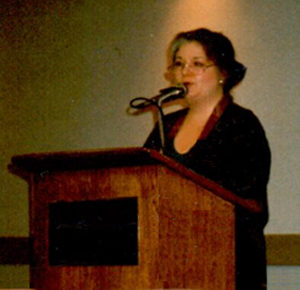
Be aware that the effectiveness of the microphone you use [especially lavaliere or headsets] can depend on your neckline, arrangement of hair, and any chain or necklace you wear. Also consider that dangling earrings and loose watches or bracelets can interfere with sound projection.

Having a strong voice may lessen the need to provide your own electronic equipment. However, if you are embarking on a lengthy tour, you might consider acquiring sound equipment that can make you more independent of the facilities in which you appear—if it is compatible with the speakers to which your equipment will be connected. In making such a decision, you will want to seek the input of an electronics specialist.

INVITING DISPLAYS
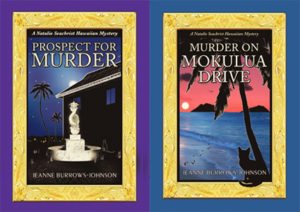
Will you be able to set up a display that greets and enlivens your audience? At the minimum, you should be able to drape a banner over the front of a podium [using double sided tape, if nothing else]. I carry the banner from the release of Prospect for Murder, first of the Natalie Seachrist Hawaiian mysteries. I also travel with varied sizes of boxes on which I can place color-coordinated tablecloths to create heightened surfaces for displaying signage, products, and handouts. And I carry stands of varying proportions to maximize visibility across a room. Do be cautious about displaying valuable items which could disappear…

Enlargements of colorful book covers, pictures of previous appearances, and banners with both your image and the works you’re presenting make a wonderful background for highlighting sales sheets, future project descriptions, and business cards. Since Murder on Mokulua Drive has an embossed jacket front, I present it on a stand, as well as on the table top to invite people to pick it up.  If there is a theme to your work, you can add decorative items that reinforce that reference. As most of my work centers on Hawai`i, I display a shell lei or two, a golden fish business card holder, and tablecloths that harmonize with my book cover colors.

BE PREPARED
If you’re speaking in your home town and have checked out the venue, you’ll know what you need to carry with you. The one thing that may affect your preparations is a change in the size of your audience, thereby impacting the number of books and handouts required. When traveling to a long-distance destination, you may be able to send a box ahead to a friend, colleague, or the hotel in which you will be staying. Regardless of whether that is an option, strategize the items that you should carry personally, rather than check into a luggage compartment.

I recall my gratitude for arriving in Hilo (after flying back from the U.S. mainland) two days in advance of a performance of Scottish Highland Dancing, since my costumes remained in Honolulu by mistake. I now keep the following items with me personally when traveling to author appearances: memory sticks and a master copy of materials needed for display and distribution; one copy of pertinent books and project samples; one small tablecloth and a shell lei to personalize a display; one copy of a short biography; two 3 x 5 inch cards with an introduction of me and my presentation; a brass name badge and any pertinent professional badges; a beautiful artificial orchid for my hair; and, one elegant jacket to dress up even an emergency wardrobe purchase if my luggage does not arrive with me!

This is the second of three discussions of Public Speaking Engagements. My next blog will address the ways in which public speaking engagements can enhance your branding as an author, and will be featured at Hometown Reads .

Wishing you the best in your creative endeavors,
Jeanne Burrows-Johnson, author, consultant, and motivational speaker

Suggestions for Dynamic Public Appearances are available in the following blog posts:
Author Appearances, December 2015
Promo Materials for Public Speaking, July 2018
All the World’s a Stage, August 2018
Final Preparations for Public Speaking, September 2018

To learn more about the award-winning Natalie Seachrist Hawaiian Mysteries, including Murders of Conveyance [Winner, Fiction Adventure-Drama, 2019 New Mexico-Arizona Book Awards] and other projects, please drop in at my author’s website JeanneBurrows-Johnson.com. You’ll even find Island Recipes that might inspire your culinary creativity.

For more ideas to strengthen your Wordpower© and branding, please visit: Imaginings Wordpower and Design Consultation.

Follow Me:
Amazon, Arizona Authors Association, Apple Books
Audible, Authors Den, Barnes and Noble, Blogarama, Book Bub
Cozy Mysteries-Unlimited, Facebook, Good Reads, Hometown Reads

Book sellers may contact book distributors such as:
Baker & Taylor, Follett, IPG, Ingram, Mackin, Midpoint, TitleWave

BOOK PROMOTION AND EVOLVING ART


THE NEVER ENDING ART & SCIENCE OF WRITING

As I examine the months since the launch of Prospect For Murder [the first book in the Natalie Seachrist Hawaiian mystery series], I realize I have not posted a blog regarding the never-ending art and science of writing for a long time.  I’ve started several, but details of the publishing and promotional processes have interfered with my sharing new author strategiesSince addressing the topic of my artistic vision for the book layout for Prospect For Murder in a previous blog, it has been released in hardcover, downloadable audio and ebook formats, and a 9-CD as well as downloadable audio book. Preparing for the promotion of each version has required re-examination of artwork and descriptive text, as each format varies in size and may appeal to a different target market. successful advertising and branding

EVOLVING BOOK SERIES
Authors may separate their work into categories of writing, publishing, and marketing, but each of these activities should unite under a shared roof of unified branding.  And while today’s book marketplace includes many self-publishing authors choosing to offer downloadable rather than printed books, such works must still be accompanied by attractive art and typography to maximize their appeal to the sensory experience of potential readers.

There are many ways to make the appearance of a book pop within the massive listings of any genre.  As mentioned in my discussion of art for PFM, I have chosen to use an Island-themed gold frame based on Hawaiian heirloom gold jewelry to distinguish my book and the promotional materials with which I market it.  

HARDCOVER BOOKS
Book jacket art
for the hardcover edition of PFM was the first design project I undertook.  After the evocative gold frame was completed, I realized it could be utilized for the entire mystery series.  And, with changes in the metallic color, it will be ideal for other book projects as well. Below is the first version of the book jacket, which was clearly too dark!

Prospect for Murder...in written and audio editions...the first Natalie Seachrist Hawaiian Mystery

ORIGINAL 9-CD AUDIO BOOK ALBUMS
After I completed recording the 9-CD audio book, it was time to modify the book jacket art.  For the CD albums, my job was to shorten text describing the book and me, as well as the snippets of reviews.  My artist and typographer Yasamine June [you can view samples of her work at www.yasaminejune.com] then adjusted the size and proportion of her original artwork and dropped in my edits.

EBOOK AND AUDIO EDITIONS
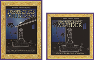
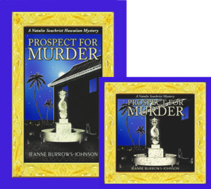
The next task was designing website icons for sites offering the downloadable audio and eBook editions.  Our goal was to enhance a visitor’s recognition of the products being offered.  Therefore we created a conjoined image of the hardcover book jacket and a square edit resembling a CD case.  Wherever possible, this paired image is used to signify that Prospect For Murder is available in multiple formats.

I should mention that during this process, I realized that the original art image was too dark. Consequently, I had Yasamine brighten the cover, especially the dragon fountain. Subsequent to these changes, I was thrilled when Prospect for Murder won cover art design in the New Mexico-Arizona Book Awards in 2017.

DESIGNING PROMO MARTERIALS & YOUR WEBSITE

The art of communication is one of the most vital skills a professional in any field can develop to help them in achieving goals and objectives in both their public and private living.  The following tools can be refined to maximize messages to colleagues, friends and the general public.

ARTWORK
I use the iconic paired image of the print and audio editions of PFM as artwork for both printed promotional materials and my author website.  Without intention, the colors for Prospect For Murder and Imaginings Wordpower were nearly the same, which has greatly simplified my choice in color palette. I am still contemplating where and how I will utilize the gold frame.

TITLING
I have used the Peignot font for my promotional business, Imaginings Wordpower [www.ImaginingsWordpower.com] for many years.  Therefore, I chose to use it for the titling of book jackets, my author website, and all promotional materials for the Natalie Seachrist series.  This decision is especially appropriate since many of the historical details used in the series predate World War II.  The Peignot font is an art déco [or style moderne dating from the 1920s], sans-serif display typeface designed by A. M. Cassandre in 1937 for the Deberny & Peignot Foundry in France.  While this font is too stylized for lengthy text, it makes a viable statement for titling and headings.

BUSINESS CARDS
Unexpectedly, I discovered that the standard size of a business card and the dark haunting color of the hardcover and audio book art was not suitable to my new double-sided author business card.  To resolve these problems, I created a new image.  I did this by overlapping the frame of the hardcover edition with that of the downloadable audio edition.   In the lower right-hand corner, I inserted the gold hibiscus found in the corners of the frames.  This has proven effective, since the image is always accompanied by text providing my name and the title of the book.

STATIONERY & FORMS
With use of the paired image of the print and audio books, plus the Peignot font, there were few decisions to make in creating my author letterhead stationery.  For most purposes, I place the iconic art image in the top left hand corner of the page and all contact information centered at the bottom.  This layout works for both letters and business forms [such as invoices]. 

LOGO NOTECARDS
For many years I’ve used what I call logo notecards to extend invitations, express gratitude, and confirm appointments.  For both portrait and landscape layouts, I place a logo in one quadrant of an 8.5 x 11 inch layout, with text positioned diagonally and upside down from the artwork.  The printed result is a sheet of paper that can be folded into a 5.5 x 4.5 notecard that will fit an invitation-sized envelope. 

POSTCARDS
After discovering that postage was the same for a couple of sizes of postcards, I chose a dimension of 8.5 x 5 inches for my author’s promotional postcard.  Beyond displaying recognizable book cover art, this ensures sufficient space for a synopsis and book reviews, plus purchasing options.  The art and descriptive text pop against a simple white background, with a high gloss finish on the front side for durability and flat finish on the back, which facilitates use of a pen for personal messages. 

Sadly, I discovered a typo after receiving an initial order of the postcards.  And having continued to receive positive reviews, I realized I should have printed a small number of the cards initially, to allow for subsequent corrections and additions.  As my publisher has declined to reprint book jackets with the latest reviews, I’m glad my second run of postcards allows me to send out books as samples, or for review or sale with up-to-date information.

OTHER PROMOTIONAL CONSIDERATIONS

COMMUNICATING THROUGH EMAILS
Every piece of communication you generate is a marketing opportunity.  And while you may not use an outgoing email layout paralleling your letterhead stationery, you can strategically position artwork, logos, and other information to draw the recipient’s eye.  I put the paired book image and purchasing information in the top left-hand corner of each outgoing email.  For the signature section for all outgoing emails, I have added a link to my author website [JeanneBurrows-Johnson.com],   my Imaginings Wordpower website [ImaginingsWordpower.com], and this blog [Blog.JeanneBurrows-Johnson.com].

WEBSITES DISPLAYING NEWLY RELEASED BOOKS
As the release date for PFM neared, the number of websites featuring the book increased.  Unfortunately, some had received galleys displaying artwork devised as a placeholder for the book jacket art that was to come.  Without proper notification, these sites would continue to display the galley image as being representative of the published book.  Therefore, I suggest that authors releasing books through publishers or on their own, remain vigilant in cruising the Internet to ensure that the words and images describing them, as well as their work appear as they intend!

In addition, authors need to be aware that many popular websites selling and promoting books do NOT offer an easy means for having books reviewed or even displayed in categorical listings.  Most of the time, an author’s work is only visible if the visitor to a site knows the author’s name or book title.  I strive to see Prospect For Murder displayed under the following categories for each of its several editions:  Hawai`i; Hawaiian mysteries; cozy mysteries; cat mysteries; female authors; female detectives; female sleuths. If you have any tips to help me with this situation, please drop me a note through the contact form on one of my websites…

Wishing you the best in your creative endeavors,
Jeanne Burrows-Johnson, author, consultant, and motivational speaker

Further discussion of art is available at the following blogs:
Authors Design Dilemmas 1, April 2015
Confronted by a Fantasia of Fonts, May 2015
Rainbows of Color, May 2015
Winning Logos & Slogans, October 2015
Quality Book Production, February 2016
Harmonizing Branding Elements, August 2016
Book Promotion and Evolving Art, January 2017
Balancing Text and Space, February 2018
Successful Cover Art, December 2018

To learn more about the award-winning Natalie Seachrist Hawaiian Mysteries, including Murders of Conveyance [Winner, Fiction Adventure-Drama, 2019 New Mexico-Arizona Book Awards] and other projects, please drop in at my author’s website JeanneBurrows-Johnson.com. You’ll even find Island Recipes that might inspire your culinary creativity.

For more ideas to strengthen your Wordpower© and branding, please visit: Imaginings Wordpower and Design Consultation.

Follow Me:
Amazon, Arizona Authors Association, Apple Books
Audible, Authors Den, Barnes and Noble, Blogarama, Book Bub
Cozy Mysteries-Unlimited, Facebook, Good Reads, Hometown Reads

Book sellers may contact book distributors such as:
Baker & Taylor, Follett, IPG, Ingram, Mackin, Midpoint, TitleWave
QUALITY BOOK PRODUCTION

IS YOUR BOOK A THING OF BEAUTY? 

The art of communication is as varied as its practitioners.  Success in your creative process usually rests on the degree of your inspiration.  For any professional, it also reflects perception of the desires of your target market. And, if you are an author, success also depends on the writing skills to which you have been introduced…and have mastered. There are many comprehensive sources of writers’ guidelines available online and in print. I will sometimes mention issues in the writing process, but in most of these blogs, I am attempting to share snippets of authoring strategies as they arise in my own wordsmithing. 

Many publishing houses restrict the amount of input an author may have in the printing process.  But as a writer, you should be able to express concerns you have about the production of a work that will carry your name.  As someone who has assisted in the process for other amateur and professional writers, and served as the art director on a collaborative effort, I am somewhat familiar with aspects of producing a high quality book.  

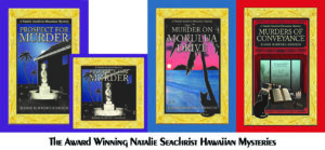
When I was a debut author of fiction, I entered a new phase of professional experience.  While the following areas of concern may not be presented in the sequencing of a publisher or art director, they represent my thought process while preparing for the publication of Prospect For Murder, the first book in the new Natalie Seachrist Hawaiian mystery series…AS I REVIEW THIS BLOG POST, I FEEL I SHOULD MENTION THAT I’M THRILLED TO ANNOUNCE THAT BOTH PROSPECT FOR MURDER AND MURDER ON MOKULUA DRIVE WERE AWARDED FIRST PLACE FOR BOOK JACKET ART IN THEIR RESPECTIVE YEARS OF COMPETITION IN THE NEW MEXICO/ARIZONA BOOK AWARDS.
branding program
UNIFIED APPEARANCE IN A SERIES
Career longevity for a writer often rests on their successful book branding and advertising. These issues bring us to the appearance of one’s product; in this case, books.  There are many design dilemmas facing authors and the people who will introduce their work to the world.  Personally, I enjoy reading a classic hardbound book, so my contemplation of quality book printing rests on my perceptions of what constitutes a fine hardcover edition.

THE READER’S EXPERIENCE
While the design elements of a print or on-line artistic project may vary in several ways (sometimes because of the genre), some issues are common.  In general, the test of a book’s initial appeal is its cover.  Does it draw the eye of the potential reader?  I say the reader, rather than the buyer, because with the constant rise in the cost of hardcopy books, library patrons represent a large segment of the public that may read your book.  Of course, to reach that readership, you will first have to appeal to the buyers of books that line library shelves.

DYNAMIC BOOK JACKET DESIGN
Book jacket design
is one of the most important elements that concerns marketers.  Therefore, I encourage you to seek an artist whose skills in fine and graphic art (as well as typography) will meet the needs of myriad projects.  Fortunately, I have found this breadth of talent in collaborating with Yasamine June.  

I do not claim to be a specialist in color theory, but generally, bold colors and print in product packaging are believed to help maximize sales.  In book publishing, successful cover design does not rest solely on these elements, or even on the overall quality of the artwork.  In publishing, the book’s genre is also vital.  Prospect for Murder is clearly a mystery.  In this genre, the coloration employed in book art often features dark colors, sometimes enhanced with the use of chiaroscuro [the effective contrasting of shadow and light]. 

To facilitate communication with my readers, my artistic vision embraces continuing historical and cultural features within the content and artistic accents that unify the appearance of the books.  Because my stories center on Hawai`i, I am using Island-themed framing based on Hawaiian heirloom jewelry for each book’s cover.  This repeating image, plus ones that are pertinent to each story, will serve to meet potential readers’ expectations by unifying my branding, thereby increasing the public’s recognition of each new addition to the series.

In classic format, I have included a cast of characters, chapter aphorisms, and a notes and acknowledgments section.  In addition, because of the inclusion of considerable foreign language and historical references, I offer a guide for pronouncing Hawaiian words and a glossary of non-English and specialized vocabulary.  For emphasis, the aphorisms are presented in italic fonts and a distinctive hibiscus-based image frames each page number.
formatting tips
Empowering Your Words Through Readable Text
The next concern I have is readability.  Given the length of my books [PFM is 92,000 words], concerns about the cost of printing could lead to printing decisions based on saving paper: Margin size can be reduced; spacing after periods can be decreased from two spaces to one, blank pages between chapters can be eliminated, and the weight of the paper reduced.  Such choices might reduce the overall size of a book and conserve paper; but they would not enhance the sensory experience of the people reading the book. 

Beyond these general considerations, my target market is older, well-educated women and men who are as interested in character relationships as they are intriguing plotlines.  Many readers within my target market may wear eye glasses or contact lenses.  Nevertheless, I am told that with the lack of certain vocabulary and situational elements, the inclusion of historical references and multiculturalism, my series may be appropriate to students in advanced placement courses in secondary school.  These students may not be as concerned with the layout preferences of older readers, but they too will benefit from easy-to-read text.

Regarding my recently published book, I have agreed to a layout that includes single spacing following the end of sentences, despite the continuing use of two spaces by many publishers both here and abroad.  To compensate for this, my publisher has used a larger font that enhances the readability of the text of the hardcopy.

Audio Books and Public Readings
With a trilogy of books already completed in the Natalie Seachrist Hawaiian Mystery series, I have already completed an audio edition of the first volume.  In general, I knew I had to employ a believable voice for each of the characters.  As the series is written in the first person, the most important voice is that of the protagonist, who is roughly my age.  For Natalie’s inner narrative, I use a measured and calm voice; for her interaction with other characters, I employ tones and rhythms appropriate to each scene.  Other characters are presented to showcase their unique profiles.

In preparation for reading portions of Prospect for Murder, I recorded descriptions and samples of each cast member. The text for each was printed in a distinctive color.  In addition, I utilized a 14 point font and 1.5 line spacing. I also used varying spacing and marks to indicate pauses and emphasis. 

For instance, I use: upward and downward arrows for changes in tone; ellipses for the trailing off of my voice; and long dashes for abrupt breaks.  For vocabulary or phrases about which I was concerned with correct pronunciation, I inserted underscoring and added hyphens between syllables.

In future blogs, I’ll report on the response to the decisions I have made in this phase of my practice of the art and science of writing!

Wishing you the best in your creative endeavors,
Jeanne Burrows-Johnson, author, consultant, and motivational speaker

Further discussion of art is available at the following blog posts:
Authors Design Dilemmas 1, April 2015
Confronted by a Fantasia of Fonts, May 2015
Rainbows of Color, May 2015
Winning Logos & Slogans, October 2015
Quality Book Production, February 2016
Harmonizing Branding Elements, August 2016
Book Promotion and Evolving Art, January 2017
Balancing Text and Space, February 2018
Successful Cover Art, December 2018

To learn more about the award-winning Natalie Seachrist Hawaiian Mysteries, including Murders of Conveyance [Winner, Fiction Adventure-Drama, 2019 New Mexico-Arizona Book Awards] and other projects, please drop in at my author’s website JeanneBurrows-Johnson.com. You’ll even find Island Recipes that might inspire your culinary creativity.

For more ideas to strengthen your Wordpower© and branding, please visit: Imaginings Wordpower and Design Consultation.

Follow Me:
Amazon, Arizona Authors Association, Apple Books
Audible, Authors Den, Barnes and Noble, Blogarama, Book Bub
Cozy Mysteries-Unlimited, Facebook, Good Reads, Hometown Reads

Book sellers may contact book distributors such as:
Baker & Taylor, Follett, IPG, Ingram, Mackin, Midpoint, TitleWave
AUTHOR APPEARANCES

Writers’ Guidelines

Jeanne Burrows-Johnson

MAKE YOUR AUTHOR APPEARANCES MEMORABLE!

Regardless of whether you write fiction or non-fiction, you will need to consider elements of successful advertising and branding for authors.  The skills you have developed as a wordsmith will help you facilitate communication and networking with individuals and organizations that can help you increase your public visibility.

AUTHOR APPEARANCES & READINGS
You’ve completed a large project in fiction or non-fiction and it’s been published. You’ve made great progress toward achieving your goals as a writer.  And if you’ve written an award-winning book, you’ve reached a major milestone in successfully practicing the art and science of writing. 

Thinking the heavy work is over? You’re wrong.  Seriously wrong. You’ve simply turned the corner from building a product to marketing it in tandem with your publisher…That is, unless you’re entering the world of independent publishing.  In that case, you’ll be responsible for self-marketing, and need to maximize a branding program that relies on dynamic but cost-effective authoring strategies and advertising messages. 

Regardless of how your work is being published, you’ll need to make promotional appearances.  That process should include opportunities for your readers to hear your words, as well as to ask you impromptu questions about yourself and your work.  Even if you do not have a strong voice or dynamic style of presentation, the public will want to get to know the mind and personality that has generated the material in which they are interested.

VENUES FOR APPEARANCES
In preparation for your work to the public personally, you can refine your oral reading skills by practicing with a voice recording device in front of a mirror.  You can also hone your skills at a writers’ group, where you could work on timing selected readings.  If you find yourself uncomfortable reading aloud, appearances at a small book club meeting may be ideal for warming up for larger audiences.  

Once you’re ready for general audiences, you’ll find there are many venues at which you might share your writing.  Some are directly related to publishing, such as book fairs and literary and artistic festivals.  Depending on your reputation as a writer, your local radio or television station may have programming featuring local writers.  This is especially true of public broadcasting in radio and television. 

Since your goal is to sell books in every form you are publishedhard- or softcover print, Ebooks, audio books, or online websites and blog sites—libraries and bookstores [local and national chains]  are ideal for promoting current work and for attracting potential long-term followers.  Again, your personal reputation and the involvement of your publisher may determine the ease with which such appearances can be booked. 
Media Relations Dos and Don’ts
EXPANDING MEDIA RELATIONS
In previous blogs—and at https://www.ImaginingsWordpower.comI’ve discussed the importance of connectivity with the media.  With each public performance opportunity, I suggest you prepare an advertising message that can be adapted to public service announcement [PSA] messages.  These can be utilized promoting the non-profit organizations (i.e. schools and libraries) at which you might appear.  For while you may have expectations of selling copies of the work you’re promoting,
your authoring events may be deemed worthy of mention in the calendar of non-profit community activities within your local media outlets and platforms, as well as virtual communities.  They may also be of interest to followers of social media and blogs featuring interviews.
s
COST-EFFECTIVE MEDIA RELATIONS
As you expand your community relations and get to know your media, you may be surprised by the amount of free media coverage you can obtain.  It all depends on your practice of the art of communication, and I don’t simply mean effective wordsmithing.  Hopefully your writer’s inspiration will aid you in establishing strategic media relations.  Much of this will rely on pithy PSAs prepared as broadcast, print, and On-line media releases [you can find samples at my marketing website, Imaginings Wordpower and Design Consultation.
You should also be prepared to attend business, social and community activities that will introduce you to members of the media, whose own work you may have been enjoying for years.
Empowering Your Words
ENHANCING THE LISTENER’S EXPERIENCE
Let me again state that You have one opportunity to make a good first impression.  Remember that each time you appear in public, you’re making a statement about yourself and your work.  And although your written work may be inspired and employ a rich palette of words, you must now present it to people who will be judging you on their sensory experience!

THE VENUE DIRECTS YOUR PREPARATION
Will you be speaking in a large or small room?  Will you be standing or seated?  How much of your body will be visible to the audience?  Will you have a microphone?  Will you be introducing yourself?  Will someone be monitoring the time you’ve been allotted for speaking?  Are you the featured speaker at the event, or one of a group of presenters?  And how will you handle stage fright?  I encourage you to remember that stage fright is not a phenomena experienced solely by actors

~  The quality of your voice.  Once you know the size of the room and whether you will be utilizing a microphone, consider how well your vocal quality matches the venue.  Remember that unless you are providing your own Audio Visual equipment, there’s no way you can be assured that the equipment provided will work as desired.  Therefore, think about whether you have the vocal strength to project your voice throughout the designated space if you end up without a sound system. 

Although no one wants to give a reading on a day when they are not feeling well, you may not be able to cancel an appearance.  If you are unable to read your material, you may need to take a friend or colleague to actually present your work, but it would still be good for you to show up (as long as you’re not contagious).   When in doubt about your condition, check with your healthcare provider.  If you just have a tickle in your throat, you can always try drinking warm tea or munching your favorite fruit to produce a clearer sounding voice.  

~  Your appearance Many artists and writers feel there’s no need to be concerned about their appearance or their behavior.  But if you want to be taken seriously, I believe you should demonstrate respect for yourself, your work, and for the public who awaits you.  What you wear may be dictated by where you’ll be speaking.  If you’re standing on a raised platform, consider how your legs and shoes will look from the audience.  Women may want to wear a longer skirt length than they normally do, or even a pantsuit to ensure they aren’t sending the wrong message.  And don’t forget that use of makeup is not limited to women.  Men, (especially those who are bald), are just as susceptible to having a glowing face that detracts whether they are on stage or on video.  Also, the eyes are key to projecting a performer’s personality.  A touch of eye liner below the lower eye lashes gives your audience a sense of being closer to you.

As to style, the casualness of ragged denim, faded hoodies and unshaven portions of one’s anatomy may seem representative of the artistic world.  But ask yourself whether they best represent the work you are introducing.  If you’re beyond the first two decades of life, consider more sophisticated choices in attire and overall self-presentation. Personally, I usually top skirts and dresses I wear to public events with a vivid Asian style silk jacket.  Not only is this in keeping with my normal wardrobe, but since the Natalie Seachrist mysteries features references to Asian culture, this choice sets the stage for the stories that I will be addressing.

INTRODUCING YOURSELF
You should have several empowering bios by the time you’re launching a book.  [You’ll find a summary for writing one on my website at https://www.ImaginingsWordpower.com/bios-to-empower-you.html]  You should have brief versions in one or two paragraphs in both first and second person voices.  If you’re lucky, there’ll be an MC or other person to introduce you, and hopefully they’ll read your bio without inappropriate ad-libs.  However, regardless of your advance planning, there will be times when you must introduce yourself.  And while it is important to have a well-written bio, it is useful to be able to speak off-the-cuff without any notes. 

YOUR PERFORMANCE
That’s right.  I said Performance.  That’s what an author’s appearance is.  You must present yourself so that you are memorable and believable as the author of the work you have produced.  And just as there are many styles of writing, there are many ways in which you can present your work.  In my opinion, the top rung of professionalism holds those rare authors who memorize portions of their work and perform it like a play…that is, sans script. 

One of the most likely venues in which you’ll see this type of performance is Cowboy Poetry.  One of my favorite entertainers in this genre is Bill Black, whose warm vocal tones are accented with more than a hint of North Carolina.  From the moment he steps onto a stage with his cowboy shirt, hat and bolo tie, the audience is wooed by both the stories he relates and his personage as their author.

At the next level are presenters who place text within a folder.  This is where I fall in terms of performance.  I try to avoid treating my audiences to the rustling and flopping of loose pages that can separate easily and cause the reader confusion.

ONE OF MANY PERFORMANCES…
At some time, you may be charged with scheduling a group of authors to read.  At a recent gathering of writers, I found that despite instructions to “read for about five minutes,” there was great variety in the lengths of the readings.  Even when a presenter has timed their work in advance, the pressure of public performance can produce variations in the actual length of a reading.  I believe that setting a measurable standard (i.e. three to four pages, double spaced).  While some will read faster or slower, the overall time of the readings should even out.

DOES AN EVENT WARRANT A MEDIA RELEASE?
Event organizers will normally generate media releases.  That’s wonderful, especially if they follow the details of a bio you submit.  But there’s nothing wrong with sending out your own media releases if you’re a featured participant.  You should include general information about the occasion, your role in it, and other newsworthy persons who are involved, so that your effort does not appear wholly self-serving.  In fact, the sponsors should welcome your boosting the likelihood of media coverage.  For information on this topic, see earlier blogs, as well as sample releases on my website at imaginingswordpower.com/media-release-samples.html.

In addition, you can send our post cards, letters, fliers or other announcements.  Recipients should include people you expect to attend, as well as those who may not be able to participate but should be aware of your involvement.  If event is open to the general public, distribution of your promo information via mail, email, and social media may add to the number of attendees. 

No matter how well you think you have prepared for an event, something can happen to derail a public appearance.  Once it is over, hold your own private event autopsy, if the event organizers do not have one.  And don’t forget to send out a post-event media release.  Again, make a point of mentioning any noteworthy persons or historical context who are of general interest in your community.  Finally, upload a sample of the reading you gave at the event on your website or social media, even if you have to record it anew.

Wishing you the best in your creative endeavors,
Jeanne Burrows-Johnson, author, consultant, and motivational speaker

Suggestions for Dynamic Public Appearances are available at following blog posts:
Author Appearances, December 2015
Promo Materials for Public Speaking, July 2018
All the World’s a Stage, August 2018
Final Preparations for Public Speaking, September 2018

To learn more about the award-winning Natalie Seachrist Hawaiian Mysteries, including Murders of Conveyance [Winner, Fiction Adventure-Drama, 2019 New Mexico-Arizona Book Awards] and other projects, please drop in at my author’s website JeanneBurrows-Johnson.com. You’ll even find Island Recipes that might inspire your culinary creativity.

For more ideas to strengthen your Wordpower© and branding, please visit: Imaginings Wordpower and Design Consultation.

Follow Me:
Amazon, Arizona Authors Association, Apple Books
Audible, Authors Den, Barnes and Noble, Blogarama, Book Bub
Cozy Mysteries-Unlimited, Facebook, Good Reads, Hometown Reads

Book sellers may contact book distributors such as:
Baker & Taylor, Follett, IPG, Ingram, Mackin, Midpoint, TitleWave
Author Media Relations, 2


DEVELOPING DYNAMIC MEDIA RELATIONS 

Applying the art and science of writing is only part of the equation for achieving  professional goals and objectives as an author. Successful branding rests on myriad authoring strategies…including positive media relations.  Like most aspects of your work, you will need to invest time, effort, and occasional infusions of money into researching, establishing, and maintaining good relations with the media.  As you think about preparing your outreach to the media, remember that you are moving into the realm of commercial writing, which requires you to employ concise verbiage that directly addresses the needs and interests of a specific audience. The bottom line is to follow the rules set down by each media outlet…

KNOW YOUR MEDIA OUTLETS
A key element in any branding program is determining which media outlets [ranging across print, broadcast, and On-line platforms] are appropriate for shining a spotlight on your current project.  Once you’ve completed compiling notes of interest about each—including the demographics of their patrons—you will need to establish relationships with their journalists and perhaps one or more of their department heads.  Regardless of whether you’re going to contact staff or management, a personal salutation is always good.  After all, looking to the future, there’s no telling what a person’s next job may be…or how you might reconnect with them to your mutual benefit.

NETWORKING WITH MEDIA CONTACTS
With your background work complete, you’re ready to launch regular rounds of communication with media contacts.  Despite interaction you may have had in the past, you will need to follow up on any leads you’ve just uncovered.  Is there a department or individual journalist for whom your current or future work will be of particular interest? Is there a community event for which your work fits well?  Can you make a donation…or otherwise interact with a newsworthy non-profit or organization which may be participating in the event?  Can you send out a tasteful PSA focusing on the group while increasing your public visibility?

As an author, it’s easy to rely heavily on your effective writing rather than speaking skills when examining how to broaden your community involvement.  But when an opportunity arises to visit with a media specialist personally, you can broaden your talent in the genteel art of verbal communication.  Through such contact, you should be able to affirm the media’s awareness of you and glean new facts about their individual needs and desires.

Even if you haven’t had an opportunity to meet media representatives you plan to contact, you can send out press releases highlighting your noteworthy work.  What constitutes a newsworthy announcement?  Chiefly, the topic must be appropriate to the specific media outlet and their concrete as well as virtual community.  For example, you wouldn’t send a notice about a program for elementary school children to a magazine for Seniors—unless that demographic is notably involved in the activity. 

TIMELY MEDIA RELEASES
If there is an element of time involved (such as a holiday event), it’s more likely the media outlet will grant you attention IF you’ve contacted them with sufficient lead time There are two simple ways to determine each media outlet’s deadlines:  Pay for a subscription to a detailed media list; or, build your own record for each of your preferred media outlets Even if you have an annual subscription to one or more media contact data bases, the information can quickly become outdated, so unless the provider of a list sends out updates, you’ll have to check with each media organization periodically. 

If you’re creating a media list yourself, you’ll need to gather the following information:  The names of each organization and their key personnel; a street address for drop-offs; a mailing address if it differs from the physical address; phone and fax numbers and email addresses for pertinent departments.  As you become acquainted with individuals within each organization, they may provide you with additional contact information. 

The creative process an author uses to facilitate communication with their audience must be dynamic.  Consider the following scenarios that can motivate you to communicate with local, regional, national, Internet, and even international media outlets:

WIN A CONTEST, AWARD OR SCHOLARSHIP?
Media outlets are always interested in stories of success, especially if they address a segment of their niche market.  Make sure you indicate the importance of the organization recognizing you with an award.

SPECIAL EVENTS
Even if the organizers of an event are sending out media releases, you can submit your own in a distinctive format that highlights your particular contribution.
political campaigns
AWARDED A NOTEWORTHY POSITION, CONTRACT, OR COMMISSION?
Send out a media release, including copy that demonstrates the stature of an individual, business or organization that grants you a noteworthy position, contract or commission. granting it to you.  You can also provide periodic releases reporting on significant stages of progress in your work.  Be sure to mention newsworthy persons who may have become involved in the project.  This could include a high profile woman or man whose image will be associated with your final product, be slated to read your text in an audio publication, or perform as the MC at an event you are managing personally.  By the way, this includes political, religious or volunteer activities in which you may be involved.

You may be wondering if there’s any way of ensuring your media release will receive positive attention and be acted upon as you desire.  The simple answer is no.  Admittedly, it helps to get your information released if you’re prominent in your field.  Your main concern should be avoiding being perceived as wasting a media professional’s time.  If your material and its content doesn’t appear relevant, not only will it minimize the possibility of coverage of your current plea for attention, but it also decreases the likelihood that your next outreach will be greeted with joy.

When selecting between two or more potential news items to promote, you should remember that the most popular topics for garnering media attention are connected to children, elders, or non-profit organizations.  That’s why it is beneficial to team up with such groups within your community on appropriate projects.   Not only will such associations gain media attention, but they will bring loyal followers to your future projects.… And word of mouth promotion is the most beneficial form of advertising!

MAKE A GOOD FIRST IMPRESSION
Regardless of how important you view your message, you must consider how a media outlet will judge its potential value to their customers.  As a promotional consultant, I’ve often worked with writers and artists who view their work as being of the utmost significance.  They begin nearly every communication by speaking of themselves and their status.  This is in direct conflict with the media’s need to serve their patrons.  Rather than opening your plea for coverage with “I” (or even your name if the piece is written in the third person), begin with something that will appeal to your reader and encourage their interest in learning more about you.

SHAPING STRONG MEDIA RELEASES
Most of the media releases I see are one or two pages of single-spaced paragraphs headed, “For immediate release.”  These releases have no sectioning, no titling, and no use of bold or underscored text.  You need to remember that if the opening of a long document is not auspicious, the recipient probably won’t finish reading it, especially when other materials are more appealing!

If you bore the recipient, how have you benefited from the effort…and cost, if you’ve mailed hardcopy?  Even if the release is read, there’s no guarantee that the recipient will act upon the information.  If you’re lucky the bare bones of your information will be published.  However, unless there’s a very slow news day (with a large “ news hole),” the full text of a long release is unlikely to be included.  If only part of your text is published, there’s no assurance that the details you deem pertinent will be included in the news piece.  

One way to short-circuit these problems is the use of the classic inverted pyramid for news writing. This means that the most important facts must be placed at the beginning of the release. With each succeeding paragraph, the importance and relevance of the information contained decreases.  Many editors are grateful to receive material they can merely drop into their layout.

SENDING OUT MEDIA RELEASES
You must, of course, follow the instructions a media outlet provides for sending press releases.  However, some organizations allow some flexibility in their instructions.  To increase the number of people who see my releases, I place a note at the end of emails stating that a FAX or even hardcopy will follow.  Since so few people bother with anything but emails today, there’s a good chance several people will read your copy when its sent in more than one form.  Of course, you cannot control how the media will respond.  Even if they decide to publish your message, you can’t be certain of how they will treat your copy, so keep in mind that providing less text gives an editor less to delete or re-sequence If they’re interested in learning more they’ll contact you.

And don’t forget to send out another media release when you’ve completed your current project.  Highlight the event’s outcome, mentioning any noteworthy person or historical context which will distinguish the activity as being of general interest in your community.  You can even send out subsequent releases to announce the results or consequences of your work.

POLISH YOUR WRITING SKILLS
With careful research and repeated practice in writing media releases, you’ll enhance your ability to work efficiently with the mediaA successful program of media blitzing rests on gathering facts and then presenting them in a way that builds interest in your topic.  Many times your challenge is in establishing a rhythm to the words you use to present the facts you have carefully laid out. 

As __________’s youth face another summer seeking entertainment …
The enclosed image shows television personality _____ donating her time at…
Jane Smith, winner of the 2015 _____ award has been named presiding judge in the forthcoming spelling bee for elementary school children in the _____ School District. 

Remember that if you are involved in an event benefiting your community, you might be the ideal guest for an early morning drive time radio talk show—one of the best ways of getting a large number of people to become aware of via free media coverage.

Despite your best efforts to enhance your connectivity with the media, at some point you may be forced to invest in advertising.  To maximize the results, your branded message must be positively memorable.  From the words you use to the colors and shapes that accompany and frame them, you must strike an accord with your target market.  In today’s tough marketplace, you will need to look beyond traditional ads and commercials.  Appropriate saturation of social media outlets, YouTube videos, and even infomercials have all been used effectively by authors seeking improved community relations.  As you contemplate your options, you will have to evaluate whether you have the skill set to design and implement a branding program without the assistance of advertising professionals.

Wishing you the best in your creative endeavors,
Jeanne Burrows-Johnson, author, consultant, and motivational speaker

Media Relations for Authors may be found at:
Know your Media, June 2015
Media Relations Dos and Don’ts, November 2015

For examples of concise print and broadcast media releases, please see
Media Release samples at Imaginings Wordpower and Design Consultation.

To learn more about the award-winning Natalie Seachrist Hawaiian Mysteries, including Murders of Conveyance [Winner, Fiction Adventure-Drama, 2019 New Mexico-Arizona Book Awards] and other projects, please drop in at my author’s website JeanneBurrows-Johnson.com. You’ll even find Island Recipes that might inspire your culinary creativity.

To learn more about the Conversations with Auntie Carol, the Natalie Seachrist Mysteries, including Murders of Conveyance [Winner, Fiction Adventure-Drama, 2019 New Mexico-Arizona Book Awards], Island recipes and other projects, please visit my author website at JeanneBurrows-Johnson.com.

For more ideas to strengthen your Wordpower© and branding, please visit: Imaginings Wordpower and Design Consultation.

Follow Me:
Amazon, Arizona Authors Association, Apple Books
Audible, Authors Den, Barnes and Noble, Blogarama, Book Bub
Cozy Mysteries-Unlimited, Facebook, Good Reads, Hometown Reads

Book sellers may contact book distributors such as:
Baker & Taylor, Follett, IPG, Ingram, Mackin, Midpoint, TitleWave
WINNING LOGOS & SLOGANS…

emmas for AuthorsRich Palettes of Words & Images for Authors & Artists!

While logos and slogans are usually associated with corporations, they can facilitate communication with the public and be key branding elements for any business endeavor, regardless of size or tax status.  And, yes, that includes professional writers wishing to facilitate communication with their readers, listeners, and/or viewers.  The memorable branding messages of successful authors truly echo the rich palette of words and images used by Fortune 500 companies! 

PICTURE A SUCCESSFUL LOGO OR SLOGAN
What comes to mind when you think of a successful logo or slogan?  Perhaps the first is the iconic image of a cola company that has been in business for over one hundred and twenty-five years.  There have been many artists who have brought their own creative process to the company.  But while its logo has changed in minor ways, the bright color palette, signature font, and swirls of one type or another have remained ever present.  

In contrast, its slogans and other commercial text for their signature product have been altered periodically.   This is not surprising since marketing styles and considerable linguistic evolution have occurred within the same decades.  But with each change, the artistic vision of the company has been consistent—to provide a pleasurable sensory experience to the product’s target market.
Tips
ELEMENTS OF A SUCCESSFUL LOGO OR SLOGAN
In addition to any artistic icon,
the choice of color and fonts utilized in shaping the outward image of a viable brand must be memorable.
They must also be appropriate to the product or service, as well as the demographics of the target market.  However, since a business can select a specific slice of their market to target, the style of two businesses within a particular industry can vary considerably.

Consider snack foods intended for children.  Generally, bright, happy colors, images, and simple easy-to-read—or even cartoonish—text fonts are appealing to that market.  But when the ingredients are organic, the use of colors associated with nature is the norm.  In addition, with growing concerns for the environment, recycled and/or recyclable packaging is becoming preferable…at least to parents.

When you know the demographics of your target market, your first decision in establishing your brand may be deciding whether to use your personal or business name without an accompanying image. This may be appropriate if your name distinguishes your business from others that offer parallel products and/or services.  However, the use of an artistic design element not only clarifies what you do, but demonstrates the style in which you operate.  Thus, a black, profiled outline of a woman with luxurious hair, standing in high heels against a deep plum color may convey an ideal image for an upscale salon or spa.  If the figure of a man in a tuxedo were added, an iconic image for a ballroom dancing studio would emerge.

DYNAMIC TEXT IN LOGO DESIGN
Let’s now consider how we might design a logo for a company we’ll call Inner City Painting.  Beyond the simple use of text, one could
use an upturned paint brush with a splash of paint for each of the i’s in the text.  At the next level of complexity, a simple line drawing of a home or a string of commercial buildings could declare the firm’s niche market. 

Aside from clean, non-seraphed text, three primary colors might convey a no-frills provider of basic painting services.  Conversely, sweeping art strokes, an elegant font, and an exotic color palette would suggest a more artistic enterprise.  [See DESIGN DILEMMAS FOR AUTHORS, Part 3:  COLOR, May 30, 2015, regarding the use of standardized colors to ensure uniform coloration in both print and electronic publishing.]

Several years ago, I was working with a local printer whose family had been in the industry in a large city for several decades.  Although the familial entity no longer existed, the branding artwork remained.  It depicted a happy cartoon character inviting the public through their doors.  The style of the figure, his attire and shoes all pointed to another era, but the idea of a friendly chap greeting customers was still a viable concept—especially in this age of impersonal mega-corporations.  With the help of a graphic artist, the image of your friendly neighborhood printer was updated and served to introduce the firm to a new generation of clients seeking full-service printing design and production.

THE IMPORTANCE OF LOGOS IN BRANDING
Equally important to an effective branding program is the choice of a slogan
, for both individuals and organizations.  Notice that I am using the single noun, S L O G A N.  Too often I find promotional decision makers attracted to complex images and multiple descriptive phrases.  This simply muddies the waters and presents a jumbled NON-MEMORABLE image to the public.

Consider artist John Smith.  He might present himself as:  John James Smith, portraitist.  In this case, his middle name separates the artist from other men named John Smith and the word portraitist specifies his specialty.  Additional, qualifying words and phrases can offer further information that will attract appropriate clients to him.  The following is a simple representation of Mr. Smith and his classic painting:

Portraits in Oil Offered by
John James Smith, M.F.A.

Another issue to consider in textual aspects of branding is punctuation.  Instead of shifting font or using italics, some promotional decision makers complicate a design by ending slogans with punctuation.   I suggest saving punctuation for actual sentences and paragraphs of descriptive text.  I find that the shortest path to memorability lies in simplifying your words and design elements.  

ENSURE SIMPLICITY
Designing branding elements in popular dimensions you are most likely to see in print ensures simplicity and that means ease in utilization in multiple projects. 
That means that although your graphic artist may be thrilled to present you with an 8.5 x 11 inch design, have them offer you samples in the sizes of dimes, nickels, quarters and silver dollars.  When you do this, you will quickly see that extraneous strokes and other details are lost in such dimensions and can even prove distracting to the message you are trying to convey with a business card or advertisement.  The size of fonts used for your name and any slogan will naturally have to be proportional to the size of the icon being presented.

With the publication of Prospect For Murder, the first Natalie Seachrist Hawaiian Mystery set in Honolulu, I have been sorting through old files.  In examining the progression of my own branding, I see that for over a decade, I simply used my name and a few bulleted words to describe my work.  In 1995, I launched use of the word Imaginings in my business name while completing edits for an article I co-authored for Broker World Magazine.  Since I was moving from Honolulu to Tucson, it was part of an authoring strategy for introducing myself to a new locale for my physical business, as well as potential regional, national or even international audiences.  [You might find it interesting to note that at that time I was sometimes told that there was no such word as imaginings.]

Through the years, I have offered clients several products and services to enhance their physical environs, as well as their promotional representations.  While previously using merely a textual presentation of myself, a couple of years ago I decided to design an iconic image that would represent several elements of my careerCommercial writing, design consultation, and floral art.  I knew that utilizing a pen would clearly represent the largest area of my work.  As I sometimes provided faux painting of accent walls to commercial clients, it seemed natural to also include an artist’s brush.  Finally, as I have offered floral designs to both friends and clients, some form of floral image was indicated. 

My logo has evolved over time is used in myriad ways.  Some variations have been necessitated by hardcopy printing vs. electronic presentations:  Boldness and detail; portrait and landscape formats; framed and unframed; isolated or with text.  Despite these differences, the use of gold, blue and plum colors have been consistent–except when a solid gold background is required. I’m glad to say that my icon is becoming recognized…

With my writing shifting from commercial writing to fiction, my personal name may become more recognizable.  Nevertheless, I like the elements of this image that sums up my work to date.  However, I think it’s time for the hand of a graphics professional to finalize my signature icon, so that I can empower my image as well as my words as an author.

Wishing you the best in your creative endeavors,
Jeanne Burrows-Johnson, author, consultant, and motivational speaker

Discussion of art is available at the following blog posts:
Authors Design Dilemmas 1, April 2015
Confronted by a Fantasia of Fonts, May 2015
Rainbows of Color, May 2015
Winning Logos & Slogans, October 2015
Quality Book Production, February 2016
Harmonizing Branding Elements, August 2016
Book Promotion and Evolving Art, January 2017
Balancing Text and Space, February 2018
Successful Cover Art, December 2018

To learn more about the award-winning Natalie Seachrist Hawaiian Mysteries, including Murders of Conveyance [Winner, Fiction Adventure-Drama, 2019 New Mexico-Arizona Book Awards] and other projects, please drop in at my author’s website JeanneBurrows-Johnson.com. You’ll even find Island Recipes that might inspire your culinary creativity.

For more ideas to strengthen your Wordpower© and branding, please visit: Imaginings Wordpower and Design Consultation.

Follow Me On:
Amazon, Arizona Authors Association, Apple Books,
Audible, Authors Den, Barnes and Noble, Blogarama, Book Bub,
Cozy Mysteries-Unlimited, Facebook, Good Reads, Hometown Reads

Book sellers may contact book distributors such as:
Baker & Taylor, Follett, IPG, Ingram, Mackin, Midpoint, TitleWave