BALANCING TEXT AND SPACE

LIMITED WORDPOWER© AND DESIGN ACUMEN?

Most of us have limits to our talents. Sometimes we are able to increase our skills or can hire professionals who can elevate the quality of our output. One of my continuing disappointments is that while I have a good sense of design and some computer graphic skills, I have not been gifted with comprehensive skills of an artist.

ALTERING TEXT
One thing I can do is change the words and even the fonts of text. This alteration of  text is usually done to maximize its appearance in the space allotted to it.  Sometimes this is disappointing, as the words I initially selected were ideal to the purpose and tone of the project.  Nevertheless, the goal in any written work is to create a product that is most appropriate for communicating with one’s target market.

As I generated promotional materials for marketing Prospect For Murder [the first book in the Natalie Seachrist Hawaiian mystery series], I frequently had to revisit this basic activity of editing—substituting vocabulary to fit the available space. Professional Wordsmith
One of the greatest values a professional wordsmith brings to a verbal project is their knowing when and how to adjust text to maximize readability.  This ability to edit within varied  parameters demands the flexibility as well as the skill to replace verbiage to accommodate the allowed space.

In the past, when a client decided my composition met their needs, they usually took the text to a graphic artist and I never saw it again—at least not before the final product was printed, uploaded to a website, or sent forth in emails.  Imagine my disappointment when I saw that the presentation of my work looked awkward because of justified paragraphing and/or the lack of breaking syllables at the end of paragraphs, which resulted in wide gaps or crammed lettering.

If I remained in close contact with the client, I sometimes had an opportunity to rectify the situation.  At a minimum, I could alert them to the problem which was bound to recur until their process of production was changed.  If I had the opportunity to work with the artist tasked with incorporating my text, I could suggest potential means for enhancing the overall layout by:

~  Changing words that were too long or short
~  Altering the paragraph structure
~  Adjusting the number of columns or their size
~  Repositioning and/or resizing artwork
Subliminal Influences

HARMONIZING PRODUCT PACKAGING AND MARKETING MATERIALS
Regardless of the sophistication of a project, balancing art and typography can truly maximize the sensory experience of your readers.  It is a vital key to synchronizing a product’s packaging and the marketing materials that accompany it.  As may be expected, this can help determine a reader’s initial response to the product being represented, thereby affecting whether it will be purchased or bypassed. 

Even the information presented in a dentist’s pamphlet should be designed to flow in an harmonious manner.  The next time you have an appointment at a professional’s office, glance through the materials in their waiting room.  If you find odd looking paragraphs, it’s probably because a graphic artist took the text and simply dropped it into their design—usually without the copy writer having the opportunity to re-edit their text.

DESIGNING PROMO MATERIALS AND WEBSITES
In my blog on the layout of books, I discussed the various issues I faced in the design of covers for the hardcover and audio book editions of Prospect For Murder.  All of the spatial challenges I’ve just explored in this blog were applicable in both editions.  I’m very grateful that my artist and typographer were the same person [you can visit www.yasaminejune.com to view her art].  This meant I was able to work with her to balance elements of concern.  Of course, working in this manner requires mutual understanding and sufficient time to accomplish the necessary edits.

Shifting From Hardcover to Audio Book Format
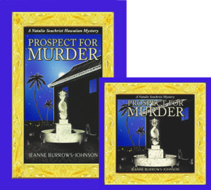
Transforming images and text of the hardcover book jacket of Prospect for Murder into the audio book’s required more than re-positioning and resizing the many design elements. The  mysterious moon above the apartment building was deleted to accommodate the titling.  Also, the book synopsis and author bio were shortened to allow for book reviews.

POSTCARDS
Recently I reworked the 8.5 x 5 inch promotional postcard I am using for several purposes.  As I now have a growing number of positive book reviews I wish to highlight, I needed to edit both the book’s description, as well as my bio to accommodate snippets from the four reviews I wanted to feature on the front of the card.  And because I may wish to employ varied greetings, I had to allow room on the backside to place labels with personalized messages.

LETTERS
It may seem needless to mention that each letter that one sends out via snail mail or email is an entity unto itself.  However, writers are just as prone as other professionals to remain wedded to verbiage for which they have an affinity.  Generally, effective letters should be limited to a single page.  This means that the need to resize the length of one’s text arises quite often.  Sometimes simply reworking the size and location of a logo and decreasing the dimension of margins will suffice to reuse a favorite piece of composition.  At other times, it’s also necessary to:

~  Combine paragraphs
~  Reduce the size of the font used for text
~  Use left justified paragraphing without indentation
~  Use a smaller dimension for line spacing between paragraphs

Wishing you the best in your creative endeavors,
Jeanne Burrows-Johnson, author, consultant, and motivational speaker

Further discussion of art is available at the following blogs:
Authors Design Dilemmas 1, April 2015
Confronted by a Fantasia of Fonts, May 2015
Rainbows of Color, May 2015
Winning Logos & Slogans, October 2015
Quality Book Production, February 2016
Harmonizing Branding Elements, August 2016
Book Promotion and Evolving Art, January 2017
Balancing Text and Space, February 2018
Successful Cover Art, December 2018

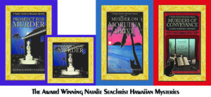
To learn more about the award-winning Natalie Seachrist Hawaiian Mysteries, including Murders of Conveyance [Winner, Fiction Adventure-Drama, 2019 New Mexico-Arizona Book Awards] and other projects, please drop in at my author’s website JeanneBurrows-Johnson.com. You’ll even find Island Recipes that might inspire your culinary creativity.

For more ideas to strengthen your Wordpower© and branding, please visit: Imaginings Wordpower and Design Consultation.

Follow Me:
Amazon, Arizona Authors Association, Apple Books
Audible, Authors Den, Barnes and Noble, Blogarama, Book Bub
Cozy Mysteries-Unlimited, Facebook, Good Reads, Hometown Reads

Book sellers may contact book distributors such as:
Baker & Taylor, Follett, IPG, Ingram, Mackin, Midpoint, TitleWave

BOOK PROMOTION AND EVOLVING ART


THE NEVER ENDING ART & SCIENCE OF WRITING

As I examine the months since the launch of Prospect For Murder [the first book in the Natalie Seachrist Hawaiian mystery series], I realize I have not posted a blog regarding the never-ending art and science of writing for a long time.  I’ve started several, but details of the publishing and promotional processes have interfered with my sharing new author strategiesSince addressing the topic of my artistic vision for the book layout for Prospect For Murder in a previous blog, it has been released in hardcover, downloadable audio and ebook formats, and a 9-CD as well as downloadable audio book. Preparing for the promotion of each version has required re-examination of artwork and descriptive text, as each format varies in size and may appeal to a different target market. successful advertising and branding

EVOLVING BOOK SERIES
Authors may separate their work into categories of writing, publishing, and marketing, but each of these activities should unite under a shared roof of unified branding.  And while today’s book marketplace includes many self-publishing authors choosing to offer downloadable rather than printed books, such works must still be accompanied by attractive art and typography to maximize their appeal to the sensory experience of potential readers.

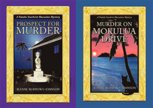
There are many ways to make the appearance of a book pop within the massive listings of any genre.  As mentioned in my discussion of art for PFM, I have chosen to use an Island-themed gold frame based on Hawaiian heirloom gold jewelry to distinguish my book and the promotional materials with which I market it.  

HARDCOVER BOOKS
Book jacket art
for the hardcover edition of PFM was the first design project I undertook.  After the evocative gold frame was completed, I realized it could be utilized for the entire mystery series.  And, with changes in the metallic color, it will be ideal for other book projects as well. Below is the first version of the book jacket, which was clearly too dark!

Prospect for Murder...in written and audio editions...the first Natalie Seachrist Hawaiian Mystery

ORIGINAL 9-CD AUDIO BOOK ALBUMS
After I completed recording the 9-CD audio book, it was time to modify the book jacket art.  For the CD albums, my job was to shorten text describing the book and me, as well as the snippets of reviews.  My artist and typographer Yasamine June [you can view samples of her work at www.yasaminejune.com] then adjusted the size and proportion of her original artwork and dropped in my edits.

EBOOK AND AUDIO EDITIONS
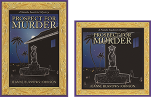
The next task was designing website icons for sites offering the downloadable audio and eBook editions.  Our goal was to enhance a visitor’s recognition of the products being offered.  Therefore we created a conjoined image of the hardcover book jacket and a square edit resembling a CD case.  Wherever possible, this paired image is used to signify that Prospect For Murder is available in multiple formats.

I should mention that during this process, I realized that the original art image was too dark. Consequently, I had Yasamine brighten the cover, especially the dragon fountain. Subsequent to these changes, I was thrilled when Prospect for Murder won cover art design in the New Mexico-Arizona Book Awards in 2017.

DESIGNING PROMO MARTERIALS & YOUR WEBSITE

The art of communication is one of the most vital skills a professional in any field can develop to help them in achieving goals and objectives in both their public and private living.  The following tools can be refined to maximize messages to colleagues, friends and the general public.

ARTWORK
I use the iconic paired image of the print and audio editions of PFM as artwork for both printed promotional materials and my author website.  Without intention, the colors for Prospect For Murder and Imaginings Wordpower were nearly the same, which has greatly simplified my choice in color palette. I am still contemplating where and how I will utilize the gold frame.

TITLING
I have used the Peignot font for my promotional business, Imaginings Wordpower [www.ImaginingsWordpower.com] for many years.  Therefore, I chose to use it for the titling of book jackets, my author website, and all promotional materials for the Natalie Seachrist series.  This decision is especially appropriate since many of the historical details used in the series predate World War II.  The Peignot font is an art déco [or style moderne dating from the 1920s], sans-serif display typeface designed by A. M. Cassandre in 1937 for the Deberny & Peignot Foundry in France.  While this font is too stylized for lengthy text, it makes a viable statement for titling and headings.

BUSINESS CARDS
Unexpectedly, I discovered that the standard size of a business card and the dark haunting color of the hardcover and audio book art was not suitable to my new double-sided author business card.  To resolve these problems, I created a new image.  I did this by overlapping the frame of the hardcover edition with that of the downloadable audio edition.   In the lower right-hand corner, I inserted the gold hibiscus found in the corners of the frames.  This has proven effective, since the image is always accompanied by text providing my name and the title of the book.

STATIONERY & FORMS
With use of the paired image of the print and audio books, plus the Peignot font, there were few decisions to make in creating my author letterhead stationery.  For most purposes, I place the iconic art image in the top left hand corner of the page and all contact information centered at the bottom.  This layout works for both letters and business forms [such as invoices]. 

LOGO NOTECARDS
For many years I’ve used what I call logo notecards to extend invitations, express gratitude, and confirm appointments.  For both portrait and landscape layouts, I place a logo in one quadrant of an 8.5 x 11 inch layout, with text positioned diagonally and upside down from the artwork.  The printed result is a sheet of paper that can be folded into a 5.5 x 4.5 notecard that will fit an invitation-sized envelope. 

POSTCARDS
After discovering that postage was the same for a couple of sizes of postcards, I chose a dimension of 8.5 x 5 inches for my author’s promotional postcard.  Beyond displaying recognizable book cover art, this ensures sufficient space for a synopsis and book reviews, plus purchasing options.  The art and descriptive text pop against a simple white background, with a high gloss finish on the front side for durability and flat finish on the back, which facilitates use of a pen for personal messages. 

Sadly, I discovered a typo after receiving an initial order of the postcards.  And having continued to receive positive reviews, I realized I should have printed a small number of the cards initially, to allow for subsequent corrections and additions.  As my publisher has declined to reprint book jackets with the latest reviews, I’m glad my second run of postcards allows me to send out books as samples, or for review or sale with up-to-date information.

OTHER PROMOTIONAL CONSIDERATIONS

COMMUNICATING THROUGH EMAILS
Every piece of communication you generate is a marketing opportunity.  And while you may not use an outgoing email layout paralleling your letterhead stationery, you can strategically position artwork, logos, and other information to draw the recipient’s eye.  I put the paired book image and purchasing information in the top left-hand corner of each outgoing email.  For the signature section for all outgoing emails, I have added a link to my author website [JeanneBurrows-Johnson.com],   my Imaginings Wordpower website [ImaginingsWordpower.com], and this blog [Blog.JeanneBurrows-Johnson.com].

WEBSITES DISPLAYING NEWLY RELEASED BOOKS
As the release date for PFM neared, the number of websites featuring the book increased.  Unfortunately, some had received galleys displaying artwork devised as a placeholder for the book jacket art that was to come.  Without proper notification, these sites would continue to display the galley image as being representative of the published book.  Therefore, I suggest that authors releasing books through publishers or on their own, remain vigilant in cruising the Internet to ensure that the words and images describing them, as well as their work appear as they intend!

In addition, authors need to be aware that many popular websites selling and promoting books do NOT offer an easy means for having books reviewed or even displayed in categorical listings.  Most of the time, an author’s work is only visible if the visitor to a site knows the author’s name or book title.  I strive to see Prospect For Murder displayed under the following categories for each of its several editions:  Hawai`i; Hawaiian mysteries; cozy mysteries; cat mysteries; female authors; female detectives; female sleuths. If you have any tips to help me with this situation, please drop me a note through the contact form on one of my websites…

Wishing you the best in your creative endeavors,
Jeanne Burrows-Johnson, author, consultant, and motivational speaker

Further discussion of art is available at the following blogs:
Authors Design Dilemmas 1, April 2015
Confronted by a Fantasia of Fonts, May 2015
Rainbows of Color, May 2015
Winning Logos & Slogans, October 2015
Quality Book Production, February 2016
Harmonizing Branding Elements, August 2016
Book Promotion and Evolving Art, January 2017
Balancing Text and Space, February 2018
Successful Cover Art, December 2018

To learn more about the award-winning Natalie Seachrist Hawaiian Mysteries, including Murders of Conveyance [Winner, Fiction Adventure-Drama, 2019 New Mexico-Arizona Book Awards] and other projects, please drop in at my author’s website JeanneBurrows-Johnson.com. You’ll even find Island Recipes that might inspire your culinary creativity.

For more ideas to strengthen your Wordpower© and branding, please visit: Imaginings Wordpower and Design Consultation.

Follow Me:
Amazon, Arizona Authors Association, Apple Books
Audible, Authors Den, Barnes and Noble, Blogarama, Book Bub
Cozy Mysteries-Unlimited, Facebook, Good Reads, Hometown Reads

Book sellers may contact book distributors such as:
Baker & Taylor, Follett, IPG, Ingram, Mackin, Midpoint, TitleWave

QUALITY BOOK PRODUCTION

IS YOUR BOOK A THING OF BEAUTY? 

The art of communication is as varied as its practitioners.  Success in your creative process usually rests on the degree of your inspiration.  For any professional, it also reflects perception of the desires of your target market. And, if you are an author, success also depends on the writing skills to which you have been introduced…and have mastered. There are many comprehensive sources of writers’ guidelines available online and in print. I will sometimes mention issues in the writing process, but in most of these blogs, I am attempting to share snippets of authoring strategies as they arise in my own wordsmithing. 

Many publishing houses restrict the amount of input an author may have in the printing process.  But as a writer, you should be able to express concerns you have about the production of a work that will carry your name.  As someone who has assisted in the process for other amateur and professional writers, and served as the art director on a collaborative effort, I am somewhat familiar with aspects of producing a high quality book.  

When I was a debut author of fiction, I entered a new phase of professional experience.  While the following areas of concern may not be presented in the sequencing of a publisher or art director, they represent my thought process while preparing for the publication of Prospect For Murder, the first book in the new Natalie Seachrist Hawaiian mystery series…AS I REVIEW THIS BLOG POST, I FEEL I SHOULD MENTION THAT I’M THRILLED TO ANNOUNCE THAT BOTH PROSPECT FOR MURDER AND MURDER ON MOKULUA DRIVE WERE AWARDED FIRST PLACE FOR BOOK JACKET ART IN THEIR RESPECTIVE YEARS OF COMPETITION IN THE NEW MEXICO/ARIZONA BOOK AWARDS.
branding program
UNIFIED APPEARANCE IN A SERIES
Career longevity for a writer often rests on their successful book branding and advertising. These issues bring us to the appearance of one’s product; in this case, books.  There are many design dilemmas facing authors and the people who will introduce their work to the world.  Personally, I enjoy reading a classic hardbound book, so my contemplation of quality book printing rests on my perceptions of what constitutes a fine hardcover edition.

THE READER’S EXPERIENCE
While the design elements of a print or on-line artistic project may vary in several ways (sometimes because of the genre), some issues are common.  In general, the test of a book’s initial appeal is its cover.  Does it draw the eye of the potential reader?  I say the reader, rather than the buyer, because with the constant rise in the cost of hardcopy books, library patrons represent a large segment of the public that may read your book.  Of course, to reach that readership, you will first have to appeal to the buyers of books that line library shelves.

DYNAMIC BOOK JACKET DESIGN
Book jacket design
is one of the most important elements that concerns marketers.  Therefore, I encourage you to seek an artist whose skills in fine and graphic art (as well as typography) will meet the needs of myriad projects.  Fortunately, I have found this breadth of talent in collaborating with Yasamine June.  

I do not claim to be a specialist in color theory, but generally, bold colors and print in product packaging are believed to help maximize sales.  In book publishing, successful cover design does not rest solely on these elements, or even on the overall quality of the artwork.  In publishing, the book’s genre is also vital.  Prospect for Murder is clearly a mystery.  In this genre, the coloration employed in book art often features dark colors, sometimes enhanced with the use of chiaroscuro [the effective contrasting of shadow and light]. 

To facilitate communication with my readers, my artistic vision embraces continuing historical and cultural features within the content and artistic accents that unify the appearance of the books.  Because my stories center on Hawai`i, I am using Island-themed framing based on Hawaiian heirloom jewelry for each book’s cover.  This repeating image, plus ones that are pertinent to each story, will serve to meet potential readers’ expectations by unifying my branding, thereby increasing the public’s recognition of each new addition to the series.

In classic format, I have included a cast of characters, chapter aphorisms, and a notes and acknowledgments section.  In addition, because of the inclusion of considerable foreign language and historical references, I offer a guide for pronouncing Hawaiian words and a glossary of non-English and specialized vocabulary.  For emphasis, the aphorisms are presented in italic fonts and a distinctive hibiscus-based image frames each page number.
formatting tips
Empowering Your Words Through Readable Text
The next concern I have is readability.  Given the length of my books [PFM is 92,000 words], concerns about the cost of printing could lead to printing decisions based on saving paper: Margin size can be reduced; spacing after periods can be decreased from two spaces to one, blank pages between chapters can be eliminated, and the weight of the paper reduced.  Such choices might reduce the overall size of a book and conserve paper; but they would not enhance the sensory experience of the people reading the book. 

Beyond these general considerations, my target market is older, well-educated women and men who are as interested in character relationships as they are intriguing plotlines.  Many readers within my target market may wear eye glasses or contact lenses.  Nevertheless, I am told that with the lack of certain vocabulary and situational elements, the inclusion of historical references and multiculturalism, my series may be appropriate to students in advanced placement courses in secondary school.  These students may not be as concerned with the layout preferences of older readers, but they too will benefit from easy-to-read text.

Regarding my recently published book, I have agreed to a layout that includes single spacing following the end of sentences, despite the continuing use of two spaces by many publishers both here and abroad.  To compensate for this, my publisher has used a larger font that enhances the readability of the text of the hardcopy.

Audio Books and Public Readings
With a trilogy of books already completed in the Natalie Seachrist Hawaiian Mystery series, I have already completed an audio edition of the first volume.  In general, I knew I had to employ a believable voice for each of the characters.  As the series is written in the first person, the most important voice is that of the protagonist, who is roughly my age.  For Natalie’s inner narrative, I use a measured and calm voice; for her interaction with other characters, I employ tones and rhythms appropriate to each scene.  Other characters are presented to showcase their unique profiles.

In preparation for reading portions of Prospect for Murder, I recorded descriptions and samples of each cast member. The text for each was printed in a distinctive color.  In addition, I utilized a 14 point font and 1.5 line spacing. I also used varying spacing and marks to indicate pauses and emphasis. 

For instance, I use: upward and downward arrows for changes in tone; ellipses for the trailing off of my voice; and long dashes for abrupt breaks.  For vocabulary or phrases about which I was concerned with correct pronunciation, I inserted underscoring and added hyphens between syllables.

In future blogs, I’ll report on the response to the decisions I have made in this phase of my practice of the art and science of writing!

Wishing you the best in your creative endeavors,
Jeanne Burrows-Johnson, author, consultant, and motivational speaker

Further discussion of art is available at the following blog posts:
Authors Design Dilemmas 1, April 2015
Confronted by a Fantasia of Fonts, May 2015
Rainbows of Color, May 2015
Winning Logos & Slogans, October 2015
Quality Book Production, February 2016
Harmonizing Branding Elements, August 2016
Book Promotion and Evolving Art, January 2017
Balancing Text and Space, February 2018
Successful Cover Art, December 2018

To learn more about the award-winning Natalie Seachrist Hawaiian Mysteries, including Murders of Conveyance [Winner, Fiction Adventure-Drama, 2019 New Mexico-Arizona Book Awards] and other projects, please drop in at my author’s website JeanneBurrows-Johnson.com. You’ll even find Island Recipes that might inspire your culinary creativity.

For more ideas to strengthen your Wordpower© and branding, please visit: Imaginings Wordpower and Design Consultation.

Follow Me:
Amazon, Arizona Authors Association, Apple Books
Audible, Authors Den, Barnes and Noble, Blogarama, Book Bub
Cozy Mysteries-Unlimited, Facebook, Good Reads, Hometown Reads

Book sellers may contact book distributors such as:
Baker & Taylor, Follett, IPG, Ingram, Mackin, Midpoint, TitleWave