COLORATION FOR AUTHORS

EFFECTIVELY USING COLOR

What visions dance in your dreams?

A shorter version of this blog was originally published on the Hometown Authors website on November 5th, 2019…

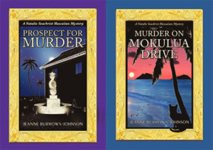
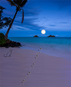
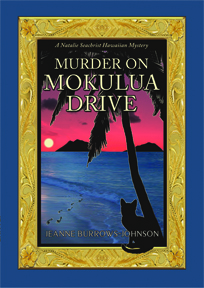
An artist’s sense of color is normally reflected in their creations, so today’s discussion may be most appropriate to authors, especially those launching their first book or moving into a new series, genre, or nom de plume which may produce new design dilemmas. Even if you are an author under contract to a publisher who controls the art for your books, you may be able to offer input regarding the ambiance you wish to see projected. Therefore, I suggest you contemplate artistic issues like color in advance of signing with a publisher. In fact, you may find that analyzing their artistic taste will help you select an appropriate publisher. I’m fortunate to have had the liberty of working regularly with an artist of my choice [Yasamine June] to develop the rich covers of the Natalie Seachrist Hawaiian Mysteries.

As a writer and design consultant, I often focus on color. One of my favorite questions for clients seeking branding advice is, “Have you had your color today?” On the surface, this seems like a simple question, perhaps referencing a bright scarf or sales banner. However, my question is directed at the person’s preferences in coloration.

If you are an author, the question addresses your approach to color in both the art and science of your writing…and how you are envisioning the images that may accompany your text. If your writing reflects your personal voice and style, choosing artistic elements may be straightforward. If not, research can ensure colors appropriate to your genre and writer’s voice. [For technical information on coloration such as color theory, colorimetry, tetrachromats, etc., visit Rainbows of Color.
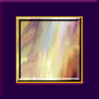
COLOR SAMPLES
Please note that despite how I’ve planned for these samples to appear, your hardware/software will alter the experience…
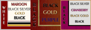
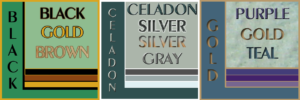
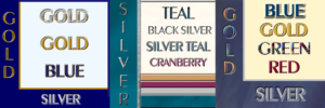
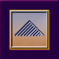
FANTASIAS OF COLOR
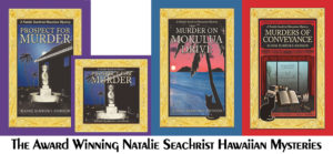
To help you consider more than your personal preferences in color, let’s explore classical and traditional interpretations of basic colors and shades. In my latest Hawaiian mystery, Murders of Conveyance, the cover features my usual frame with the carved gold of Hawaiian heirloom jewelry and the classic red of ancient and modern China.

RedThis color is traditionally linked to sunsets, fire, blood, Mars the planet and Mars the Roman god of war. Red is now often associated with signature holidays like New Year’s, Christmas, and St. Valentine’s Day, as well as certain nations like China. This vibrant color calls attention to anything depicted in it. Philosophically, it has been associated with licentiousness and the concept of Satan.

Yellow and OrangeAssociated with the sun and gold, these happy and bright colors are used for many attention-getting purposes. Depending on their tone, they may announce deeply discounted items, or conversely, the richest and most valued products.

GreenRepresentative of nature, green is often used for health and environmental topics, products, and services. Green colors are also used for military uniforms and equipment.

BlueIn daily conversation, blue ideally speaks of clear and serene waters and skies. In many philosophical traditions, it has been associated with purity and loyalty. Today, the color is often utilized by financial and insurance institutions wanting to declare their honesty, and by healthcare providers wishing to project their dedication to the well-being of their patients and clients.

Violet and PurpleAlthough these colors are not adjacent on the color wheel, humans perceive them as related to one another. Located at the end of the visible spectrum of light [literally next to ultraviolet], violet is a spectral color that is less saturated [intense] and displays more blue. Purple is more saturated [intense, pure] and balances two spectral colors, red and blue. With both colors perceived as blends of blue and red, these rich colors remain linked to ancient concepts of royalty, power, and wealth.

WhiteWhite is an achromatic color [without hue], embodying all wavelengths of visible light. It is historically linked to purity, cleanliness, goodness, and perfection. Like black, it is a good background for highlighting all colors.

BlackAbsorbing all colors of light, this achromatic color [without hue], is the absence of all visible light and therefore color. Obtained by the mixing of all primary colors, black is linked to darkness, night and evil in historical religious written materials. It is an excellent background for both vibrant and subtle colors.

White and black are often paired for the expression of opposites, as in good and evil, the white hats of the good cowboys vs. the black hats of rustlers, the white dress of the bride and the black of a widow in mourning.

 Gray Also an achromatic color, gray is created by the mixing of white and black. Being neutral, this color is most often associated with somberness, dullness, boredom, uncertainty, and advanced age.

SELECTING COLOR
Scientifically, colors [hues] are specific wavelengths of visible light. When considering coloration in your writing and for book jackets, one of the first questions you might ask yourself is, “What is my design aesthetic?” Also, “Does the style of my writing reflect my taste in art?” Do you like the detail of classicism or the sharp clean lines of modern art? Do you prefer bright primary colors or muted tones? Like an artist, the author draws on a rich palette of images within their mind’s eye. But to effectively communicate, this must be tempered by the expectations of the readers of the genre in which one works.

~  Lighting. The intensity and type of lighting affects one’s perception of tone [intensity of color] and shade [a mixture of black with color which determines how bright the color is].

~  Layering. The layering of color also affects our view of it. For instance, putting a red color on an ivory background will produce a color that has hints of orange.

~  Tint. The tint of a color is determined by the amount of white it may have, which lightens the color.

~  Region. Through the dialect[s] of your characters, as well as the scenes you describe, your text may indicate colors distinctive to the locale of your work. Within my work, I’ve found the greens of trees and plants growing along the shorelines of the Hawaiian Islands [the setting of the Natalie Seachrist Hawaiian Mysteries] to be lighter than those of the hills of `Ulupalakua, Maui. So, which greens are most appropriate to your project? And what about the clarity and tones of blue in the waters and skies you describe?

~  Perceived Gender. This may sound like a dated, or even prejudiced, approach to design. But examining perceptions of your writer’s voice or protagonist may help define appropriate book jacket colors. Consider the differences between romance novels and police procedurals. In the first example, you may have established an ambience that is classically feminine with soft, gentle, and elegant notes. In the second, you may have described a hard-nosed undercover police officer [male or female] who wears black, employs harsh street slang, and fiercely responds to violence. While black is an excellent background for both genres, the artist’s treatment may vary considerably. The romance book often invites the reader to wonder what lurks behind subtle gradations and soft brush strokes of mystical colors and tones. In contrast, the police procedural usually pairs bold primary colors with dark shading set within sharp modern lines.

Once you’ve completed your research and contemplation of coloration for your project, I suggest you write a paragraph outlining the elements you desire with a sample color palette. With colors identified by number in your art or text software program, this will facilitate communication with publishers and artists [should you decide to self-publish].

I should caution you that identifying the colors you wish to see on a book jacket is no guarantee of how the printed work will arrive at your doorstep. Even two editions of the same book, printed by the same company following the same instructions can yield variations in color because of differences in batches of ink or toner, the moisture content of the paper used, and production executed on innumerable types and conditions of equipment.

Wishing you the best in your creative endeavors,
Jeanne Burrows-Johnson, author, consultant, and motivational speaker

For more ideas to strengthen your Wordpower© and branding, please visit: Imaginings Wordpower and Design Consultation. For an in-depth discussion of the nature of color, go to Wearing Your Brand.

You may also wish to check out: 
Rainbows of Color, May 2015
Harmonizing Branding Elements, August 2016
Book Promotion and Evolving Art, January 2017

To learn more about the award-winning Natalie Seachrist Hawaiian Mysteries, including Murders of Conveyance [Winner, Fiction Adventure-Drama, 2019 New Mexico-Arizona Book Awards] and other projects, please drop in at my author’s website JeanneBurrows-Johnson.com. You’ll even find Island Recipes that might inspire your culinary creativity.

Follow Me:
Amazon, Arizona Authors Association, Apple Books
Audible, Authors Den, Barnes and Noble, Blogarama, Book Bub
Cozy Mysteries-Unlimited, Facebook, Good Reads, Hometown Reads

Book sellers may contact book distributors such as:
Baker & Taylor, Follett, IPG, Ingram, Mackin, Midpoint, TitleWave

SUCCESSFUL COVER ART

SUCCESSFUL TEAMWORK YIELDS WINNING ART!

Successful cover art is the product of teamwork. In November 2018, Murder on Mokulua Drive [the second Natalie Seachrist Hawaiian mystery] won several awards. Notably, it won Second Place for Published Fiction in the 2018 Arizona Literary Excellence Contest. This was due in large part to the superb editing of Viki Gillespie, who has helped to refine each of the books in the series. Like Prospect for Murder, MOMD also won First Place for Cover Art Design in the New Mexico-Arizona Book Awards, where it was also a Finalist in the Cozy Mystery Category.

 Let’s examine how the winning cover art for this series has been achieved…

TEAMWORK
Regardless of what you do in life, one of the major keys to your success is teamwork. Even when you are the primary producer of a product, you will be relying on the merchandise, talents, and skills of others. If you are an artist, you utilize a variety of products to create your art, and usually employ a framer to present your finished work to the world. Authors, whether self-published or working with a publisher, are likewise dependent on the output of others to finalize their creations. First, capturing their thoughts depends on a variety of manual and electronic tools. Succinct editing services are also required. Then there is the issue of layout, fortunately provided to me (along with overall publishing skills) by Geoff Habiger of Artemesia Publishing. Of course, he cannot complete his work without the final art designs brought to fruition by fine and graphic artist Yasamine June.

MY APPROACH TO ARTISTIC PROJECTS
While I possess some skill as a design consultant and can produce certain graphic art elements for marketing materials and my websites, I lack the tactile skills to produce truly refined artistic images. So where do I begin art projects? First there is the overall concept, generally driven by text I have already composed. For a book cover, the first consideration is determining the images that will evoke the essence of the story I need to highlight.

Fortunately, when I began writing the series, I composed timelines, chapter synopses, and descriptions of settings and characters. Even a cursory review of these elements reveals a list of those that may be appropriate to a book cover and supportive marketing materials. While some authors create new art for each of their works, I chose to present certain images with consistency including Miss Una, Natalie’s silent but fleet-footed feline companion and images like palm trees and ocean waters reflecting Hawai`i. In addition, I have conceived a recurring gold frame based on Hawaiian heirloom jewelry. I also utilize pagination folio art that I designed, and a gold hibiscus flower that Yasamine has refined. At the point that I have a list of elements that might be good for book jacket art, I begin roughing out a tentative layout in a graphic art software program.

ARTISTIC DEVELOPMENT
As I examine my list of suitable artistic elements, I manually draw a few pictures that fit the requisite portrait layout of a book cover—knowing that the final product can easily be converted to a square layout for an audio book. So where did the award-winning cover of Murder on Mokulua Drive begin?

First of all, Natalie’s life has shifted from a high rise in Waikīkī to a cottage in the beach community of Lanikai on the windward side of the island of O`ahu. Next was consideration of the fact that the murder in this story occurs at night. What does this add up to? A nighttime beach scene which includes the Mokulua islets, the moon, a palm tree, footprints in the sand, and Miss Una. Additionally, although I will not be completing the design, I try to allow space for the insertion of Titling in my signature Peignot font so that there will be no overlapping of images and text. Here is the initial layout I sent to Yasamine which was a rough copy and paste of elements I found evocative.

How did Yasamine’s magic polish this concept?

Since this is the second book in the NS mysteries, I had been through the publishing process for the series once. Additionally, I was able to draw on my experience as art director for the well-received multi-author anthology, Under Sonoran Skies, Prose and Poetry of the High Desert. For that project, I featured a picture I shot of the desert at sunset from my back lānai.

Whatever your artistic needs may be, I urge you to be involved in the process, even if you are unable to finalize the images yourself. The input you provide to a professional artist will ensure a product that reflects your own work and the goals you may be setting for future projects…Here’s a look at the before and after images for Murders of Conveyance, which was released in early 2019! As I edit this in April of 2021, I can happily report that this third book in the Natalie Seachrist Hawaiian Mysteries was a finalist for art and WINNER FOR FICTION ADVENTURE-DRAMA IN THE 2019 NEW MEXICO ARIZONA BOOK AWARDS!

As noted, the award winning book covers for the Natalie Seachrist Hawaiian Mysteries [as well as that for the forthcoming Conversations with Auntie Carol] were designed by Yasamine June. Her many talents include: Creative Direction; Fine art; Graphic Design; Illustration; Photography; Typography; and Videography. You can learn more about her at YasamineJune.com/about.


Wishing you the best in your creative endeavors,
Jeanne Burrows-Johnson, author, consultant, and motivational speaker

Further discussion of art is available at the following blog posts:
Authors Design Dilemmas 1, April 2015
Confronted by a Fantasia of Fonts, May 2015
Rainbows of Color, May 2015
Winning Logos & Slogans, October 2015
Quality Book Production, February 2016
Harmonizing Branding Elements, August 2016
Book Promotion and Evolving Art, January 2017
Balancing Text and Space, February 2018
Successful Cover Art, December 2018

To learn more about the award-winning Natalie Seachrist Hawaiian Mysteries, including Murders of Conveyance [Winner, Fiction Adventure-Drama, 2019 New Mexico-Arizona Book Awards] and other projects, please drop in at my author’s website JeanneBurrows-Johnson.com. You’ll even find Island Recipes that might inspire your culinary creativity.

For more ideas to strengthen your Wordpower© and branding, please visit: Imaginings Wordpower and Design Consultation.

Follow Me:
Amazon, Arizona Authors Association, Apple Books
Audible, Authors Den, Barnes and Noble, Blogarama, Book Bub
Cozy Mysteries-Unlimited, Facebook, Good Reads, Hometown Reads

Book sellers may contact book distributors such as:
Baker & Taylor, Follett, IPG, Ingram, Mackin, Midpoint, TitleWave

WINNING LOGOS & SLOGANS…

emmas for AuthorsRich Palettes of Words & Images for Authors & Artists!

While logos and slogans are usually associated with corporations, they can facilitate communication with the public and be key branding elements for any business endeavor, regardless of size or tax status.  And, yes, that includes professional writers wishing to facilitate communication with their readers, listeners, and/or viewers.  The memorable branding messages of successful authors truly echo the rich palette of words and images used by Fortune 500 companies! 

PICTURE A SUCCESSFUL LOGO OR SLOGAN
What comes to mind when you think of a successful logo or slogan?  Perhaps the first is the iconic image of a cola company that has been in business for over one hundred and twenty-five years.  There have been many artists who have brought their own creative process to the company.  But while its logo has changed in minor ways, the bright color palette, signature font, and swirls of one type or another have remained ever present.  

In contrast, its slogans and other commercial text for their signature product have been altered periodically.   This is not surprising since marketing styles and considerable linguistic evolution have occurred within the same decades.  But with each change, the artistic vision of the company has been consistent—to provide a pleasurable sensory experience to the product’s target market.
Tips
ELEMENTS OF A SUCCESSFUL LOGO OR SLOGAN
In addition to any artistic icon,
the choice of color and fonts utilized in shaping the outward image of a viable brand must be memorable.
They must also be appropriate to the product or service, as well as the demographics of the target market.  However, since a business can select a specific slice of their market to target, the style of two businesses within a particular industry can vary considerably.

Consider snack foods intended for children.  Generally, bright, happy colors, images, and simple easy-to-read—or even cartoonish—text fonts are appealing to that market.  But when the ingredients are organic, the use of colors associated with nature is the norm.  In addition, with growing concerns for the environment, recycled and/or recyclable packaging is becoming preferable…at least to parents.

When you know the demographics of your target market, your first decision in establishing your brand may be deciding whether to use your personal or business name without an accompanying image. This may be appropriate if your name distinguishes your business from others that offer parallel products and/or services.  However, the use of an artistic design element not only clarifies what you do, but demonstrates the style in which you operate.  Thus, a black, profiled outline of a woman with luxurious hair, standing in high heels against a deep plum color may convey an ideal image for an upscale salon or spa.  If the figure of a man in a tuxedo were added, an iconic image for a ballroom dancing studio would emerge.

DYNAMIC TEXT IN LOGO DESIGN
Let’s now consider how we might design a logo for a company we’ll call Inner City Painting.  Beyond the simple use of text, one could
use an upturned paint brush with a splash of paint for each of the i’s in the text.  At the next level of complexity, a simple line drawing of a home or a string of commercial buildings could declare the firm’s niche market. 

Aside from clean, non-seraphed text, three primary colors might convey a no-frills provider of basic painting services.  Conversely, sweeping art strokes, an elegant font, and an exotic color palette would suggest a more artistic enterprise.  [See DESIGN DILEMMAS FOR AUTHORS, Part 3:  COLOR, May 30, 2015, regarding the use of standardized colors to ensure uniform coloration in both print and electronic publishing.]

Several years ago, I was working with a local printer whose family had been in the industry in a large city for several decades.  Although the familial entity no longer existed, the branding artwork remained.  It depicted a happy cartoon character inviting the public through their doors.  The style of the figure, his attire and shoes all pointed to another era, but the idea of a friendly chap greeting customers was still a viable concept—especially in this age of impersonal mega-corporations.  With the help of a graphic artist, the image of your friendly neighborhood printer was updated and served to introduce the firm to a new generation of clients seeking full-service printing design and production.

THE IMPORTANCE OF LOGOS IN BRANDING
Equally important to an effective branding program is the choice of a slogan
, for both individuals and organizations.  Notice that I am using the single noun, S L O G A N.  Too often I find promotional decision makers attracted to complex images and multiple descriptive phrases.  This simply muddies the waters and presents a jumbled NON-MEMORABLE image to the public.

Consider artist John Smith.  He might present himself as:  John James Smith, portraitist.  In this case, his middle name separates the artist from other men named John Smith and the word portraitist specifies his specialty.  Additional, qualifying words and phrases can offer further information that will attract appropriate clients to him.  The following is a simple representation of Mr. Smith and his classic painting:

Portraits in Oil Offered by
John James Smith, M.F.A.

Another issue to consider in textual aspects of branding is punctuation.  Instead of shifting font or using italics, some promotional decision makers complicate a design by ending slogans with punctuation.   I suggest saving punctuation for actual sentences and paragraphs of descriptive text.  I find that the shortest path to memorability lies in simplifying your words and design elements.  

ENSURE SIMPLICITY
Designing branding elements in popular dimensions you are most likely to see in print ensures simplicity and that means ease in utilization in multiple projects. 
That means that although your graphic artist may be thrilled to present you with an 8.5 x 11 inch design, have them offer you samples in the sizes of dimes, nickels, quarters and silver dollars.  When you do this, you will quickly see that extraneous strokes and other details are lost in such dimensions and can even prove distracting to the message you are trying to convey with a business card or advertisement.  The size of fonts used for your name and any slogan will naturally have to be proportional to the size of the icon being presented.

With the publication of Prospect For Murder, the first Natalie Seachrist Hawaiian Mystery set in Honolulu, I have been sorting through old files.  In examining the progression of my own branding, I see that for over a decade, I simply used my name and a few bulleted words to describe my work.  In 1995, I launched use of the word Imaginings in my business name while completing edits for an article I co-authored for Broker World Magazine.  Since I was moving from Honolulu to Tucson, it was part of an authoring strategy for introducing myself to a new locale for my physical business, as well as potential regional, national or even international audiences.  [You might find it interesting to note that at that time I was sometimes told that there was no such word as imaginings.]

Through the years, I have offered clients several products and services to enhance their physical environs, as well as their promotional representations.  While previously using merely a textual presentation of myself, a couple of years ago I decided to design an iconic image that would represent several elements of my careerCommercial writing, design consultation, and floral art.  I knew that utilizing a pen would clearly represent the largest area of my work.  As I sometimes provided faux painting of accent walls to commercial clients, it seemed natural to also include an artist’s brush.  Finally, as I have offered floral designs to both friends and clients, some form of floral image was indicated. 

My logo has evolved over time is used in myriad ways.  Some variations have been necessitated by hardcopy printing vs. electronic presentations:  Boldness and detail; portrait and landscape formats; framed and unframed; isolated or with text.  Despite these differences, the use of gold, blue and plum colors have been consistent–except when a solid gold background is required. I’m glad to say that my icon is becoming recognized…

With my writing shifting from commercial writing to fiction, my personal name may become more recognizable.  Nevertheless, I like the elements of this image that sums up my work to date.  However, I think it’s time for the hand of a graphics professional to finalize my signature icon, so that I can empower my image as well as my words as an author.

Wishing you the best in your creative endeavors,
Jeanne Burrows-Johnson, author, consultant, and motivational speaker

Discussion of art is available at the following blog posts:
Authors Design Dilemmas 1, April 2015
Confronted by a Fantasia of Fonts, May 2015
Rainbows of Color, May 2015
Winning Logos & Slogans, October 2015
Quality Book Production, February 2016
Harmonizing Branding Elements, August 2016
Book Promotion and Evolving Art, January 2017
Balancing Text and Space, February 2018
Successful Cover Art, December 2018

To learn more about the award-winning Natalie Seachrist Hawaiian Mysteries, including Murders of Conveyance [Winner, Fiction Adventure-Drama, 2019 New Mexico-Arizona Book Awards] and other projects, please drop in at my author’s website JeanneBurrows-Johnson.com. You’ll even find Island Recipes that might inspire your culinary creativity.

For more ideas to strengthen your Wordpower© and branding, please visit: Imaginings Wordpower and Design Consultation.

Follow Me On:
Amazon, Arizona Authors Association, Apple Books,
Audible, Authors Den, Barnes and Noble, Blogarama, Book Bub,
Cozy Mysteries-Unlimited, Facebook, Good Reads, Hometown Reads

Book sellers may contact book distributors such as:
Baker & Taylor, Follett, IPG, Ingram, Mackin, Midpoint, TitleWave

Communicating with The Senses

What visions dance in your dreams?
Sense Memory:  Words For The Eye and Palette

Are you communicating with all of your senses? The art of communication largely relies on visual and aural stimulation.
~  An author communicates with the written word.
~  A dancer creates a visual message with his or her body.
~  Actors and public speakers communicate with the spoken word and their bodies.

In the past, the sense of touch helped to share the message of written words, as finely tooled leather-bound tomes invited the reader’s fingers to trace the lettering on a book cover.  Even the sense of smell may be involved, as the carved leather fostered anticipation of the remarkable thoughts within. 

Today, all five of the senses of the writer’s audience may be involved through the communication tools of our multi-media civilizationBeyond the realm of streaming radio and audio books, there are audio messages being sent into space that may not be heard for thousands or even millions of years.  We are also at the brink of attempts at smell- or taste-athon forms of entertainment. 

The goal of any communicator is to ensure that their readers, listeners, and/or viewers will respond positively to their message.  Sometimes the process for achieving this is straightforward, even mechanical.  At other times, the gathering of ingredients for connecting with one’s audience seems happenstance if not magical.

A successful advertising campaign is an example of how this process can work.  Most of us are accustomed to extending our minds beyond a limited promotional image and message to the full experience enjoyed when actually partaking of the featured product or activity.  Whether viewed in a full-page magazine ad or television commercial, the sight of a glistening golden turkey on a platter is expected to invoke memories of holiday feasts shared with our loved ones…rather than the reality of a studio of near-strangers focused on taking pictures of an artificial bird glued to a platter and painted with an oily brown glaze.

Sadly, the perception of truth can be more important than truth itself.  For example, I recall being instructed about the art of opening doors, shaking hands and kissing on stage.  I quickly learned that the natural ways of performing these tasks were irrelevant. The actors had to adjust their movements to make the audience feel comfortable with the actions necessary to theatrical performance.

To ensure our audience will be accepting of the images we have created, the artful wordsmith must do more than employ accurate vocabulary.  This is one reason that translation of text from one language to another is so difficult.  In fact, in addition to being an editorial process, it is a fine artMerely selecting a word that correctly describes something does not make it a successful choice:  The descriptive word you eventually choose must evoke the most appropriate image to both your genre and your audience.

Consider how you might employ the following words and phrases:  Azure, blue, and sapphire; highlighted, revealed, and shone down upon; bright, luminescent, and sunny; juicy, moist, and succulent; boar, ham, and pig.  Depending on the scene being described AND your audience, the text you compose from these words will differ.  While the word blue may be appropriate for an advertisement, a children’s book and a romance novel, the same cannot be said for luminescent, azure, and succulent.

As adults with sophisticated English vocabularies, we may envision immediately the magical sparkle of a luminescent sky and the moist deliciousness of a pork loin described as succulent. However, these word choices would be inappropriate for a children’s book intended for a beginning reader.  Our creative process may draw on a rich palette of images within our mind’s eye, but it must be tempered by the realities of the genre in which we are working.

Refining our writer’s palette is one of the most important authoring strategies we can employ, regardless of whether we are working on fiction or non-fiction projects.  In my work as a practitioner of the art and science of writing, I seek to create a juncture between language and the sensory organsI do this by striving to balance carefully chosen nouns and modifiers within an appropriate structure to provide my targeted audience with a rich sensory experience that they will accept within the current genre.  

There is, of course, no right or wrong decision in the scenarios you create as a writerThe options are many.  The choices are yours.  But as you work on any project, consider the demographics, as well as the expressed responses of members of your audience.  In the end, your word selections should be guided by determining the effect you wish to create in each passage…

Wishing you the best in your creative endeavors,
Jeanne Burrows-Johnson, author, consultant, and motivational speaker

For examples of sample color palettes, please visit:  https://www.ImaginingsWordpower.com/color/plays_on_color.html

Further discussion of the nature and impact of color is provided at:
https://www.imaginingswordpower.com/wearing/wearing_your_brand.html

To learn more about the award-winning Natalie Seachrist Hawaiian Mysteries, including Murders of Conveyance [Winner, Fiction Adventure-Drama, 2019 New Mexico-Arizona Book Awards] and other projects, please drop in at my author’s website JeanneBurrows-Johnson.com. You’ll even find Island Recipes that might inspire your culinary creativity.

For more ideas to strengthen your Wordpower© and branding, please visit: Imaginings Wordpower and Design Consultation.

Follow Me On:
Amazon, Arizona Authors Association, Apple Books,
Audible, Authors Den, Barnes and Noble, Blogarama, Book Bub,
Cozy Mysteries-Unlimited, Facebook, Good Reads, Hometown Reads

Book sellers may contact book distributors such as:
Baker & Taylor, Follett, IPG, Ingram, Mackin, Midpoint, TitleWave

Design Dilemmas 2, Fonts

Confronted By a Fantasia of Fonts?

You’ve completed your research for a writing project.  You’re through composing and editing the text.  What a relief!  But if you’re in control of printing and/or publishing the finished work, you’re probably facing several decisions about its appearance.  While there are clear differences in design for hardcopy and electronic publishing, you may find that layout is not an issue—if your text is being dropped into a predetermined format, as in an existing website or magazine. 

Whether or not this is the case, you may need to select and apply the fonts that will present your message to the world If you have written a piece of fiction, you may be facing fewer considerations.  In this scenario, the sections of your piece may not exceed a title page, table of contents, preface, prologue, chapters, epilogue, and acknowledgements.  If so, a single font family may be ideal for the entire work—with variations in italics, all-caps and bold face. 

But if your piece is non-fiction, you may have additional elements, such as:  An Introduction, Afterword, and Appendices; Glossary and Index; Graphs and Charts; and, Photographs, Pictures, and Illustrations.  While simplicity in visual elements is ideal in any reading material, you will want to ensure your presentation has a positive impact on the readerAnd this may require the use of more than one font family.

Your first consideration in font families is the choice between serif typefaces [historically referred to as Roman typefaces by typographers] and sans-serif [Gothic] typefaces.  Unfamiliar with the term serif?  You’re not alone.  A serif is a small tic or line placed on the ends of letter strokes.  To compare these two categories of typefaces, let’s examine the differences between the classic Times New Roman and Arial font families.  While the former looks fancier with its little tics, the latter is straighter and bolder. 

But before you declare the cleaner look of Arial ideal for all purposes in our modern world, consider the issue of eye fatigue.  When we stare at the same kind of image [i.e. a uniformly straight font] for very long, our eyes become tired…and when that happens, your audience may lose interest in the message you have worked so hard to produce.  Therefore, consider using a mix of two or three font families that will make the various parts of your work pop.  Not only will this lessen the chance of your reader becoming tired, it may increase the likelihood that he or she will remember your key points. 

In general, for both print and electronic purposes, sans-serif font families are ideal for section titling, and sub-categories or menu labels.  This bold lettering says, “Stop and Pay Attention to Me.”  Although you may not be able to lessen the number of words used in a title, if you limit menu labels for website and other electronic publishing to one to three words, they will be memorable.  Conversely, for the body of your text, you may want a serifed typeface, that allows the letters and words to flow from one to the next, while minimizing eye strain. 

Before moving on, let me clarify that I am NOT suggesting you go wild, using a wide mixture of font styles and treatments in hopes of looking artistic.  While I have suggested using three font families, in most cases, two of those would be non-serifed fonts for titling and menu labels.  Titling might be in classic Arial [in bold], while the labels of menus might feature a smaller and tighter font such as Arial Narrow.  For wide, easy-to-read text, I prefer Palatino Linotype rather than the Times New Roman that most computers will default to, if the specified font is not loaded. 

There are many details to the history of the design and use of fonts that reach beyond the scope of this discussion.  One is the mathematics of font spacing, which you may find mentioned in your own research of the topic of fonts.  Simply stated, a monospaced, fixed-pitch-or fixed-width font is non-proportional, meaning that each letter and character occupies the same amount of horizontal space.  This is in contrast to a variable-width font, in which the space between letters and characters depends on the actual space a letter requires.  Since an “I” requires less space than an “E,” a variable width font may be helpful if you have a limited amount of width. 

Let me also make a few comments on the judicious use of italics.  While some design specialists are allergic to any use of them, I think italics are appropriate in some cases:  Differentiating a slogan from the name and contact information of an individual or corporate entity; emphasizing a word or phrase within a large body of text; replacing quotation marks to indicate dialogue or a character’s inner thoughts.  For me, I base my decision on using fonts on one key issue, How effective will this form of highlighting be?  The answer often rests in examining the length of verbiage surrounding the text you propose to italicize.  The overuse of any element reduces its effectiveness.

A similar evaluation should help you in determining when to use a bold font.  Consider business cards that offer every letter and character in bold…Without a variety of shapes, color and emphasis, the reader is likely to be indifferent rather than impressed.

In closing the book on fonts for today, let me say that your ultimate choices will depend on your individual taste and style.  To help you refine the process of choosing fonts, I recommend you collect a number of business cards (and maybe a couple of brochures) and consider the elements that appeal to you.  Spread the printing samples out on a neutral background and ask yourself, “What does the text style say about the featured person or business?”

~  Is the presentation organized and easy to read?
~  Do I relate to the person or business?  Do I trust their message?
~  Does the message reflect current standards for the industry or genre?

If you find yourself responding negatively to the sample materials, envision how you might improve both the message AND its delivery.  As to your own work, ask yourself two questions.  “Is my proposed use of fonts going to accomplish my goal of impressing the reader with my message?”  And, “What will my choices in fonts and other design elements tell readers about me?” 

My signature font family is Peignot For titling and limited amounts of text, I often use a mix of the Peignot and Arial Narrow fonts [see the logo at the top of this post].  By embellishing these non-serifed fonts with varied treatments of sizing, texture, and color, I hope to announce that I’m progressive in perspective yet respectful of elements of classic design.  Do you think I have accomplished my goal?

Wishing you the best in your creative endeavors,
Jeanne Burrows-Johnson, author, consultant, and motivational speaker

Discussion of art is available at the following blogs:
Authors Design Dilemmas 1, April 2015
Confronted by a Fantasia of Fonts, May 2015
Rainbows of Color, May 2015
Winning Logos & Slogans, October 2015
Quality Book Production, February 2016
Harmonizing Branding Elements, August 2016
Book Promotion and Evolving Art, January 2017
Balancing Text and Space, February 2018
Successful Cover Art, December 2018

To learn more about the award-winning Natalie Seachrist Hawaiian Mysteries, including Murders of Conveyance [Winner, Fiction Adventure-Drama, 2019 New Mexico-Arizona Book Awards] and other projects, please drop in at my author’s website JeanneBurrows-Johnson.com. You’ll even find Island Recipes that might inspire your culinary creativity.

For more ideas to strengthen your Wordpower© and branding, please visit: Imaginings Wordpower and Design Consultation.

Follow Me:
Amazon, Arizona Authors Association, Apple Books
Audible, Authors Den, Barnes and Noble, Blogarama, Book Bub
Cozy Mysteries-Unlimited, Facebook, Good Reads, Hometown Reads

Book sellers may contact book distributors such as:
Baker & Taylor, Follett, IPG, Ingram, Mackin, Midpoint, TitleWave

Creating Fictional Characters

What are the elements of your brand?

HOW DO YOU SHOP FOR CHARACTERS?

If you’re a writer—fledgling amateur or seasoned professional—you should not be surprised to spend a lot of time in research.  While much of this work can be performed on a computer, tablet or smart phone, some reference materials must be accessed in person.  If you’re lucky, the information you’re seeking can be found at a nearby library or university.

Otherwise, you may need to travel to complete your research in another city, region, or country to visit libraries, museums or archival collections.  Unfortunately, the cost of travel and time spent away from home may be higher than you wish to invest in a project.  Another option is hiring a research assistant.  While this scenario may save time and out-of-pocket expenses, be prepared for unforeseen complexities in working with someone you may never have met.  Even when you speak the same language, the manner in which each of you approaches research may be wholly different.

Whether you are an author seeking fictional characters (or a business executive writing descriptions of your target clientele), you may need to present snapshots of people that truly grab a reader’s attentionWriting succinct portrayals of people can be challenging to the most creative writerFortunately, the answer to this research dilemma may be close at hand.

In addition to your visionary skills, consider people you already know and can easily depict.  While you may not want to author a description of someone likely to read your work, you can combine the attributes of several individuals so that no single person can take offense.   

In the weekly writers’ salon I founded a few years ago, one member has shared a unique research technique. Like her, you might consider using newspaper obituaries as a source for biographic images.  Available online or in hardcopy, this resource is readily available at little or no cost.  Often accompanied by photos of the deceased in their prime, these simple paragraphs offer highlights of individuals from every variety of background, education, profession and economic level.

Due to the cost, writers of obituaries usually limit the number of words they use, often omitting physical descriptions of the departed if photos are included.  Despite the brevity, you will find a rich palette of words from which you can shape a dynamic biographic image.  To enhance the available descriptive text for your own project, you might want to draw on information from more than one entry.

Keep in mind that rules of plagiarism apply to any writer’s work, including obituaries.  This fact should not detract from your ability to draw inspiration from an obituary to develop biographical sketches for your work.  The effort you invest in this activity should minimize any assistance you may require from a professional editor.

Wishing you the best in your creative endeavors,
Jeanne Burrows-Johnson, author, consultant, and motivational speaker

To learn more about the award-winning Natalie Seachrist Hawaiian Mysteries, including Murders of Conveyance [Winner, Fiction Adventure-Drama, 2019 New Mexico-Arizona Book Awards] and other projects, please drop in at my author’s website JeanneBurrows-Johnson.com. You’ll even find Island Recipes that might inspire your culinary creativity.

For more ideas to strengthen your Wordpower© and branding, please visit: Imaginings Wordpower and Design Consultation.

Follow Me:
Amazon, Arizona Authors Association, Apple Books
Audible, Authors Den, Barnes and Noble, Blogarama, Book Bub
Cozy Mysteries-Unlimited, Facebook, Good Reads, Hometown Reads

Book sellers may contact book distributors such as:
Baker & Taylor, Follett, IPG, Ingram, Mackin, Midpoint, TitleWave

Empowering Your Words

The peaks of your power

POWERFULLY TARGET YOUR AUDIENCE!

For decades, I have striven to shape effective written materials for clients and myself.  At the end of many assignments, clients often ask if there’s a definitive method for generating quality writing.  Unfortunately, while some aspects of the pieces I write can serve as virtual templates, I have to report there’s no magic potion for guaranteeing effective wordsmithing.  For anyone. 

Amateur or pro, the key to quality writing is blending creativity with exhaustive editing!

LAUNCHING YOUR PROJECT. Feeling nervous to launch your writing project?  Ask yourself one simple question:  Am I so focused on the final product that I’m inhibiting my ability to write?  Your honest answer might be a reluctant yes.  If so, merely facing a pen or keyboard can be traumatic.  In response, consider performing a visualization exercise.  Without committing yourself to serious meditative practices, you should be able to picture your target audience reacting positively to a large screen presentation of your message.  Armed with this optimistic image, you should feel better prepared to set your verbal vehicle on the path to success.

THE VALUE OF AN OUTLINE. How will you reach your goal?  Regardless of the type of text you are composing, I’ve found that outlining is an invaluable tool.  I believe there are three essential steps to shaping a focused outline:

~  Write a mission statement summarizing your project’s purpose
 ~  List key points in a progressive sequence that validates your summary
~  Craft a closing statement summarizing how you’ve met the goals of your mission

You now have a recipe for determining the content and sequencing of the elements of your composition.  The exact position of the various components will vary, depending on the product you’re fabricating.  The key points on your list may yield paragraphs in an essay, article or speech.  They may also become individual pages in a website.  If you are seeking financial backing for a new business, they could become categories within your business plan And fiction?  Well, your list may be the plotline that yields the chapters of a prize winning novel.

DOVETAILING CREATIVITY AND TECHNICALITY. Despite my assertion that such organization will aid every writing endeavor, do not suppose that good writers never experience confusion, indecision, or misdirection.  The writing process is a dovetailing of creative and technical activity.  As you plunge into the construction process of your project, you will need to alternate between capturing the essence of what you want to say and coldly editing what you have written.  The beauty of this double pronged approach is that you can let your thoughts flow freely, knowing that the structure of your work will evolve as you edit your way toward a harmonious conclusion. I certainly found this approach to wordsmithing invaluable in writing the first Natalie Seachrist Hawaiian mystery, Prospect For Murder. This approach facilitates your remaining productive, even when experiencing writer’s block. 

STAGNATION.  If you feel your creativity as a writer has stagnated, turn to another aspect of the project.  Is there supporting material that requires your attention?  Perhaps you need to shape a bibliography or glossary, or a preface, afterword, or acknowledgement section.  If you’re responsible for printing, broadcasting, or uploading the final product, you may also need to work on color, form, texture, and artwork to present your thoughts with dynamism to your readers or viewers.  And, of course, you can  always revisit your personal bio or corporate mission statement

Wishing you the best in your creative endeavors,
Jeanne Burrows-Johnson, author, consultant, and motivational speaker

Tips to enhancing your writing may be found in:
Empowering Your Words, February 2015
Creating Fictional Characters, March 2015
Sidestepping Writer’s Block, April 2015
Communicating with Every Sense, May 2015
Energizing Narrative Passages, September 2015
The Author Recycles, July 2017
Balancing Text & Space, February 2017
Book Series Adventures, April 2018
Drawing on Sense Memories, July 2018

To learn more about the award-winning Natalie Seachrist Hawaiian Mysteries, including Murders of Conveyance [Winner, Fiction Adventure-Drama, 2019 New Mexico-Arizona Book Awards] and other projects, please drop in at my author’s website JeanneBurrows-Johnson.com. You’ll even find Island Recipes that might inspire your culinary creativity.

For more ideas to strengthen your Wordpower© and branding, please visit: Imaginings Wordpower and Design Consultation.

Follow Me On:
Amazon, Arizona Authors Association, Apple Books,
Audible, Authors Den, Barnes and Noble, Blogarama, Book Bub,
Cozy Mysteries-Unlimited, Facebook, Good Reads, Hometown Reads

Book sellers may contact book distributors such as:
Baker & Taylor, Follett, IPG, Ingram, Mackin, Midpoint, TitleWave