LESSONS FROM AN EVENT

Creative tablescapes dynamically introduce your unique work!

Make your participation in a retail, wholesale, or non-profit event memorable for both participants and attendees!

Recently, I participated in an art fair that reminded me of the need to anticipate inherent challenges you may experience in any event. As the old adage notes, you have only one opportunity to make a good first impression. One way to effectively introduce your unique work to new audiences is with a creative tablescape! While thinking about the elements that make your work remarkable, consider the following issues…

As a seller of the books I write, I have many opportunities to introduce my work. Sometimes the events are large like the Tucson Festival of Books [one of the largest book fairs in the U.S.]. At others, the occasion is small and cozy. Regardless of size, each event provides a chance to review your self-introduction and marketing from a new perspective…

BASIC ISSUES

Selecting Venues
The holiday season presents many occasions to participate in community or targeted audience events. With probable limits on the availability of time and money, you will want to choose among your opportunities carefully.

Appropriateness
Will the event you are considering increase public awareness and appreciation of your brand? While I now live in Tucson, Arizona, most of my work focuses on Hawai`i. Accordingly, I seek venues that appeal to a broad demographic of attendees and am unlikely to participate in a western-themed event.

Location and Travel Considerations
Is the event located in or near your city? How far will you have to travel to participate? The distance you must travel from your home to the event will affect the cost of transporting yourself and your product[s].

Event Size
The size of an event will impact the numbers of people with whom you will have contact. That may affect the nature and dimensions of your materials and tablescape layout. Do you already possess the materials you will need, or are there extraordinary expenses to be paid or traded in one opportunity over another?

Attendees
Some events, like a county or state fair will attract diverse types of people. Others may be focused on a niche market. Ask yourself, which among your top opportunities is the best fit for meeting your current customer/reader base and what might appeal to a new demographic?

Cost of Event
In addition to the fee for participating in an event, there may be additional expenses such as: Lodging; meals; parking; secondary transportation such as delivery and setup of your product[s] and display elements; paying for assistants. There may even be financial transaction fees, as some non-profit events charge a percentage for each sale you make.

Secondary Benefits of an Event
Beyond the event itself, are there any benefits to be realized, like connecting with family, friends, colleagues, and your editor and/or publisher? Might there be an opportunity for you to combine the benefits of this event with something else…an advertising campaign? A book signing at a store or library? A podcast and/or interview?

PACKING PRODUCTS & SUPPORT MATERIALS

Carefully pack your products and promotional materials with an eye toward unpacking and setting them up for the event. For example, if you will be using tablecloths, it is a good idea to have them available for immediate use upon your arrival at the venue. As an author, I am also careful to place my supplies of books at the bottom of carts and boxes as they are heavy and could damage lighter weight décor and other display materials.

DISPLAYS

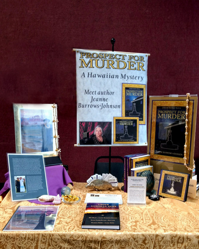
Your tablescape should be a stimulating yet tasteful presentation of your product[s] should include consideration of maintenance throughout the activity as well as the distinctive elements of your branding! What are colors and textures distinguish your brand? What will be the backdrop for your space? Can you hang a colorful curtain…on the back of a tent, or perhaps a screen behind your table display? Might a montage of book jackets make an appealing branding accent? Are there elements in your tablescape that can be easily dislodged by visitors?

Fliers, folding business cards and bookmarks, and bookplates are the primary handouts I offer visitors. At the art fair, I found that fewer readers desired bookmarks than in the past, and no one wished to leave their contact information, even if they were returning customers. Thank goodness my other handouts assure people can contact me if they wish to do so! And, with my distinctive name, I think everyone will be able to find their way to “Contact” forms on my websites!

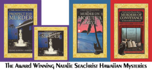
I continually monitor the restocking and alignment of the elements of my tablescape. This includes business cards, bookmarks and fliers, which means I have to select bookends and containers that are sturdy enough to keep your display tidy. With three titles and several editions in the Natalie Seachrist Hawaiian Mysteries, plus other projects, I’m contemplating using folding metal shelving to display my books to full advantage…

OPERATIONAL SUPPLIES

What secretarial/display supplies might you need? While you can prepare a standard container of supplies, review your collection prior to every event. When I will be outside, I make sure to include a few heavy items to keep paper materials from being caught up in unexpected changes in wind or other weather conditions.

~  Pens. In addition to pens for general writing purposes, I must include a few that are waterproof and can flow appropriately across title pages at book signings.

~  Secretarial supplies. These might include scissors, pencils, tape, plastic bags [for storage and product purchases], paper clips, rubber bands, string and/or cording, a lined note pad may prove useful to fellow vendors if not you.

~  Transactional supplies. Receipt forms/books, note pad for random reminders of products to order, etc., and a mechanism for taking electronic payments.

PERSONAL PREPARATION

Dress appropriately for your product and the event. Have a filling meal before the event and drink fluids during it. Snack foods should not be messy nor create crumbs you cannot swallow easily. Carry several bottles of plain water that are not too cold. Carbonation may cause digestive discomfort; and anything with color can become a disaster to clothing or products if spilled. If you will be speaking for prolonged periods, you consider adding lemon juice, but only if you’ve tried it previously. Remember to have a go-to-bag with a comb, tissues, disinfecting handwipes [good for post cash sale usage], lip balm and/or lipstick to moisten your lips. Throat lozenges will also moisten your mouth, freshen your breath, and can provide an emergency boost to your sugar level.

PUBLICITY AND MARKETING

While there may be a limited potential for making sales at an event, can you gain positive attention for your work before, during and after the event? For the art fair, I added announcements to the News and Events pages of my author and marketing tip websites, as well as my personal and professional Facebook pages. In addition, I included a notice about the event in general emails sent to a couple of hundred people and organizations in my data base. Your options may vary from mine, but consider them all…especially social media!

POST-EVENT CONSIDERATIONS

~ Preparing for Departure. Hopefully, you have sold and distributed much of the product and promotional material with which you arrived. Keep in mind that that is no guarantee that everything can be repacked in the methodical manner in which you arrived. If you will be participating in frequent events, have a plan for repacking in preparation for the next occasion, with heavy items on the bottom and more fragile pieces on top.

~ Expressing Your Gratitude. Customized expressions of gratitude will help assure that your participation is memorable and that you may have made significant contacts for future! This includes thanking event organizers and media outlets that may have enhanced the experience for both event vendors and attendees.

~ Announcing the Results. To truly benefit from the exertion it takes to participate in even a small event, you will find it appropriate to notify colleagues, the media, and followers of many types about the results of the event. On the last day of the arts fair, my latest Hawaiian mystery, Murders of Conveyance, took first place in the category of Fiction-Adventure in the New Mexico/Arizona Book Awards. This provided me with an excellent reason for contacting many people and organizations in my database!

Wishing you the best in your creative endeavors,
Jeanne Burrows-Johnson, author, consultant, and motivational speaker

To learn more about the award-winning Natalie Seachrist Hawaiian Mysteries, including Murders of Conveyance [Winner, Fiction Adventure-Drama, 2019 New Mexico-Arizona Book Awards] and other projects, please drop in at my author’s website JeanneBurrows-Johnson.com. You’ll even find Island Recipes that might inspire your culinary creativity.

For more ideas to strengthen your Wordpower© and branding, please visit: Imaginings Wordpower and Design Consultation.

Follow Me:
Amazon, Arizona Authors Association, Apple Books
Audible, Authors Den, Barnes and Noble, Blogarama, Book Bub
Cozy Mysteries-Unlimited, Facebook, Good Reads, Hometown Reads

Book sellers may contact book distributors such as:
Baker & Taylor, Follett, IPG, Ingram, Mackin, Midpoint, TitleWave

COLORATION FOR AUTHORS

EFFECTIVELY USING COLOR

What visions dance in your dreams?

A shorter version of this blog was originally published on the Hometown Authors website on November 5th, 2019…

An artist’s sense of color is normally reflected in their creations, so today’s discussion may be most appropriate to authors, especially those launching their first book or moving into a new series, genre, or nom de plume which may produce new design dilemmas. Even if you are an author under contract to a publisher who controls the art for your books, you may be able to offer input regarding the ambiance you wish to see projected. Therefore, I suggest you contemplate artistic issues like color in advance of signing with a publisher. In fact, you may find that analyzing their artistic taste will help you select an appropriate publisher. I’m fortunate to have had the liberty of working regularly with an artist of my choice [Yasamine June] to develop the rich covers of the Natalie Seachrist Hawaiian Mysteries.

As a writer and design consultant, I often focus on color. One of my favorite questions for clients seeking branding advice is, “Have you had your color today?” On the surface, this seems like a simple question, perhaps referencing a bright scarf or sales banner. However, my question is directed at the person’s preferences in coloration.

If you are an author, the question addresses your approach to color in both the art and science of your writing…and how you are envisioning the images that may accompany your text. If your writing reflects your personal voice and style, choosing artistic elements may be straightforward. If not, research can ensure colors appropriate to your genre and writer’s voice. [For technical information on coloration such as color theory, colorimetry, tetrachromats, etc., visit Rainbows of Color.

COLOR SAMPLES
Please note that despite how I’ve planned for these samples to appear, your hardware/software will alter the experience…

FANTASIAS OF COLOR
To help you consider more than your personal preferences in color, let’s explore classical and traditional interpretations of basic colors and shades. In my latest Hawaiian mystery, Murders of Conveyance, the cover features my usual frame with the carved gold of Hawaiian heirloom jewelry and the classic red of ancient and modern China.

RedThis color is traditionally linked to sunsets, fire, blood, Mars the planet and Mars the Roman god of war. Red is now often associated with signature holidays like New Year’s, Christmas, and St. Valentine’s Day, as well as certain nations like China. This vibrant color calls attention to anything depicted in it. Philosophically, it has been associated with licentiousness and the concept of Satan.

Yellow and OrangeAssociated with the sun and gold, these happy and bright colors are used for many attention-getting purposes. Depending on their tone, they may announce deeply discounted items, or conversely, the richest and most valued products.

GreenRepresentative of nature, green is often used for health and environmental topics, products, and services. Green colors are also used for military uniforms and equipment.

BlueIn daily conversation, blue ideally speaks of clear and serene waters and skies. In many philosophical traditions, it has been associated with purity and loyalty. Today, the color is often utilized by financial and insurance institutions wanting to declare their honesty, and by healthcare providers wishing to project their dedication to the well-being of their patients and clients.

Violet and PurpleAlthough these colors are not adjacent on the color wheel, humans perceive them as related to one another. Located at the end of the visible spectrum of light [literally next to ultraviolet], violet is a spectral color that is less saturated [intense] and displays more blue. Purple is more saturated [intense, pure] and balances two spectral colors, red and blue. With both colors perceived as blends of blue and red, these rich colors remain linked to ancient concepts of royalty, power, and wealth.

WhiteWhite is an achromatic color [without hue], embodying all wavelengths of visible light. It is historically linked to purity, cleanliness, goodness, and perfection. Like black, it is a good background for highlighting all colors.

BlackAbsorbing all colors of light, this achromatic color [without hue], is the absence of all visible light and therefore color. Obtained by the mixing of all primary colors, black is linked to darkness, night and evil in historical religious written materials. It is an excellent background for both vibrant and subtle colors.

White and black are often paired for the expression of opposites, as in good and evil, the white hats of the good cowboys vs. the black hats of rustlers, the white dress of the bride and the black of a widow in mourning.

 Gray Also an achromatic color, gray is created by the mixing of white and black. Being neutral, this color is most often associated with somberness, dullness, boredom, uncertainty, and advanced age.

SELECTING COLOR
Scientifically, colors [hues] are specific wavelengths of visible light. When considering coloration in your writing and for book jackets, one of the first questions you might ask yourself is, “What is my design aesthetic?” Also, “Does the style of my writing reflect my taste in art?” Do you like the detail of classicism or the sharp clean lines of modern art? Do you prefer bright primary colors or muted tones? Like an artist, the author draws on a rich palette of images within their mind’s eye. But to effectively communicate, this must be tempered by the expectations of the readers of the genre in which one works.

~  Lighting. The intensity and type of lighting affects one’s perception of tone [intensity of color] and shade [a mixture of black with color which determines how bright the color is].

~  Layering. The layering of color also affects our view of it. For instance, putting a red color on an ivory background will produce a color that has hints of orange.

~  Tint. The tint of a color is determined by the amount of white it may have, which lightens the color.

~  Region. Through the dialect[s] of your characters, as well as the scenes you describe, your text may indicate colors distinctive to the locale of your work. Within my work, I’ve found the greens of trees and plants growing along the shorelines of the Hawaiian Islands [the setting of the Natalie Seachrist Hawaiian Mysteries] to be lighter than those of the hills of `Ulupalakua, Maui. So, which greens are most appropriate to your project? And what about the clarity and tones of blue in the waters and skies you describe?

~  Perceived Gender. This may sound like a dated, or even prejudiced, approach to design. But examining perceptions of your writer’s voice or protagonist may help define appropriate book jacket colors. Consider the differences between romance novels and police procedurals. In the first example, you may have established an ambience that is classically feminine with soft, gentle, and elegant notes. In the second, you may have described a hard-nosed undercover police officer [male or female] who wears black, employs harsh street slang, and fiercely responds to violence. While black is an excellent background for both genres, the artist’s treatment may vary considerably. The romance book often invites the reader to wonder what lurks behind subtle gradations and soft brush strokes of mystical colors and tones. In contrast, the police procedural usually pairs bold primary colors with dark shading set within sharp modern lines.

Once you’ve completed your research and contemplation of coloration for your project, I suggest you write a paragraph outlining the elements you desire with a sample color palette. With colors identified by number in your art or text software program, this will facilitate communication with publishers and artists [should you decide to self-publish].

I should caution you that identifying the colors you wish to see on a book jacket is no guarantee of how the printed work will arrive at your doorstep. Even two editions of the same book, printed by the same company following the same instructions can yield variations in color because of differences in batches of ink or toner, the moisture content of the paper used, and production executed on innumerable types and conditions of equipment.

Wishing you the best in your creative endeavors,
Jeanne Burrows-Johnson, author, consultant, and motivational speaker

For more ideas to strengthen your Wordpower© and branding, please visit: Imaginings Wordpower and Design Consultation. For an in-depth discussion of the nature of color, go to Wearing Your Brand.

You may also wish to check out: 
Rainbows of Color, May 2015
Harmonizing Branding Elements, August 2016
Book Promotion and Evolving Art, January 2017

To learn more about the award-winning Natalie Seachrist Hawaiian Mysteries, including Murders of Conveyance [Winner, Fiction Adventure-Drama, 2019 New Mexico-Arizona Book Awards] and other projects, please drop in at my author’s website JeanneBurrows-Johnson.com. You’ll even find Island Recipes that might inspire your culinary creativity.

Follow Me:
Amazon, Arizona Authors Association, Apple Books
Audible, Authors Den, Barnes and Noble, Blogarama, Book Bub
Cozy Mysteries-Unlimited, Facebook, Good Reads, Hometown Reads

Book sellers may contact book distributors such as:
Baker & Taylor, Follett, IPG, Ingram, Mackin, Midpoint, TitleWave

Author Design Dilemmas 3, Color


What visions dance in your dreams?An Author’s Inspiring Rainbows of Color

How many colors are in the rainbows you paint? There are many perspectives on the use of color in the art and science of writing.  But even if I were an expert, this short space wouldn’t allow a comprehensive discussion of color theory [the traditional theory for mixing three primary colors to derive all other colors] or colorimetry [analysis of human color perception]. 

Variables in Color PerceptionMost people can see three distinct ranges of color.  Due to genetics, some women [called tetrachromats] are able to see four ranges of color.   Sometimes a temporary inability to see some or all color is caused by illness, allergies, medication, or hormone replacement therapy.  Even sufferers of Post-Traumatic Stress Disorder [PTSD] may notice a decrease in perception of color.  And, did you know that one out of twelve men and one out of two hundred women have color vision deficiencies? 

Choosing Color Palettes For Artwork to Accompany Text.   As discussed in my blog on engaging a reader’s senses, I believe that analysis of one’s genre provides the answer to many publishing questions and can help solidify authoring strategies.  Empowering your words as an author can take many forms.  One author I know brings a minimalist approach to her creative process in selecting art for a children’s book.  She believes that faint sketches without full form, shape, or color will encourage children listening to or reading her prose to bring images from their own minds to their reading experienceThis minimalist approach may be ideal for poetry and historical fiction.  However, it would be at odds with the hard-nosed writer’s voice usually employed in a police procedural and would lack clarity for many non-fiction projects.
Art and Science of Writing
While minimalism is a specific art movement, the term may be used generically to describe the overall expression of modern art in the late nineteenth and twentieth centuries.  Beyond an escape from classic realism, modern art focuses on the artist’s desire to interact with the minds and life experiences of his or her audience members.

Consider More Than Personal Preferences When Selecting Color.  If you are new to wordsmithing, you may not be thinking about branding But you might want to consider establishing the foundations of the brand for which your writing will be noted someday.  And just as an effective editorial process dictates that writers carefully select modifiers to create a scene rich in sensory images, a distinctive color palette can be one element in a design aesthetic that harmonizes with and even intensifies the impact of text.
Writers’ Guidelines
Beyond technical research you conduct regarding coloration, there are several issues to consider.  Does the style of your writing reflect your taste in art?  Do you like the detail of classism or the sharp clean lines of modern art?  Are you drawn to bright primary colors or muted subtle tones?  Do the peach and aqua tones of a sunset in the Southwest reflect your taste and your work? 

Regional Coloration Differences in regional color can be indicated by the dialect[s] of your characters, as well as the scenes you describe.  Growing up in Oregon, I was accustomed to the dark green of Douglas fir trees and the mosses that grow on them.  The palm trees in Hawai`i are pale in comparison.  In Arizona the array of green is mixed, depending on topography, season, and the amount of rainfall.  So which green would be most appropriate to your project?

The Juncture Of Style And Color.   In children’s books, hard-edged cartoon-like solid color images (like those a child might create) may be ideal.  But regardless of the style of art you select, the bright saturated colors associated with modern art are popular with and stimulating for young children.  Conversely, the sometimes dark tones of animè lend a sophisticated note to projects for both adults and older children.  For most genres, classic realism is appropriate.  To present images realistically, considerable detail and subtleties of color are usually required.

Articulating Your Artistic Vision is vital.  Since it is unlikely that you will be the artist shaping the images that will highlight your writing, you must be able to describe your desires to whoever is in charge of publication.  I suggest writing a paragraph outlining the specific elements you are seeking.  As with a journalistic endeavor, an inverted pyramid structure is useful.  Begin with an overview of the style you desire and then move on to specific issues like color.  If possible, use technical terms an artist or printer will understand.  For instance, consider specifying the tones and shades of colors you prefer. 

When viewed under varied lighting, a color’s tone [intensity of color] or shade [how bright a color is] will be perceived differently. Personally, I have found it challenging to use what I have termed a plum color in artwork for Prospect For Murder [the first book in the Natalie Seachrist Hawaiian Mystery series].  While my artist Yasamine June [view her work at www.yasaminejune.com] generated a wonderful color for the book jacket, subsequent applications for the audio book and some promotional materials have deviated from the color and/or tones she utilized.

Samples Of Your Preferred Palette and style will greatly aid the person executing your artistic vision.  These can be drawn from many sources:  websites; books and other printed material; fabric and clothing; pieces of art.  Consider offering the images of famous paintings.  Simply naming a type of art or an easily referenced artist will communicate your wishes.  Personally, I am drawn to the delicate images of classical Asian paintings, as well as the neo-classism of Maxfield Parish who was known for his use of saturated colorUnfortunately, since his work ended mid-twentieth century, a young artist may be wholly unaware of his work.

You can also provide numerical descriptions of colors.  Paint Stores offer samples of colors, with numerical coding as well as alphabetical names.  Printers can provide numbers for the Pantone® colors of ink used in most hardcopy printing.  And remember that you do not have to access a graphic art program to provide the color model numeration of computer font colors.  Simply mark a section of text within a word processing program and examine the ranges of colors available under the drop-down arrow for font color.

I should caution you that identifying a color is no guarantee of how a printed product will arrive at your doorstep.  Have you ever seen two editions of the same book, printed by the same company following the same instructions?  Even in hardcopy printing, variations in color can occur because of differences in batches of ink or toner, the moisture content of the paper used, and production executed on innumerable types and conditions of equipment.

A final consideration in our discussion of color printing is publication via downloading from the Internet.  If this is how your work will be published, you should consider using colors designated as “web safe.”  Again, there will be varied results in what is viewed by your readers.  If nothing else, variations in monitor settings can prevent uniformity in how myriad viewers will experience a color on your website or in your book. 

Before we leave the topic of color, let’s consider the historical and classical interpretations of color.  Some colors, like the royal purple from Tyre, Lebanon, were originally drawn from rare and precious sources.  To produce even small amounts of the Tyrian colorant, thousands of Mediterranean Sea mollusks [scientific name, murex brandaris] were needed for the dyes with which luxurious garments for ancient royals were fashioned.  Another historically rare color was the crimson worn by Roman legionnaires and wealthy matrons.  Traditionally associated with power and wealth, this color was obtained from the kermes vermilio planchon, an insect that grows on the kermes oak tree [quercus coccifera] of southern Europe.  Although the means for obtaining and utilizing dyes and paints have changed dramatically through history, their inner meanings have remained linked to aspects of nature.

Yellow and Orange – Associated with the sun and gold, these happy and bright colors are used for many attention-getting purposes.  Depending on their tone, they may be linked to base and deeply discounted items, or conversely, to the richest and most valued products.

Red – Traditionally linked to sunsets, fire, blood, Mars the planet and Mars the Roman god of war.  Red is now often associated with signature holidays like New Year’s, Christmas, and St. Valentine’s Day and certain nations like China.   This vibrant color calls attention to anything depicted in it.  It is sometimes associated with licentiousness and the concept of Satan.

Purple – Blending blue and red, this rich color is remains linked to the concepts and value of royalty, power and wealth.

Blue – In its deepest shades, blue speaks of clear waters and skies.  In many religious expressions, it is associated with holiness and purity.  This color is often utilized by financial and insurance institutions, as well as myriad industries dealing with healthcare that wish to be considered honest and dedicated to be well-being of their clients.

Green – Representative of health in nature, it is often used for health and environmental topics, products, and services.

White –  Reflects light and embodies the presence of all colors of light.  While many substances in nature are white, animals having pure white fur are rare, and therefore their pelts were historically associated with the power and wealth of royalty.  Once difficult to achieve in pure form, white colored clothing was often valuable regardless of the type of fabric.  The color is historically linked to purity, cleanliness, goodness, and perfection. 

Black – Absorbing all colors of light, it is actually the absence of color.  Obtained by the mixing of all primary colors, black is sometimes associated with darkness and evil in historical religious written materials.  It is an excellent background for both vibrant and subtle colors.

Wishing you the best in your creative endeavors,
Jeanne Burrows-Johnson, author, consultant, and motivational speaker

For examples of sample color palettes, please also visit:  https://www.ImaginingsWordpower.com/color/plays_on_color.html

Additional discussion of the nature of color is provided at: https://www.imaginingswordpower.com/wearing/wearing_your_brand.html.

Discussion of art is available at the following blogs:
Authors Design Dilemmas 1, April 2015
Confronted by a Fantasia of Fonts, May 2015
Rainbows of Color, May 2015
Winning Logos & Slogans, October 2015
Quality Book Production, February 2016
Harmonizing Branding Elements, August 2016
Book Promotion and Evolving Art, January 2017
Balancing Text and Space, February 2018
Successful Cover Art, December 2018

To learn more about the award-winning Natalie Seachrist Hawaiian Mysteries, including Murders of Conveyance [Winner, Fiction Adventure-Drama, 2019 New Mexico-Arizona Book Awards] and other projects, please drop in at my author’s website JeanneBurrows-Johnson.com. You’ll even find Island Recipes that might inspire your culinary creativity.

For more ideas to strengthen your Wordpower© and branding, please visit: Imaginings Wordpower and Design Consultation.

Follow Me On:
Amazon, Arizona Authors Association, Apple Books,
Audible, Authors Den, Barnes and Noble, Blogarama, Book Bub,
Cozy Mysteries-Unlimited, Facebook, Good Reads, Hometown Reads

Book sellers may contact book distributors such as:
Baker & Taylor, Follett, IPG, Ingram, Mackin, Midpoint, TitleWave

Communicating with The Senses

What visions dance in your dreams?
Sense Memory:  Words For The Eye and Palette

Are you communicating with all of your senses? The art of communication largely relies on visual and aural stimulation.
~  An author communicates with the written word.
~  A dancer creates a visual message with his or her body.
~  Actors and public speakers communicate with the spoken word and their bodies.

In the past, the sense of touch helped to share the message of written words, as finely tooled leather-bound tomes invited the reader’s fingers to trace the lettering on a book cover.  Even the sense of smell may be involved, as the carved leather fostered anticipation of the remarkable thoughts within. 

Today, all five of the senses of the writer’s audience may be involved through the communication tools of our multi-media civilizationBeyond the realm of streaming radio and audio books, there are audio messages being sent into space that may not be heard for thousands or even millions of years.  We are also at the brink of attempts at smell- or taste-athon forms of entertainment. 

The goal of any communicator is to ensure that their readers, listeners, and/or viewers will respond positively to their message.  Sometimes the process for achieving this is straightforward, even mechanical.  At other times, the gathering of ingredients for connecting with one’s audience seems happenstance if not magical.

A successful advertising campaign is an example of how this process can work.  Most of us are accustomed to extending our minds beyond a limited promotional image and message to the full experience enjoyed when actually partaking of the featured product or activity.  Whether viewed in a full-page magazine ad or television commercial, the sight of a glistening golden turkey on a platter is expected to invoke memories of holiday feasts shared with our loved ones…rather than the reality of a studio of near-strangers focused on taking pictures of an artificial bird glued to a platter and painted with an oily brown glaze.

Sadly, the perception of truth can be more important than truth itself.  For example, I recall being instructed about the art of opening doors, shaking hands and kissing on stage.  I quickly learned that the natural ways of performing these tasks were irrelevant. The actors had to adjust their movements to make the audience feel comfortable with the actions necessary to theatrical performance.

To ensure our audience will be accepting of the images we have created, the artful wordsmith must do more than employ accurate vocabulary.  This is one reason that translation of text from one language to another is so difficult.  In fact, in addition to being an editorial process, it is a fine artMerely selecting a word that correctly describes something does not make it a successful choice:  The descriptive word you eventually choose must evoke the most appropriate image to both your genre and your audience.

Consider how you might employ the following words and phrases:  Azure, blue, and sapphire; highlighted, revealed, and shone down upon; bright, luminescent, and sunny; juicy, moist, and succulent; boar, ham, and pig.  Depending on the scene being described AND your audience, the text you compose from these words will differ.  While the word blue may be appropriate for an advertisement, a children’s book and a romance novel, the same cannot be said for luminescent, azure, and succulent.

As adults with sophisticated English vocabularies, we may envision immediately the magical sparkle of a luminescent sky and the moist deliciousness of a pork loin described as succulent. However, these word choices would be inappropriate for a children’s book intended for a beginning reader.  Our creative process may draw on a rich palette of images within our mind’s eye, but it must be tempered by the realities of the genre in which we are working.

Refining our writer’s palette is one of the most important authoring strategies we can employ, regardless of whether we are working on fiction or non-fiction projects.  In my work as a practitioner of the art and science of writing, I seek to create a juncture between language and the sensory organsI do this by striving to balance carefully chosen nouns and modifiers within an appropriate structure to provide my targeted audience with a rich sensory experience that they will accept within the current genre.  

There is, of course, no right or wrong decision in the scenarios you create as a writerThe options are many.  The choices are yours.  But as you work on any project, consider the demographics, as well as the expressed responses of members of your audience.  In the end, your word selections should be guided by determining the effect you wish to create in each passage…

Wishing you the best in your creative endeavors,
Jeanne Burrows-Johnson, author, consultant, and motivational speaker

For examples of sample color palettes, please visit:  https://www.ImaginingsWordpower.com/color/plays_on_color.html

Further discussion of the nature and impact of color is provided at:
https://www.imaginingswordpower.com/wearing/wearing_your_brand.html

To learn more about the award-winning Natalie Seachrist Hawaiian Mysteries, including Murders of Conveyance [Winner, Fiction Adventure-Drama, 2019 New Mexico-Arizona Book Awards] and other projects, please drop in at my author’s website JeanneBurrows-Johnson.com. You’ll even find Island Recipes that might inspire your culinary creativity.

For more ideas to strengthen your Wordpower© and branding, please visit: Imaginings Wordpower and Design Consultation.

Follow Me On:
Amazon, Arizona Authors Association, Apple Books,
Audible, Authors Den, Barnes and Noble, Blogarama, Book Bub,
Cozy Mysteries-Unlimited, Facebook, Good Reads, Hometown Reads

Book sellers may contact book distributors such as:
Baker & Taylor, Follett, IPG, Ingram, Mackin, Midpoint, TitleWave