SUCCESSFUL COVER ART

SUCCESSFUL TEAMWORK YIELDS WINNING ART!

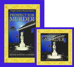
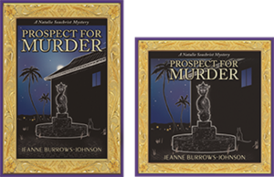
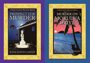
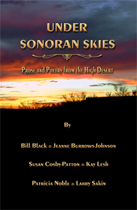
Successful cover art is the product of teamwork. In November 2018, Murder on Mokulua Drive [the second Natalie Seachrist Hawaiian mystery] won several awards. Notably, it won Second Place for Published Fiction in the 2018 Arizona Literary Excellence Contest. This was due in large part to the superb editing of Viki Gillespie, who has helped to refine each of the books in the series. Like Prospect for Murder, MOMD also won First Place for Cover Art Design in the New Mexico-Arizona Book Awards, where it was also a Finalist in the Cozy Mystery Category.

 Let’s examine how the winning cover art for this series has been achieved…

TEAMWORK
Regardless of what you do in life, one of the major keys to your success is teamwork. Even when you are the primary producer of a product, you will be relying on the merchandise, talents, and skills of others. If you are an artist, you utilize a variety of products to create your art, and usually employ a framer to present your finished work to the world. Authors, whether self-published or working with a publisher, are likewise dependent on the output of others to finalize their creations. First, capturing their thoughts depends on a variety of manual and electronic tools. Succinct editing services are also required. Then there is the issue of layout, fortunately provided to me (along with overall publishing skills) by Geoff Habiger of Artemesia Publishing. Of course, he cannot complete his work without the final art designs brought to fruition by fine and graphic artist Yasamine June.

MY APPROACH TO ARTISTIC PROJECTS
While I possess some skill as a design consultant and can produce certain graphic art elements for marketing materials and my websites, I lack the tactile skills to produce truly refined artistic images. So where do I begin art projects? First there is the overall concept, generally driven by text I have already composed. For a book cover, the first consideration is determining the images that will evoke the essence of the story I need to highlight.

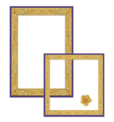
Fortunately, when I began writing the series, I composed timelines, chapter synopses, and descriptions of settings and characters. Even a cursory review of these elements reveals a list of those that may be appropriate to a book cover and supportive marketing materials. While some authors create new art for each of their works, I chose to present certain images with consistency including Miss Una, Natalie’s silent but fleet-footed feline companion and images like palm trees and ocean waters reflecting Hawai`i. In addition, I have conceived a recurring gold frame based on Hawaiian heirloom jewelry. I also utilize pagination folio art that I designed, and a gold hibiscus flower that Yasamine has refined. At the point that I have a list of elements that might be good for book jacket art, I begin roughing out a tentative layout in a graphic art software program.

ARTISTIC DEVELOPMENT
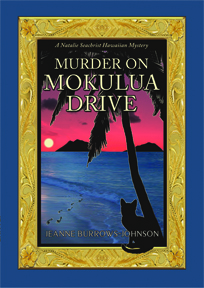
As I examine my list of suitable artistic elements, I manually draw a few pictures that fit the requisite portrait layout of a book cover—knowing that the final product can easily be converted to a square layout for an audio book. So where did the award-winning cover of Murder on Mokulua Drive begin?

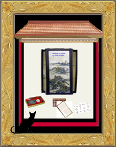
First of all, Natalie’s life has shifted from a high rise in Waikīkī to a cottage in the beach community of Lanikai on the windward side of the island of O`ahu. Next was consideration of the fact that the murder in this story occurs at night. What does this add up to? A nighttime beach scene which includes the Mokulua islets, the moon, a palm tree, footprints in the sand, and Miss Una. Additionally, although I will not be completing the design, I try to allow space for the insertion of Titling in my signature Peignot font so that there will be no overlapping of images and text. Here is the initial layout I sent to Yasamine which was a rough copy and paste of elements I found evocative.

How did Yasamine’s magic polish this concept?

Since this is the second book in the NS mysteries, I had been through the publishing process for the series once. Additionally, I was able to draw on my experience as art director for the well-received multi-author anthology, Under Sonoran Skies, Prose and Poetry of the High Desert. For that project, I featured a picture I shot of the desert at sunset from my back lānai.

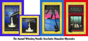
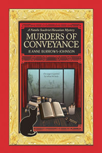
Whatever your artistic needs may be, I urge you to be involved in the process, even if you are unable to finalize the images yourself. The input you provide to a professional artist will ensure a product that reflects your own work and the goals you may be setting for future projects…Here’s a look at the before and after images for Murders of Conveyance, which was released in early 2019! As I edit this in April of 2021, I can happily report that this third book in the Natalie Seachrist Hawaiian Mysteries was a finalist for art and WINNER FOR FICTION ADVENTURE-DRAMA IN THE 2019 NEW MEXICO ARIZONA BOOK AWARDS!

As noted, the award winning book covers for the Natalie Seachrist Hawaiian Mysteries [as well as that for the forthcoming Conversations with Auntie Carol] were designed by Yasamine June. Her many talents include: Creative Direction; Fine art; Graphic Design; Illustration; Photography; Typography; and Videography. You can learn more about her at YasamineJune.com/about.


Wishing you the best in your creative endeavors,
Jeanne Burrows-Johnson, author, consultant, and motivational speaker

Further discussion of art is available at the following blog posts:
Authors Design Dilemmas 1, April 2015
Confronted by a Fantasia of Fonts, May 2015
Rainbows of Color, May 2015
Winning Logos & Slogans, October 2015
Quality Book Production, February 2016
Harmonizing Branding Elements, August 2016
Book Promotion and Evolving Art, January 2017
Balancing Text and Space, February 2018
Successful Cover Art, December 2018

To learn more about the award-winning Natalie Seachrist Hawaiian Mysteries, including Murders of Conveyance [Winner, Fiction Adventure-Drama, 2019 New Mexico-Arizona Book Awards] and other projects, please drop in at my author’s website JeanneBurrows-Johnson.com. You’ll even find Island Recipes that might inspire your culinary creativity.

For more ideas to strengthen your Wordpower© and branding, please visit: Imaginings Wordpower and Design Consultation.

Follow Me:
Amazon, Arizona Authors Association, Apple Books
Audible, Authors Den, Barnes and Noble, Blogarama, Book Bub
Cozy Mysteries-Unlimited, Facebook, Good Reads, Hometown Reads

Book sellers may contact book distributors such as:
Baker & Taylor, Follett, IPG, Ingram, Mackin, Midpoint, TitleWave

BALANCING TEXT AND SPACE

LIMITED WORDPOWER© AND DESIGN ACUMEN?

Most of us have limits to our talents. Sometimes we are able to increase our skills or can hire professionals who can elevate the quality of our output. One of my continuing disappointments is that while I have a good sense of design and some computer graphic skills, I have not been gifted with comprehensive skills of an artist.

ALTERING TEXT
One thing I can do is change the words and even the fonts of text. This alteration of  text is usually done to maximize its appearance in the space allotted to it.  Sometimes this is disappointing, as the words I initially selected were ideal to the purpose and tone of the project.  Nevertheless, the goal in any written work is to create a product that is most appropriate for communicating with one’s target market.

As I generated promotional materials for marketing Prospect For Murder [the first book in the Natalie Seachrist Hawaiian mystery series], I frequently had to revisit this basic activity of editing—substituting vocabulary to fit the available space. Professional Wordsmith
One of the greatest values a professional wordsmith brings to a verbal project is their knowing when and how to adjust text to maximize readability.  This ability to edit within varied  parameters demands the flexibility as well as the skill to replace verbiage to accommodate the allowed space.

In the past, when a client decided my composition met their needs, they usually took the text to a graphic artist and I never saw it again—at least not before the final product was printed, uploaded to a website, or sent forth in emails.  Imagine my disappointment when I saw that the presentation of my work looked awkward because of justified paragraphing and/or the lack of breaking syllables at the end of paragraphs, which resulted in wide gaps or crammed lettering.

If I remained in close contact with the client, I sometimes had an opportunity to rectify the situation.  At a minimum, I could alert them to the problem which was bound to recur until their process of production was changed.  If I had the opportunity to work with the artist tasked with incorporating my text, I could suggest potential means for enhancing the overall layout by:

~  Changing words that were too long or short
~  Altering the paragraph structure
~  Adjusting the number of columns or their size
~  Repositioning and/or resizing artwork
Subliminal Influences

HARMONIZING PRODUCT PACKAGING AND MARKETING MATERIALS
Regardless of the sophistication of a project, balancing art and typography can truly maximize the sensory experience of your readers.  It is a vital key to synchronizing a product’s packaging and the marketing materials that accompany it.  As may be expected, this can help determine a reader’s initial response to the product being represented, thereby affecting whether it will be purchased or bypassed. 

Even the information presented in a dentist’s pamphlet should be designed to flow in an harmonious manner.  The next time you have an appointment at a professional’s office, glance through the materials in their waiting room.  If you find odd looking paragraphs, it’s probably because a graphic artist took the text and simply dropped it into their design—usually without the copy writer having the opportunity to re-edit their text.

DESIGNING PROMO MATERIALS AND WEBSITES
In my blog on the layout of books, I discussed the various issues I faced in the design of covers for the hardcover and audio book editions of Prospect For Murder.  All of the spatial challenges I’ve just explored in this blog were applicable in both editions.  I’m very grateful that my artist and typographer were the same person [you can visit www.yasaminejune.com to view her art].  This meant I was able to work with her to balance elements of concern.  Of course, working in this manner requires mutual understanding and sufficient time to accomplish the necessary edits.

Shifting From Hardcover to Audio Book Format
Transforming images and text of the hardcover book jacket of Prospect for Murder into the audio book’s required more than re-positioning and resizing the many design elements. The  mysterious moon above the apartment building was deleted to accommodate the titling.  Also, the book synopsis and author bio were shortened to allow for book reviews.

POSTCARDS
Recently I reworked the 8.5 x 5 inch promotional postcard I am using for several purposes.  As I now have a growing number of positive book reviews I wish to highlight, I needed to edit both the book’s description, as well as my bio to accommodate snippets from the four reviews I wanted to feature on the front of the card.  And because I may wish to employ varied greetings, I had to allow room on the backside to place labels with personalized messages.

LETTERS
It may seem needless to mention that each letter that one sends out via snail mail or email is an entity unto itself.  However, writers are just as prone as other professionals to remain wedded to verbiage for which they have an affinity.  Generally, effective letters should be limited to a single page.  This means that the need to resize the length of one’s text arises quite often.  Sometimes simply reworking the size and location of a logo and decreasing the dimension of margins will suffice to reuse a favorite piece of composition.  At other times, it’s also necessary to:

~  Combine paragraphs
~  Reduce the size of the font used for text
~  Use left justified paragraphing without indentation
~  Use a smaller dimension for line spacing between paragraphs

Wishing you the best in your creative endeavors,
Jeanne Burrows-Johnson, author, consultant, and motivational speaker

Further discussion of art is available at the following blogs:
Authors Design Dilemmas 1, April 2015
Confronted by a Fantasia of Fonts, May 2015
Rainbows of Color, May 2015
Winning Logos & Slogans, October 2015
Quality Book Production, February 2016
Harmonizing Branding Elements, August 2016
Book Promotion and Evolving Art, January 2017
Balancing Text and Space, February 2018
Successful Cover Art, December 2018

To learn more about the award-winning Natalie Seachrist Hawaiian Mysteries, including Murders of Conveyance [Winner, Fiction Adventure-Drama, 2019 New Mexico-Arizona Book Awards] and other projects, please drop in at my author’s website JeanneBurrows-Johnson.com. You’ll even find Island Recipes that might inspire your culinary creativity.

For more ideas to strengthen your Wordpower© and branding, please visit: Imaginings Wordpower and Design Consultation.

Follow Me:
Amazon, Arizona Authors Association, Apple Books
Audible, Authors Den, Barnes and Noble, Blogarama, Book Bub
Cozy Mysteries-Unlimited, Facebook, Good Reads, Hometown Reads

Book sellers may contact book distributors such as:
Baker & Taylor, Follett, IPG, Ingram, Mackin, Midpoint, TitleWave

BOOK PROMOTION AND EVOLVING ART


THE NEVER ENDING ART & SCIENCE OF WRITING

As I examine the months since the launch of Prospect For Murder [the first book in the Natalie Seachrist Hawaiian mystery series], I realize I have not posted a blog regarding the never-ending art and science of writing for a long time.  I’ve started several, but details of the publishing and promotional processes have interfered with my sharing new author strategiesSince addressing the topic of my artistic vision for the book layout for Prospect For Murder in a previous blog, it has been released in hardcover, downloadable audio and ebook formats, and a 9-CD as well as downloadable audio book. Preparing for the promotion of each version has required re-examination of artwork and descriptive text, as each format varies in size and may appeal to a different target market. successful advertising and branding

EVOLVING BOOK SERIES
Authors may separate their work into categories of writing, publishing, and marketing, but each of these activities should unite under a shared roof of unified branding.  And while today’s book marketplace includes many self-publishing authors choosing to offer downloadable rather than printed books, such works must still be accompanied by attractive art and typography to maximize their appeal to the sensory experience of potential readers.

There are many ways to make the appearance of a book pop within the massive listings of any genre.  As mentioned in my discussion of art for PFM, I have chosen to use an Island-themed gold frame based on Hawaiian heirloom gold jewelry to distinguish my book and the promotional materials with which I market it.  

HARDCOVER BOOKS
Book jacket art
for the hardcover edition of PFM was the first design project I undertook.  After the evocative gold frame was completed, I realized it could be utilized for the entire mystery series.  And, with changes in the metallic color, it will be ideal for other book projects as well. Below is the first version of the book jacket, which was clearly too dark!

Prospect for Murder...in written and audio editions...the first Natalie Seachrist Hawaiian Mystery

ORIGINAL 9-CD AUDIO BOOK ALBUMS
After I completed recording the 9-CD audio book, it was time to modify the book jacket art.  For the CD albums, my job was to shorten text describing the book and me, as well as the snippets of reviews.  My artist and typographer Yasamine June [you can view samples of her work at www.yasaminejune.com] then adjusted the size and proportion of her original artwork and dropped in my edits.

EBOOK AND AUDIO EDITIONS
The next task was designing website icons for sites offering the downloadable audio and eBook editions.  Our goal was to enhance a visitor’s recognition of the products being offered.  Therefore we created a conjoined image of the hardcover book jacket and a square edit resembling a CD case.  Wherever possible, this paired image is used to signify that Prospect For Murder is available in multiple formats.

I should mention that during this process, I realized that the original art image was too dark. Consequently, I had Yasamine brighten the cover, especially the dragon fountain. Subsequent to these changes, I was thrilled when Prospect for Murder won cover art design in the New Mexico-Arizona Book Awards in 2017.

DESIGNING PROMO MARTERIALS & YOUR WEBSITE

The art of communication is one of the most vital skills a professional in any field can develop to help them in achieving goals and objectives in both their public and private living.  The following tools can be refined to maximize messages to colleagues, friends and the general public.

ARTWORK
I use the iconic paired image of the print and audio editions of PFM as artwork for both printed promotional materials and my author website.  Without intention, the colors for Prospect For Murder and Imaginings Wordpower were nearly the same, which has greatly simplified my choice in color palette. I am still contemplating where and how I will utilize the gold frame.

TITLING
I have used the Peignot font for my promotional business, Imaginings Wordpower [www.ImaginingsWordpower.com] for many years.  Therefore, I chose to use it for the titling of book jackets, my author website, and all promotional materials for the Natalie Seachrist series.  This decision is especially appropriate since many of the historical details used in the series predate World War II.  The Peignot font is an art déco [or style moderne dating from the 1920s], sans-serif display typeface designed by A. M. Cassandre in 1937 for the Deberny & Peignot Foundry in France.  While this font is too stylized for lengthy text, it makes a viable statement for titling and headings.

BUSINESS CARDS
Unexpectedly, I discovered that the standard size of a business card and the dark haunting color of the hardcover and audio book art was not suitable to my new double-sided author business card.  To resolve these problems, I created a new image.  I did this by overlapping the frame of the hardcover edition with that of the downloadable audio edition.   In the lower right-hand corner, I inserted the gold hibiscus found in the corners of the frames.  This has proven effective, since the image is always accompanied by text providing my name and the title of the book.

STATIONERY & FORMS
With use of the paired image of the print and audio books, plus the Peignot font, there were few decisions to make in creating my author letterhead stationery.  For most purposes, I place the iconic art image in the top left hand corner of the page and all contact information centered at the bottom.  This layout works for both letters and business forms [such as invoices]. 

LOGO NOTECARDS
For many years I’ve used what I call logo notecards to extend invitations, express gratitude, and confirm appointments.  For both portrait and landscape layouts, I place a logo in one quadrant of an 8.5 x 11 inch layout, with text positioned diagonally and upside down from the artwork.  The printed result is a sheet of paper that can be folded into a 5.5 x 4.5 notecard that will fit an invitation-sized envelope. 

POSTCARDS
After discovering that postage was the same for a couple of sizes of postcards, I chose a dimension of 8.5 x 5 inches for my author’s promotional postcard.  Beyond displaying recognizable book cover art, this ensures sufficient space for a synopsis and book reviews, plus purchasing options.  The art and descriptive text pop against a simple white background, with a high gloss finish on the front side for durability and flat finish on the back, which facilitates use of a pen for personal messages. 

Sadly, I discovered a typo after receiving an initial order of the postcards.  And having continued to receive positive reviews, I realized I should have printed a small number of the cards initially, to allow for subsequent corrections and additions.  As my publisher has declined to reprint book jackets with the latest reviews, I’m glad my second run of postcards allows me to send out books as samples, or for review or sale with up-to-date information.

OTHER PROMOTIONAL CONSIDERATIONS

COMMUNICATING THROUGH EMAILS
Every piece of communication you generate is a marketing opportunity.  And while you may not use an outgoing email layout paralleling your letterhead stationery, you can strategically position artwork, logos, and other information to draw the recipient’s eye.  I put the paired book image and purchasing information in the top left-hand corner of each outgoing email.  For the signature section for all outgoing emails, I have added a link to my author website [JeanneBurrows-Johnson.com],   my Imaginings Wordpower website [ImaginingsWordpower.com], and this blog [Blog.JeanneBurrows-Johnson.com].

WEBSITES DISPLAYING NEWLY RELEASED BOOKS
As the release date for PFM neared, the number of websites featuring the book increased.  Unfortunately, some had received galleys displaying artwork devised as a placeholder for the book jacket art that was to come.  Without proper notification, these sites would continue to display the galley image as being representative of the published book.  Therefore, I suggest that authors releasing books through publishers or on their own, remain vigilant in cruising the Internet to ensure that the words and images describing them, as well as their work appear as they intend!

In addition, authors need to be aware that many popular websites selling and promoting books do NOT offer an easy means for having books reviewed or even displayed in categorical listings.  Most of the time, an author’s work is only visible if the visitor to a site knows the author’s name or book title.  I strive to see Prospect For Murder displayed under the following categories for each of its several editions:  Hawai`i; Hawaiian mysteries; cozy mysteries; cat mysteries; female authors; female detectives; female sleuths. If you have any tips to help me with this situation, please drop me a note through the contact form on one of my websites…

Wishing you the best in your creative endeavors,
Jeanne Burrows-Johnson, author, consultant, and motivational speaker

Further discussion of art is available at the following blogs:
Authors Design Dilemmas 1, April 2015
Confronted by a Fantasia of Fonts, May 2015
Rainbows of Color, May 2015
Winning Logos & Slogans, October 2015
Quality Book Production, February 2016
Harmonizing Branding Elements, August 2016
Book Promotion and Evolving Art, January 2017
Balancing Text and Space, February 2018
Successful Cover Art, December 2018

To learn more about the award-winning Natalie Seachrist Hawaiian Mysteries, including Murders of Conveyance [Winner, Fiction Adventure-Drama, 2019 New Mexico-Arizona Book Awards] and other projects, please drop in at my author’s website JeanneBurrows-Johnson.com. You’ll even find Island Recipes that might inspire your culinary creativity.

For more ideas to strengthen your Wordpower© and branding, please visit: Imaginings Wordpower and Design Consultation.

Follow Me:
Amazon, Arizona Authors Association, Apple Books
Audible, Authors Den, Barnes and Noble, Blogarama, Book Bub
Cozy Mysteries-Unlimited, Facebook, Good Reads, Hometown Reads

Book sellers may contact book distributors such as:
Baker & Taylor, Follett, IPG, Ingram, Mackin, Midpoint, TitleWave

QUALITY BOOK PRODUCTION

IS YOUR BOOK A THING OF BEAUTY? 

The art of communication is as varied as its practitioners.  Success in your creative process usually rests on the degree of your inspiration.  For any professional, it also reflects perception of the desires of your target market. And, if you are an author, success also depends on the writing skills to which you have been introduced…and have mastered. There are many comprehensive sources of writers’ guidelines available online and in print. I will sometimes mention issues in the writing process, but in most of these blogs, I am attempting to share snippets of authoring strategies as they arise in my own wordsmithing. 

Many publishing houses restrict the amount of input an author may have in the printing process.  But as a writer, you should be able to express concerns you have about the production of a work that will carry your name.  As someone who has assisted in the process for other amateur and professional writers, and served as the art director on a collaborative effort, I am somewhat familiar with aspects of producing a high quality book.  

When I was a debut author of fiction, I entered a new phase of professional experience.  While the following areas of concern may not be presented in the sequencing of a publisher or art director, they represent my thought process while preparing for the publication of Prospect For Murder, the first book in the new Natalie Seachrist Hawaiian mystery series…AS I REVIEW THIS BLOG POST, I FEEL I SHOULD MENTION THAT I’M THRILLED TO ANNOUNCE THAT BOTH PROSPECT FOR MURDER AND MURDER ON MOKULUA DRIVE WERE AWARDED FIRST PLACE FOR BOOK JACKET ART IN THEIR RESPECTIVE YEARS OF COMPETITION IN THE NEW MEXICO/ARIZONA BOOK AWARDS.
branding program
UNIFIED APPEARANCE IN A SERIES
Career longevity for a writer often rests on their successful book branding and advertising. These issues bring us to the appearance of one’s product; in this case, books.  There are many design dilemmas facing authors and the people who will introduce their work to the world.  Personally, I enjoy reading a classic hardbound book, so my contemplation of quality book printing rests on my perceptions of what constitutes a fine hardcover edition.

THE READER’S EXPERIENCE
While the design elements of a print or on-line artistic project may vary in several ways (sometimes because of the genre), some issues are common.  In general, the test of a book’s initial appeal is its cover.  Does it draw the eye of the potential reader?  I say the reader, rather than the buyer, because with the constant rise in the cost of hardcopy books, library patrons represent a large segment of the public that may read your book.  Of course, to reach that readership, you will first have to appeal to the buyers of books that line library shelves.

DYNAMIC BOOK JACKET DESIGN
Book jacket design
is one of the most important elements that concerns marketers.  Therefore, I encourage you to seek an artist whose skills in fine and graphic art (as well as typography) will meet the needs of myriad projects.  Fortunately, I have found this breadth of talent in collaborating with Yasamine June.  

I do not claim to be a specialist in color theory, but generally, bold colors and print in product packaging are believed to help maximize sales.  In book publishing, successful cover design does not rest solely on these elements, or even on the overall quality of the artwork.  In publishing, the book’s genre is also vital.  Prospect for Murder is clearly a mystery.  In this genre, the coloration employed in book art often features dark colors, sometimes enhanced with the use of chiaroscuro [the effective contrasting of shadow and light]. 

To facilitate communication with my readers, my artistic vision embraces continuing historical and cultural features within the content and artistic accents that unify the appearance of the books.  Because my stories center on Hawai`i, I am using Island-themed framing based on Hawaiian heirloom jewelry for each book’s cover.  This repeating image, plus ones that are pertinent to each story, will serve to meet potential readers’ expectations by unifying my branding, thereby increasing the public’s recognition of each new addition to the series.

In classic format, I have included a cast of characters, chapter aphorisms, and a notes and acknowledgments section.  In addition, because of the inclusion of considerable foreign language and historical references, I offer a guide for pronouncing Hawaiian words and a glossary of non-English and specialized vocabulary.  For emphasis, the aphorisms are presented in italic fonts and a distinctive hibiscus-based image frames each page number.
formatting tips
Empowering Your Words Through Readable Text
The next concern I have is readability.  Given the length of my books [PFM is 92,000 words], concerns about the cost of printing could lead to printing decisions based on saving paper: Margin size can be reduced; spacing after periods can be decreased from two spaces to one, blank pages between chapters can be eliminated, and the weight of the paper reduced.  Such choices might reduce the overall size of a book and conserve paper; but they would not enhance the sensory experience of the people reading the book. 

Beyond these general considerations, my target market is older, well-educated women and men who are as interested in character relationships as they are intriguing plotlines.  Many readers within my target market may wear eye glasses or contact lenses.  Nevertheless, I am told that with the lack of certain vocabulary and situational elements, the inclusion of historical references and multiculturalism, my series may be appropriate to students in advanced placement courses in secondary school.  These students may not be as concerned with the layout preferences of older readers, but they too will benefit from easy-to-read text.

Regarding my recently published book, I have agreed to a layout that includes single spacing following the end of sentences, despite the continuing use of two spaces by many publishers both here and abroad.  To compensate for this, my publisher has used a larger font that enhances the readability of the text of the hardcopy.

Audio Books and Public Readings
With a trilogy of books already completed in the Natalie Seachrist Hawaiian Mystery series, I have already completed an audio edition of the first volume.  In general, I knew I had to employ a believable voice for each of the characters.  As the series is written in the first person, the most important voice is that of the protagonist, who is roughly my age.  For Natalie’s inner narrative, I use a measured and calm voice; for her interaction with other characters, I employ tones and rhythms appropriate to each scene.  Other characters are presented to showcase their unique profiles.

In preparation for reading portions of Prospect for Murder, I recorded descriptions and samples of each cast member. The text for each was printed in a distinctive color.  In addition, I utilized a 14 point font and 1.5 line spacing. I also used varying spacing and marks to indicate pauses and emphasis. 

For instance, I use: upward and downward arrows for changes in tone; ellipses for the trailing off of my voice; and long dashes for abrupt breaks.  For vocabulary or phrases about which I was concerned with correct pronunciation, I inserted underscoring and added hyphens between syllables.

In future blogs, I’ll report on the response to the decisions I have made in this phase of my practice of the art and science of writing!

Wishing you the best in your creative endeavors,
Jeanne Burrows-Johnson, author, consultant, and motivational speaker

Further discussion of art is available at the following blog posts:
Authors Design Dilemmas 1, April 2015
Confronted by a Fantasia of Fonts, May 2015
Rainbows of Color, May 2015
Winning Logos & Slogans, October 2015
Quality Book Production, February 2016
Harmonizing Branding Elements, August 2016
Book Promotion and Evolving Art, January 2017
Balancing Text and Space, February 2018
Successful Cover Art, December 2018

To learn more about the award-winning Natalie Seachrist Hawaiian Mysteries, including Murders of Conveyance [Winner, Fiction Adventure-Drama, 2019 New Mexico-Arizona Book Awards] and other projects, please drop in at my author’s website JeanneBurrows-Johnson.com. You’ll even find Island Recipes that might inspire your culinary creativity.

For more ideas to strengthen your Wordpower© and branding, please visit: Imaginings Wordpower and Design Consultation.

Follow Me:
Amazon, Arizona Authors Association, Apple Books
Audible, Authors Den, Barnes and Noble, Blogarama, Book Bub
Cozy Mysteries-Unlimited, Facebook, Good Reads, Hometown Reads

Book sellers may contact book distributors such as:
Baker & Taylor, Follett, IPG, Ingram, Mackin, Midpoint, TitleWave

WINNING LOGOS & SLOGANS…

emmas for AuthorsRich Palettes of Words & Images for Authors & Artists!

While logos and slogans are usually associated with corporations, they can facilitate communication with the public and be key branding elements for any business endeavor, regardless of size or tax status.  And, yes, that includes professional writers wishing to facilitate communication with their readers, listeners, and/or viewers.  The memorable branding messages of successful authors truly echo the rich palette of words and images used by Fortune 500 companies! 

PICTURE A SUCCESSFUL LOGO OR SLOGAN
What comes to mind when you think of a successful logo or slogan?  Perhaps the first is the iconic image of a cola company that has been in business for over one hundred and twenty-five years.  There have been many artists who have brought their own creative process to the company.  But while its logo has changed in minor ways, the bright color palette, signature font, and swirls of one type or another have remained ever present.  

In contrast, its slogans and other commercial text for their signature product have been altered periodically.   This is not surprising since marketing styles and considerable linguistic evolution have occurred within the same decades.  But with each change, the artistic vision of the company has been consistent—to provide a pleasurable sensory experience to the product’s target market.
Tips
ELEMENTS OF A SUCCESSFUL LOGO OR SLOGAN
In addition to any artistic icon,
the choice of color and fonts utilized in shaping the outward image of a viable brand must be memorable.
They must also be appropriate to the product or service, as well as the demographics of the target market.  However, since a business can select a specific slice of their market to target, the style of two businesses within a particular industry can vary considerably.

Consider snack foods intended for children.  Generally, bright, happy colors, images, and simple easy-to-read—or even cartoonish—text fonts are appealing to that market.  But when the ingredients are organic, the use of colors associated with nature is the norm.  In addition, with growing concerns for the environment, recycled and/or recyclable packaging is becoming preferable…at least to parents.

When you know the demographics of your target market, your first decision in establishing your brand may be deciding whether to use your personal or business name without an accompanying image. This may be appropriate if your name distinguishes your business from others that offer parallel products and/or services.  However, the use of an artistic design element not only clarifies what you do, but demonstrates the style in which you operate.  Thus, a black, profiled outline of a woman with luxurious hair, standing in high heels against a deep plum color may convey an ideal image for an upscale salon or spa.  If the figure of a man in a tuxedo were added, an iconic image for a ballroom dancing studio would emerge.

DYNAMIC TEXT IN LOGO DESIGN
Let’s now consider how we might design a logo for a company we’ll call Inner City Painting.  Beyond the simple use of text, one could
use an upturned paint brush with a splash of paint for each of the i’s in the text.  At the next level of complexity, a simple line drawing of a home or a string of commercial buildings could declare the firm’s niche market. 

Aside from clean, non-seraphed text, three primary colors might convey a no-frills provider of basic painting services.  Conversely, sweeping art strokes, an elegant font, and an exotic color palette would suggest a more artistic enterprise.  [See DESIGN DILEMMAS FOR AUTHORS, Part 3:  COLOR, May 30, 2015, regarding the use of standardized colors to ensure uniform coloration in both print and electronic publishing.]

Several years ago, I was working with a local printer whose family had been in the industry in a large city for several decades.  Although the familial entity no longer existed, the branding artwork remained.  It depicted a happy cartoon character inviting the public through their doors.  The style of the figure, his attire and shoes all pointed to another era, but the idea of a friendly chap greeting customers was still a viable concept—especially in this age of impersonal mega-corporations.  With the help of a graphic artist, the image of your friendly neighborhood printer was updated and served to introduce the firm to a new generation of clients seeking full-service printing design and production.

THE IMPORTANCE OF LOGOS IN BRANDING
Equally important to an effective branding program is the choice of a slogan
, for both individuals and organizations.  Notice that I am using the single noun, S L O G A N.  Too often I find promotional decision makers attracted to complex images and multiple descriptive phrases.  This simply muddies the waters and presents a jumbled NON-MEMORABLE image to the public.

Consider artist John Smith.  He might present himself as:  John James Smith, portraitist.  In this case, his middle name separates the artist from other men named John Smith and the word portraitist specifies his specialty.  Additional, qualifying words and phrases can offer further information that will attract appropriate clients to him.  The following is a simple representation of Mr. Smith and his classic painting:

Portraits in Oil Offered by
John James Smith, M.F.A.

Another issue to consider in textual aspects of branding is punctuation.  Instead of shifting font or using italics, some promotional decision makers complicate a design by ending slogans with punctuation.   I suggest saving punctuation for actual sentences and paragraphs of descriptive text.  I find that the shortest path to memorability lies in simplifying your words and design elements.  

ENSURE SIMPLICITY
Designing branding elements in popular dimensions you are most likely to see in print ensures simplicity and that means ease in utilization in multiple projects. 
That means that although your graphic artist may be thrilled to present you with an 8.5 x 11 inch design, have them offer you samples in the sizes of dimes, nickels, quarters and silver dollars.  When you do this, you will quickly see that extraneous strokes and other details are lost in such dimensions and can even prove distracting to the message you are trying to convey with a business card or advertisement.  The size of fonts used for your name and any slogan will naturally have to be proportional to the size of the icon being presented.

With the publication of Prospect For Murder, the first Natalie Seachrist Hawaiian Mystery set in Honolulu, I have been sorting through old files.  In examining the progression of my own branding, I see that for over a decade, I simply used my name and a few bulleted words to describe my work.  In 1995, I launched use of the word Imaginings in my business name while completing edits for an article I co-authored for Broker World Magazine.  Since I was moving from Honolulu to Tucson, it was part of an authoring strategy for introducing myself to a new locale for my physical business, as well as potential regional, national or even international audiences.  [You might find it interesting to note that at that time I was sometimes told that there was no such word as imaginings.]

Through the years, I have offered clients several products and services to enhance their physical environs, as well as their promotional representations.  While previously using merely a textual presentation of myself, a couple of years ago I decided to design an iconic image that would represent several elements of my careerCommercial writing, design consultation, and floral art.  I knew that utilizing a pen would clearly represent the largest area of my work.  As I sometimes provided faux painting of accent walls to commercial clients, it seemed natural to also include an artist’s brush.  Finally, as I have offered floral designs to both friends and clients, some form of floral image was indicated. 

My logo has evolved over time is used in myriad ways.  Some variations have been necessitated by hardcopy printing vs. electronic presentations:  Boldness and detail; portrait and landscape formats; framed and unframed; isolated or with text.  Despite these differences, the use of gold, blue and plum colors have been consistent–except when a solid gold background is required. I’m glad to say that my icon is becoming recognized…

With my writing shifting from commercial writing to fiction, my personal name may become more recognizable.  Nevertheless, I like the elements of this image that sums up my work to date.  However, I think it’s time for the hand of a graphics professional to finalize my signature icon, so that I can empower my image as well as my words as an author.

Wishing you the best in your creative endeavors,
Jeanne Burrows-Johnson, author, consultant, and motivational speaker

Discussion of art is available at the following blog posts:
Authors Design Dilemmas 1, April 2015
Confronted by a Fantasia of Fonts, May 2015
Rainbows of Color, May 2015
Winning Logos & Slogans, October 2015
Quality Book Production, February 2016
Harmonizing Branding Elements, August 2016
Book Promotion and Evolving Art, January 2017
Balancing Text and Space, February 2018
Successful Cover Art, December 2018

To learn more about the award-winning Natalie Seachrist Hawaiian Mysteries, including Murders of Conveyance [Winner, Fiction Adventure-Drama, 2019 New Mexico-Arizona Book Awards] and other projects, please drop in at my author’s website JeanneBurrows-Johnson.com. You’ll even find Island Recipes that might inspire your culinary creativity.

For more ideas to strengthen your Wordpower© and branding, please visit: Imaginings Wordpower and Design Consultation.

Follow Me On:
Amazon, Arizona Authors Association, Apple Books,
Audible, Authors Den, Barnes and Noble, Blogarama, Book Bub,
Cozy Mysteries-Unlimited, Facebook, Good Reads, Hometown Reads

Book sellers may contact book distributors such as:
Baker & Taylor, Follett, IPG, Ingram, Mackin, Midpoint, TitleWave

Interview and Oral History Projects, 2


EFFECTIVE INTERVIEW PREPARATION

The Art and Science of Writing
Today’s post is a recipe to help you prepare for any general or oral history interview you may conduct.  While the ingredients may prove dry for some of my readers, my intent is to simplify the process for those of you seeking to broaden your skills as a researcher, interviewer and writer For, like a piece of fine art, the strong interview provides a complex layering of elements that leads to a deeper understanding of the interviewee’s life, their place within world events, and the experiences that have made them who they are. 

Relying on their charm and a heavy dose of luck, some interviewers claim that establishing a good rapport with one’s subject is all that is required for a strong interview.  But although creating a personal connection with your subject is definitely required, I urge you to consider that doing a bit of research will strengthen your credibility with the interviewee and boost your skills as a professional interviewer worthy of respect.

Although the following example falls under the category of art, it demonstrates how the lack of professional training can interfere with one’s work.  Many years ago, I met a gifted painter who employed the tiniest makeup brushes to create delicate lace, fine hairs on African wildlife, and complex patterns on silken fabrics.  Noticing flaws in the placement of shadows, proportion of objects, and the musculature of human bodies, I gently suggested she take classes in the foundations of art

When she responded that an art teacher had previously crushed her spirit, I suggested she study privately with an artist she could carefully select for compatibility.  Over the years she has achieved a measure of success, but the flaws I first noticed continue throughout the body of her work.  I can only imagine what the knowledge of an authoritative artist could have added to the depth of her art.

Where should you begin your research as an interviewer?  Like the ideal scientist, you will want to thoroughly research your interview subject, confirming basic facts you may have assumed were correct.  To establish a reliable foundation for the facts to be revealed in the interview (as well as to offer a concise expression of the interviewee’s viewpoint), you will need to conduct research that goes beyond the details of their résumé.  This work should be completed before formulating the questions you will ask in the interview. 

As you move through the process of gathering information, consider the following questions.  What is the purpose of the interview project?  What are the demographics of your target audience who will be accessing your work?  Also, what direction is suggested by the format and themes of the media outlet with which you are working

Regardless of the proposed thrust of an interview, information that the public may seek about the subject should be addressed.  In addition, if you wish to separate your interview from others the subject may have granted, I believe it is good to have at least one surprising fact revealed. 

Now comes what some will consider the boring work.  There’s no way around it, unless you want to rely on your great charm.  To organize the facts you have discovered effectively, I suggest you consider using several tools.

  1. Create a double-spaced copy of the interviewee’s résumé or curriculum vitae [CV].  Highlight each piece of information you need to verify.  Place a check mark beside each one you confirm.
  1. Working from either a list provided by the subject (or revealed in your research), examine the interviewee’s articles, books, previous interviews, and other expressions of their thoughts that may exist.
  1. As you proceed with your research, write out potential topics for your forthcoming dialogue.
  1. Create a timeline of the subject’s life.  Although you may be focused on their career and public persona, list highlights in both their professional and personal living as a guideline to help you respond to unexpected turns your dialogue may take.  Depending on what has made the person newsworthy, you may wish to look at a graph of historical events that intersect with their life.  

How will such timelines be useful?  If, for example, the interviewee was involved in the labor movement of the post-World War II era, the strikes of labor unions on the West Coast and in Hawai`i greatly impacted the general public as well as union members.  Consider also the arts.  If your subject is a composer of music or lyrics, you may find that their noteworthy pieces were created at times of considerable importance in history.  Sometimes their work will actually be named for such an occurrence or an entire era.  This was true of a symphony named for, and embodying the discordant notes of, the Chinese Cultural Revolution.  Depending on the flow of your interview, reference to an intersection of general history and your subject’s life may yield surprising insights about their career or personal living.  This can help you communicate with your subject, as well as with your readers or listeners.

  1. Prepare an interviewee survey.  Sequence your questions from the information they have provided to you.  You can simplify the process for your subject by filling in information you have been able to confirm through your research.  This could include:  Dates and descriptions of their degrees, certifications, accreditations, and other qualifications; institutions of affiliation; professional positions they have held; published works, community volunteerism and other involvement; names, ages, careers of spouse, partners, or children.  Remember that if you put in data you have not confirmed, you may be inviting errors—should their memory be flawed, or they actually wish to perpetuate dissemination of erroneous information.

To further your acquaintanceship—and to trigger your subject’s memories—you may want to offer blank space for them to fill in items such as:  Their nicknames; mentors and public figures who have impacted their life; programs and schools of thought that have shaped their perspective; adjunct and social organizations with which they may be associated; and, hobbies and interests.  Whether or not you wish to pursue topics such as political, philosophical or religious associations may depend on both what you have learned about your interviewee and the orientation of the media outlet with which you are working.

Despite the details I am suggesting you consider, keep the resulting survey as short and simple as possible.  I also recommend using a five-point Likert Scale for any questions you wish answered with a measurement of the subject’s agreement.  Hopefully, your subject will be able to provide you with a completed survey prior to the interview.  This will allow you to fold their responses into questions you are preparing for conducting the interview. 

If you do not receive a response to your survey, have a pleasant conversation with your interviewee about your preparation, so that they will want to participate fully in the process.  If necessary, try to reschedule the survey by a day or two to ensure you are fully prepared.  If you must conduct the interview without seeing your subject’s survey responses, you may want to take a few moments to try to write notes in the margins of your interview questions about issues you now feel you need to explore.

By the time you are nearing completion of your research, you should know whether or not the facts you have uncovered demonstrate your subject’s ability and desire to answer your questions fully and honestly.  In addition, you will have determined whether the facts revealed are in accord with the original goals of your project.  It is also important to determine whether the direction of the interview indeed fits within the thrust of the media outlet with which you may be working

It is possible that you will find there are fundamental conflicts within the facts revealed in your research, your initial perspective on the interviewee, and the boundaries of the planned interview.  If you are able to control publication of the information resulting from your interview, you are fortunate.  But if you are restricted by the media outlet’s direction, I sincerely hope you will discuss your concerns with their management team prior to conducting an interview that does not honor you or your interviewee.

Wishing you the best in your creative endeavors,
Jeanne Burrows-Johnson, author, consultant, and motivational speaker

For further information on interviews and oral histories, see:
Overview of Interview and Oral History Projects, June 2015
Researching for Interviews, July 2015
Conducting Interviews, May 2016
After the Interview, August 2017

To learn more about the award-winning Natalie Seachrist Hawaiian Mysteries, including Murders of Conveyance [Winner, Fiction Adventure-Drama, 2019 New Mexico-Arizona Book Awards] and other projects, please drop in at my author’s website JeanneBurrows-Johnson.com. You’ll even find Island Recipes that might inspire your culinary creativity.

For more ideas to strengthen your Wordpower© and branding, please visit: Imaginings Wordpower and Design Consultation.

Follow Me On:
Amazon, Arizona Authors Association, Apple Books,
Audible, Authors Den, Barnes and Noble, Blogarama, Book Bub,
Cozy Mysteries-Unlimited, Facebook, Good Reads, Hometown Reads

Book sellers may contact book distributors such as:
Baker & Taylor, Follett, IPG, Ingram, Mackin, Midpoint, TitleWave

Tips From a Newbie Blogger

Is your pen always at the ready?

TALES FROM A NEWBIE BLOGGER

What can a newbie blogger tell you? Are you expanding your practice of the Art & Science of Writing? Perhaps you’re thinking of beginning your own blog.  Recently I’ve received requests for tips on setting up a blog.  Before launching into how I’ve created and maintain this site, I must clarify that I’m not a techie and do not possess the mental acumen to write the code required to build any website from scratch.

If you are a professional writer, having a blog can be a key feature of your authoring strategies Regardless of whether you are an author, you may be thinking your greatest concern is what you’ll write about.  I suggest that if you feel the need to have a blog, the contents of it are already floating in your mind.  The quality of your output will, of course, depend on your skill set.

Setting up a blog demands many things beyond the writing of text.  Therefore, today I’ll focus on the mechanics of creating a blog. The first and recurring requirement for doing this is having the patience to accomplish the task.  Next on my list of requirements, is my favorite pairing of ingredients in most things I do:  Art and Science.  I place the issue of art at the fore, because without an artist’s inspiration, you’re less likely to create an appealing space that will capture and keep your readers’ attentionPlease note that I’m not suggesting that all of us are worthy of assuming the title of artist.  However, we can reach for the artist’s balance of mind and spirit in exploring color, shape, and overall composition—regardless of the style in which we create our memorable statements.

As to the element of science, whether or not you are a techie, there are sources to help you determine the appropriate building blocks for bringing your vision to fruition.  Your research can begin with querying your favorite search engines This will provide the technical terminology you need to be able to ask intelligent questions during online searches and efficient analysis of tech manuals.

Even if you decide you’re not qualified to build a blog site, this preparation will help you communicate effectively with specialists in building websites.  For by the time you’re ready to launch the building of a blog, you should have established a connection with a reliable techie or tech support company—online, if not in person.

Parallel to my June 2015 blog on Media Relations, I suggest you make the most of every contact you can develop.  How do you go about making friends with techies?  If you are able to move from online communication to meeting in person, take a page from your personal life.  Coffee, lunch, or drinks (not necessarily alcoholic) moves you into a social atmosphere in which you can explore commonalities and a potential working relationship with the person.  Regardless of how you connect, when it’s time to formalize a professional relationship, be specific about your needs and desires Ask the individual or company to clarify the services they will be performing for you and the fees you will pay.  Depending on the parameters of the work involved, a contract may be called for.  If that is so, you may want to consult colleagues as well as an attorney prior to signing a contract or making any payment.

Personally, although I’ve designed my own websites several times, I am now using website and blog templates provided by the company that hosts my online presence.  Regardless of the tools used, the design of a website or blog is a major commitment of energy and time.  This is especially true since search engines now expect a level of optimization that meets the standards of the latest electronic devices—and those standards never stop changing.  Fortunately, an international company providing templates should ensure that the products they offer their clients are state of the art.  They may also help you with a program of search engine optimization.

Before you feel I have failed to help you in your hour of need, let me tell you how I’ve modified the template for this blog.  Fortunately the templates provided by such a company usually offer varied features and levels of adaptability.  There are some limitations I’ve had to accept, since I chose to accept the parameters of a free template.  For example, while current posts offer my bio at the bottom, it does not appear in posts that have been archived.  Also, without utilizing an add-on menu, I cannot customize items in the contents list to the left of the page—nor can I modify their appearance.  And, although I’ve can choose the text colors of my posts, I am unable to do so for their titles.

Design features in the blog were drawn from my website. Harmonious in appearance, both feature:

My artwork includes a banner with my logo at the top of each page
~  Ivory colored backgrounds
~  Dark blue and plum colored fonts
Favicons with my logo to the left of the URLs

Color is a very important element in any visual project While there are many blues and golds to choose from, I selected colors for my logo that print well in gray scale.  The blue is deep enough to print as nearly black when printed in gray scale.  Conversely, the gold I work with is light enough that it prints as a light gray, allowing the lettering in the blue to be readable.  I should point out that the colors I tend to use are close to, but not exactly web safe colors.  This means that I provide subtleties that most visitors to my website or blog will view; but should a visitor’s monitor and software limit the range of visible colors, their default settings will be close to my design.

The operation and maintenance for a website or blog may rest on trial and error…at least initially.  When I first uploaded posts, I was not aware of choices I could make in visibility.  There were also instances where I failed to notice a typo or changed my mind about the wording of a section of text.  Eventually I recognized the value of choosing the preview option after inputting text.  This allows you to make sure that both the content and its appearance are pleasing.  As a final test, I read the text out loud, prior to hitting the publish button.

Determining the topics I explore in posts is purely personal and often a spur-of-the-moment decision In my weekly authors’ salon, areas of concern and new discoveries arise as we share materials we are reading and writing.  My commentary is also motivated by edits of text that reveal recurring flaws in my own work.  This particular post is in response to repeated questions from readers of this blog and visitors to my website.

When launching this blog, I was reviewing the first three books in a trilogy of murder mysteries set in Honolulu, where I lived for over two decades.  With the launch of Prospect For Murder, I am moving forward with seeking publication of the next two books in the Natalie Seachrist Hawaiian Mystery Series.  I’m sure that my personal issues with writing and editing will continue to encourage me to examine questions of authorship that may be occurring in your own work.

Finally, I want to thank a couple of readers who sent suggestions for improving the coding used within this blog, and for heightening its search engine optimization.  I’m just beginning to act upon your welcome response by changing the formatting of images for some online locales from JPEGs or GIFS to PNGs…

Wishing you the best in your creative endeavors,
Jeanne Burrows-Johnson, author, consultant, and motivational speaker

To learn more about the award-winning Natalie Seachrist Hawaiian Mysteries, including Murders of Conveyance [Winner, Fiction Adventure-Drama, 2019 New Mexico-Arizona Book Awards] and other projects, please drop in at my author’s website JeanneBurrows-Johnson.com. You’ll even find Island Recipes that might inspire your culinary creativity.

For more ideas to strengthen your Wordpower© and branding, please visit: Imaginings Wordpower and Design Consultation.

Follow Me On:
Amazon, Arizona Authors Association, Apple Books,
Audible, Authors Den, Barnes and Noble, Blogarama, Book Bub,
Cozy Mysteries-Unlimited, Facebook, Good Reads, Hometown Reads

Book sellers may contact book distributors such as:
Baker & Taylor, Follett, IPG, Ingram, Mackin, Midpoint, TitleWave

Author Design Dilemmas 3, Color


What visions dance in your dreams?An Author’s Inspiring Rainbows of Color

How many colors are in the rainbows you paint? There are many perspectives on the use of color in the art and science of writing.  But even if I were an expert, this short space wouldn’t allow a comprehensive discussion of color theory [the traditional theory for mixing three primary colors to derive all other colors] or colorimetry [analysis of human color perception]. 

Variables in Color PerceptionMost people can see three distinct ranges of color.  Due to genetics, some women [called tetrachromats] are able to see four ranges of color.   Sometimes a temporary inability to see some or all color is caused by illness, allergies, medication, or hormone replacement therapy.  Even sufferers of Post-Traumatic Stress Disorder [PTSD] may notice a decrease in perception of color.  And, did you know that one out of twelve men and one out of two hundred women have color vision deficiencies? 

Choosing Color Palettes For Artwork to Accompany Text.   As discussed in my blog on engaging a reader’s senses, I believe that analysis of one’s genre provides the answer to many publishing questions and can help solidify authoring strategies.  Empowering your words as an author can take many forms.  One author I know brings a minimalist approach to her creative process in selecting art for a children’s book.  She believes that faint sketches without full form, shape, or color will encourage children listening to or reading her prose to bring images from their own minds to their reading experienceThis minimalist approach may be ideal for poetry and historical fiction.  However, it would be at odds with the hard-nosed writer’s voice usually employed in a police procedural and would lack clarity for many non-fiction projects.
Art and Science of Writing
While minimalism is a specific art movement, the term may be used generically to describe the overall expression of modern art in the late nineteenth and twentieth centuries.  Beyond an escape from classic realism, modern art focuses on the artist’s desire to interact with the minds and life experiences of his or her audience members.

Consider More Than Personal Preferences When Selecting Color.  If you are new to wordsmithing, you may not be thinking about branding But you might want to consider establishing the foundations of the brand for which your writing will be noted someday.  And just as an effective editorial process dictates that writers carefully select modifiers to create a scene rich in sensory images, a distinctive color palette can be one element in a design aesthetic that harmonizes with and even intensifies the impact of text.
Writers’ Guidelines
Beyond technical research you conduct regarding coloration, there are several issues to consider.  Does the style of your writing reflect your taste in art?  Do you like the detail of classism or the sharp clean lines of modern art?  Are you drawn to bright primary colors or muted subtle tones?  Do the peach and aqua tones of a sunset in the Southwest reflect your taste and your work? 

Regional Coloration Differences in regional color can be indicated by the dialect[s] of your characters, as well as the scenes you describe.  Growing up in Oregon, I was accustomed to the dark green of Douglas fir trees and the mosses that grow on them.  The palm trees in Hawai`i are pale in comparison.  In Arizona the array of green is mixed, depending on topography, season, and the amount of rainfall.  So which green would be most appropriate to your project?

The Juncture Of Style And Color.   In children’s books, hard-edged cartoon-like solid color images (like those a child might create) may be ideal.  But regardless of the style of art you select, the bright saturated colors associated with modern art are popular with and stimulating for young children.  Conversely, the sometimes dark tones of animè lend a sophisticated note to projects for both adults and older children.  For most genres, classic realism is appropriate.  To present images realistically, considerable detail and subtleties of color are usually required.

Articulating Your Artistic Vision is vital.  Since it is unlikely that you will be the artist shaping the images that will highlight your writing, you must be able to describe your desires to whoever is in charge of publication.  I suggest writing a paragraph outlining the specific elements you are seeking.  As with a journalistic endeavor, an inverted pyramid structure is useful.  Begin with an overview of the style you desire and then move on to specific issues like color.  If possible, use technical terms an artist or printer will understand.  For instance, consider specifying the tones and shades of colors you prefer. 

When viewed under varied lighting, a color’s tone [intensity of color] or shade [how bright a color is] will be perceived differently. Personally, I have found it challenging to use what I have termed a plum color in artwork for Prospect For Murder [the first book in the Natalie Seachrist Hawaiian Mystery series].  While my artist Yasamine June [view her work at www.yasaminejune.com] generated a wonderful color for the book jacket, subsequent applications for the audio book and some promotional materials have deviated from the color and/or tones she utilized.

Samples Of Your Preferred Palette and style will greatly aid the person executing your artistic vision.  These can be drawn from many sources:  websites; books and other printed material; fabric and clothing; pieces of art.  Consider offering the images of famous paintings.  Simply naming a type of art or an easily referenced artist will communicate your wishes.  Personally, I am drawn to the delicate images of classical Asian paintings, as well as the neo-classism of Maxfield Parish who was known for his use of saturated colorUnfortunately, since his work ended mid-twentieth century, a young artist may be wholly unaware of his work.

You can also provide numerical descriptions of colors.  Paint Stores offer samples of colors, with numerical coding as well as alphabetical names.  Printers can provide numbers for the Pantone® colors of ink used in most hardcopy printing.  And remember that you do not have to access a graphic art program to provide the color model numeration of computer font colors.  Simply mark a section of text within a word processing program and examine the ranges of colors available under the drop-down arrow for font color.

I should caution you that identifying a color is no guarantee of how a printed product will arrive at your doorstep.  Have you ever seen two editions of the same book, printed by the same company following the same instructions?  Even in hardcopy printing, variations in color can occur because of differences in batches of ink or toner, the moisture content of the paper used, and production executed on innumerable types and conditions of equipment.

A final consideration in our discussion of color printing is publication via downloading from the Internet.  If this is how your work will be published, you should consider using colors designated as “web safe.”  Again, there will be varied results in what is viewed by your readers.  If nothing else, variations in monitor settings can prevent uniformity in how myriad viewers will experience a color on your website or in your book. 

Before we leave the topic of color, let’s consider the historical and classical interpretations of color.  Some colors, like the royal purple from Tyre, Lebanon, were originally drawn from rare and precious sources.  To produce even small amounts of the Tyrian colorant, thousands of Mediterranean Sea mollusks [scientific name, murex brandaris] were needed for the dyes with which luxurious garments for ancient royals were fashioned.  Another historically rare color was the crimson worn by Roman legionnaires and wealthy matrons.  Traditionally associated with power and wealth, this color was obtained from the kermes vermilio planchon, an insect that grows on the kermes oak tree [quercus coccifera] of southern Europe.  Although the means for obtaining and utilizing dyes and paints have changed dramatically through history, their inner meanings have remained linked to aspects of nature.

Yellow and Orange – Associated with the sun and gold, these happy and bright colors are used for many attention-getting purposes.  Depending on their tone, they may be linked to base and deeply discounted items, or conversely, to the richest and most valued products.

Red – Traditionally linked to sunsets, fire, blood, Mars the planet and Mars the Roman god of war.  Red is now often associated with signature holidays like New Year’s, Christmas, and St. Valentine’s Day and certain nations like China.   This vibrant color calls attention to anything depicted in it.  It is sometimes associated with licentiousness and the concept of Satan.

Purple – Blending blue and red, this rich color is remains linked to the concepts and value of royalty, power and wealth.

Blue – In its deepest shades, blue speaks of clear waters and skies.  In many religious expressions, it is associated with holiness and purity.  This color is often utilized by financial and insurance institutions, as well as myriad industries dealing with healthcare that wish to be considered honest and dedicated to be well-being of their clients.

Green – Representative of health in nature, it is often used for health and environmental topics, products, and services.

White –  Reflects light and embodies the presence of all colors of light.  While many substances in nature are white, animals having pure white fur are rare, and therefore their pelts were historically associated with the power and wealth of royalty.  Once difficult to achieve in pure form, white colored clothing was often valuable regardless of the type of fabric.  The color is historically linked to purity, cleanliness, goodness, and perfection. 

Black – Absorbing all colors of light, it is actually the absence of color.  Obtained by the mixing of all primary colors, black is sometimes associated with darkness and evil in historical religious written materials.  It is an excellent background for both vibrant and subtle colors.

Wishing you the best in your creative endeavors,
Jeanne Burrows-Johnson, author, consultant, and motivational speaker

For examples of sample color palettes, please also visit:  https://www.ImaginingsWordpower.com/color/plays_on_color.html

Additional discussion of the nature of color is provided at: https://www.imaginingswordpower.com/wearing/wearing_your_brand.html.

Discussion of art is available at the following blogs:
Authors Design Dilemmas 1, April 2015
Confronted by a Fantasia of Fonts, May 2015
Rainbows of Color, May 2015
Winning Logos & Slogans, October 2015
Quality Book Production, February 2016
Harmonizing Branding Elements, August 2016
Book Promotion and Evolving Art, January 2017
Balancing Text and Space, February 2018
Successful Cover Art, December 2018

To learn more about the award-winning Natalie Seachrist Hawaiian Mysteries, including Murders of Conveyance [Winner, Fiction Adventure-Drama, 2019 New Mexico-Arizona Book Awards] and other projects, please drop in at my author’s website JeanneBurrows-Johnson.com. You’ll even find Island Recipes that might inspire your culinary creativity.

For more ideas to strengthen your Wordpower© and branding, please visit: Imaginings Wordpower and Design Consultation.

Follow Me On:
Amazon, Arizona Authors Association, Apple Books,
Audible, Authors Den, Barnes and Noble, Blogarama, Book Bub,
Cozy Mysteries-Unlimited, Facebook, Good Reads, Hometown Reads

Book sellers may contact book distributors such as:
Baker & Taylor, Follett, IPG, Ingram, Mackin, Midpoint, TitleWave