
THE NEVER ENDING ART & SCIENCE OF WRITING
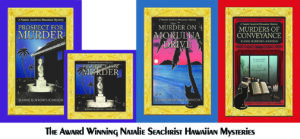
As I examine the months since the launch of Prospect For Murder [the first book in the Natalie Seachrist Hawaiian mystery series], I realize I have not posted a blog regarding the never-ending art and science of writing for a long time. I’ve started several, but details of the publishing and promotional processes have interfered with my sharing new author strategies… Since addressing the topic of my artistic vision for the book layout for Prospect For Murder in a previous blog, it has been released in hardcover, downloadable audio and ebook formats, and a 9-CD as well as downloadable audio book. Preparing for the promotion of each version has required re-examination of artwork and descriptive text, as each format varies in size and may appeal to a different target market. successful advertising and branding
EVOLVING BOOK SERIES
Authors may separate their work into categories of writing, publishing, and marketing, but each of these activities should unite under a shared roof of unified branding. And while today’s book marketplace includes many self-publishing authors choosing to offer downloadable rather than printed books, such works must still be accompanied by attractive art and typography to maximize their appeal to the sensory experience of potential readers.
There are many ways to make the appearance of a book pop within the massive listings of any genre. As mentioned in my discussion of art for PFM, I have chosen to use an Island-themed gold frame based on Hawaiian heirloom gold jewelry to distinguish my book and the promotional materials with which I market it.
HARDCOVER BOOKS
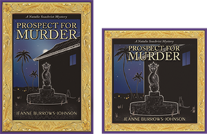
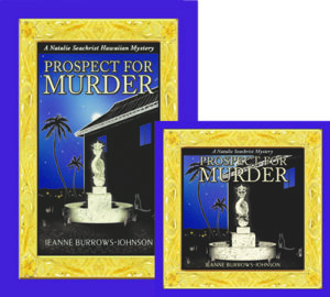
Book jacket art for the hardcover edition of PFM was the first design project I undertook. After the evocative gold frame was completed, I realized it could be utilized for the entire mystery series. And, with changes in the metallic color, it will be ideal for other book projects as well. Below is the first version of the book jacket, which was clearly too dark!
ORIGINAL 9-CD AUDIO BOOK ALBUMS
After I completed recording the 9-CD audio book, it was time to modify the book jacket art. For the CD albums, my job was to shorten text describing the book and me, as well as the snippets of reviews. My artist and typographer Yasamine June [you can view samples of her work at www.yasaminejune.com] then adjusted the size and proportion of her original artwork and dropped in my edits.
EBOOK AND AUDIO EDITIONS
The next task was designing website icons for sites offering the downloadable audio and eBook editions. Our goal was to enhance a visitor’s recognition of the products being offered. Therefore we created a conjoined image of the hardcover book jacket and a square edit resembling a CD case. Wherever possible, this paired image is used to signify that Prospect For Murder is available in multiple formats.
I should mention that during this process, I realized that the original art image was too dark. Consequently, I had Yasamine brighten the cover, especially the dragon fountain. Subsequent to these changes, I was thrilled when Prospect for Murder won cover art design in the New Mexico-Arizona Book Awards in 2017.
DESIGNING PROMO MARTERIALS & YOUR WEBSITE
The art of communication is one of the most vital skills a professional in any field can develop to help them in achieving goals and objectives in both their public and private living. The following tools can be refined to maximize messages to colleagues, friends and the general public.
ARTWORK
I use the iconic paired image of the print and audio editions of PFM as artwork for both printed promotional materials and my author website. Without intention, the colors for Prospect For Murder and Imaginings Wordpower were nearly the same, which has greatly simplified my choice in color palette. I am still contemplating where and how I will utilize the gold frame.
TITLING
I have used the Peignot font for my promotional business, Imaginings Wordpower [www.ImaginingsWordpower.com] for many years. Therefore, I chose to use it for the titling of book jackets, my author website, and all promotional materials for the Natalie Seachrist series. This decision is especially appropriate since many of the historical details used in the series predate World War II. The Peignot font is an art déco [or style moderne dating from the 1920s], sans-serif display typeface designed by A. M. Cassandre in 1937 for the Deberny & Peignot Foundry in France. While this font is too stylized for lengthy text, it makes a viable statement for titling and headings.
BUSINESS CARDS
Unexpectedly, I discovered that the standard size of a business card and the dark haunting color of the hardcover and audio book art was not suitable to my new double-sided author business card. To resolve these problems, I created a new image. I did this by overlapping the frame of the hardcover edition with that of the downloadable audio edition. In the lower right-hand corner, I inserted the gold hibiscus found in the corners of the frames. This has proven effective, since the image is always accompanied by text providing my name and the title of the book.
STATIONERY & FORMS
With use of the paired image of the print and audio books, plus the Peignot font, there were few decisions to make in creating my author letterhead stationery. For most purposes, I place the iconic art image in the top left hand corner of the page and all contact information centered at the bottom. This layout works for both letters and business forms [such as invoices].
LOGO NOTECARDS
For many years I’ve used what I call logo notecards to extend invitations, express gratitude, and confirm appointments. For both portrait and landscape layouts, I place a logo in one quadrant of an 8.5 x 11 inch layout, with text positioned diagonally and upside down from the artwork. The printed result is a sheet of paper that can be folded into a 5.5 x 4.5 notecard that will fit an invitation-sized envelope.
POSTCARDS
After discovering that postage was the same for a couple of sizes of postcards, I chose a dimension of 8.5 x 5 inches for my author’s promotional postcard. Beyond displaying recognizable book cover art, this ensures sufficient space for a synopsis and book reviews, plus purchasing options. The art and descriptive text pop against a simple white background, with a high gloss finish on the front side for durability and flat finish on the back, which facilitates use of a pen for personal messages.
Sadly, I discovered a typo after receiving an initial order of the postcards. And having continued to receive positive reviews, I realized I should have printed a small number of the cards initially, to allow for subsequent corrections and additions. As my publisher has declined to reprint book jackets with the latest reviews, I’m glad my second run of postcards allows me to send out books as samples, or for review or sale with up-to-date information.
OTHER PROMOTIONAL CONSIDERATIONS
COMMUNICATING THROUGH EMAILS
Every piece of communication you generate is a marketing opportunity. And while you may not use an outgoing email layout paralleling your letterhead stationery, you can strategically position artwork, logos, and other information to draw the recipient’s eye. I put the paired book image and purchasing information in the top left-hand corner of each outgoing email. For the signature section for all outgoing emails, I have added a link to my author website [JeanneBurrows-Johnson.com], my Imaginings Wordpower website [ImaginingsWordpower.com], and this blog [Blog.JeanneBurrows-Johnson.com].
WEBSITES DISPLAYING NEWLY RELEASED BOOKS
As the release date for PFM neared, the number of websites featuring the book increased. Unfortunately, some had received galleys displaying artwork devised as a placeholder for the book jacket art that was to come. Without proper notification, these sites would continue to display the galley image as being representative of the published book. Therefore, I suggest that authors releasing books through publishers or on their own, remain vigilant in cruising the Internet to ensure that the words and images describing them, as well as their work appear as they intend!
In addition, authors need to be aware that many popular websites selling and promoting books do NOT offer an easy means for having books reviewed or even displayed in categorical listings. Most of the time, an author’s work is only visible if the visitor to a site knows the author’s name or book title. I strive to see Prospect For Murder displayed under the following categories for each of its several editions: Hawai`i; Hawaiian mysteries; cozy mysteries; cat mysteries; female authors; female detectives; female sleuths. If you have any tips to help me with this situation, please drop me a note through the contact form on one of my websites…
Wishing you the best in your creative endeavors,
Jeanne Burrows-Johnson, author, consultant, and motivational speaker
Further discussion of art is available at the following blogs:
Authors Design Dilemmas 1, April 2015
Confronted by a Fantasia of Fonts, May 2015
Rainbows of Color, May 2015
Winning Logos & Slogans, October 2015
Quality Book Production, February 2016
Harmonizing Branding Elements, August 2016
Book Promotion and Evolving Art, January 2017
Balancing Text and Space, February 2018
Successful Cover Art, December 2018
To learn more about the award-winning Natalie Seachrist Hawaiian Mysteries, including Murders of Conveyance [Winner, Fiction Adventure-Drama, 2019 New Mexico-Arizona Book Awards] and other projects, please drop in at my author’s website JeanneBurrows-Johnson.com. You’ll even find Island Recipes that might inspire your culinary creativity.
For more ideas to strengthen your Wordpower© and branding, please visit: Imaginings Wordpower and Design Consultation.
Follow Me:
Amazon, Arizona Authors Association, Apple Books
Audible, Authors Den, Barnes and Noble, Blogarama, Book Bub
Cozy Mysteries-Unlimited, Facebook, Good Reads, Hometown Reads
Book sellers may contact book distributors such as:
Baker & Taylor, Follett, IPG, Ingram, Mackin, Midpoint, TitleWave