emmas for Authors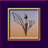 Rich Palettes of Words & Images for Authors & Artists!
While logos and slogans are usually associated with corporations, they can facilitate communication with the public and be key branding elements for any business endeavor, regardless of size or tax status. And, yes, that includes professional writers wishing to facilitate communication with their readers, listeners, and/or viewers. The memorable branding messages of successful authors truly echo the rich palette of words and images used by Fortune 500 companies!
PICTURE A SUCCESSFUL LOGO OR SLOGAN
What comes to mind when you think of a successful logo or slogan? Perhaps the first is the iconic image of a cola company that has been in business for over one hundred and twenty-five years. There have been many artists who have brought their own creative process to the company. But while its logo has changed in minor ways, the bright color palette, signature font, and swirls of one type or another have remained ever present.
In contrast, its slogans and other commercial text for their signature product have been altered periodically. This is not surprising since marketing styles and considerable linguistic evolution have occurred within the same decades. But with each change, the artistic vision of the company has been consistent—to provide a pleasurable sensory experience to the product’s target market.
Tips
ELEMENTS OF A SUCCESSFUL LOGO OR SLOGAN
In addition to any artistic icon, the choice of color and fonts utilized in shaping the outward image of a viable brand must be memorable. They must also be appropriate to the product or service, as well as the demographics of the target market. However, since a business can select a specific slice of their market to target, the style of two businesses within a particular industry can vary considerably.
Consider snack foods intended for children. Generally, bright, happy colors, images, and simple easy-to-read—or even cartoonish—text fonts are appealing to that market. But when the ingredients are organic, the use of colors associated with nature is the norm. In addition, with growing concerns for the environment, recycled and/or recyclable packaging is becoming preferable…at least to parents.
When you know the demographics of your target market, your first decision in establishing your brand may be deciding whether to use your personal or business name without an accompanying image. This may be appropriate if your name distinguishes your business from others that offer parallel products and/or services. However, the use of an artistic design element not only clarifies what you do, but demonstrates the style in which you operate. Thus, a black, profiled outline of a woman with luxurious hair, standing in high heels against a deep plum color may convey an ideal image for an upscale salon or spa. If the figure of a man in a tuxedo were added, an iconic image for a ballroom dancing studio would emerge.
DYNAMIC TEXT IN LOGO DESIGN
Let’s now consider how we might design a logo for a company we’ll call Inner City Painting. Beyond the simple use of text, one could use an upturned paint brush with a splash of paint for each of the i’s in the text. At the next level of complexity, a simple line drawing of a home or a string of commercial buildings could declare the firm’s niche market.
Aside from clean, non-seraphed text, three primary colors might convey a no-frills provider of basic painting services. Conversely, sweeping art strokes, an elegant font, and an exotic color palette would suggest a more artistic enterprise. [See DESIGN DILEMMAS FOR AUTHORS, Part 3: COLOR, May 30, 2015, regarding the use of standardized colors to ensure uniform coloration in both print and electronic publishing.]
Several years ago, I was working with a local printer whose family had been in the industry in a large city for several decades. Although the familial entity no longer existed, the branding artwork remained. It depicted a happy cartoon character inviting the public through their doors. The style of the figure, his attire and shoes all pointed to another era, but the idea of a friendly chap greeting customers was still a viable concept—especially in this age of impersonal mega-corporations. With the help of a graphic artist, the image of your friendly neighborhood printer was updated and served to introduce the firm to a new generation of clients seeking full-service printing design and production.
THE IMPORTANCE OF LOGOS IN BRANDING
Equally important to an effective branding program is the choice of a slogan, for both individuals and organizations. Notice that I am using the single noun, S L O G A N. Too often I find promotional decision makers attracted to complex images and multiple descriptive phrases. This simply muddies the waters and presents a jumbled NON-MEMORABLE image to the public.
Consider artist John Smith. He might present himself as: John James Smith, portraitist. In this case, his middle name separates the artist from other men named John Smith and the word portraitist specifies his specialty. Additional, qualifying words and phrases can offer further information that will attract appropriate clients to him. The following is a simple representation of Mr. Smith and his classic painting:
Portraits in Oil Offered by
John James Smith, M.F.A.
Another issue to consider in textual aspects of branding is punctuation. Instead of shifting font or using italics, some promotional decision makers complicate a design by ending slogans with punctuation. I suggest saving punctuation for actual sentences and paragraphs of descriptive text. I find that the shortest path to memorability lies in simplifying your words and design elements.
ENSURE SIMPLICITY
Designing branding elements in popular dimensions you are most likely to see in print ensures simplicity and that means ease in utilization in multiple projects. That means that although your graphic artist may be thrilled to present you with an 8.5 x 11 inch design, have them offer you samples in the sizes of dimes, nickels, quarters and silver dollars. When you do this, you will quickly see that extraneous strokes and other details are lost in such dimensions and can even prove distracting to the message you are trying to convey with a business card or advertisement. The size of fonts used for your name and any slogan will naturally have to be proportional to the size of the icon being presented.
With the publication of Prospect For Murder, the first Natalie Seachrist Hawaiian Mystery set in Honolulu, I have been sorting through old files. In examining the progression of my own branding, I see that for over a decade, I simply used my name and a few bulleted words to describe my work. In 1995, I launched use of the word Imaginings in my business name while completing edits for an article I co-authored for Broker World Magazine. Since I was moving from Honolulu to Tucson, it was part of an authoring strategy for introducing myself to a new locale for my physical business, as well as potential regional, national or even international audiences. [You might find it interesting to note that at that time I was sometimes told that there was no such word as imaginings.]
Through the years, I have offered clients several products and services to enhance their physical environs, as well as their promotional representations. While previously using merely a textual presentation of myself, a couple of years ago I decided to design an iconic image that would represent several elements of my career: Commercial writing, design consultation, and floral art. I knew that utilizing a pen would clearly represent the largest area of my work. As I sometimes provided faux painting of accent walls to commercial clients, it seemed natural to also include an artist’s brush. Finally, as I have offered floral designs to both friends and clients, some form of floral image was indicated.
![]()
My logo has evolved over time is used in myriad ways. Some variations have been necessitated by hardcopy printing vs. electronic presentations: Boldness and detail; portrait and landscape formats; framed and unframed; isolated or with text. Despite these differences, the use of gold, blue and plum colors have been consistent–except when a solid gold background is required. I’m glad to say that my icon is becoming recognized…
With my writing shifting from commercial writing to fiction, my personal name may become more recognizable. Nevertheless, I like the elements of this image that sums up my work to date. However, I think it’s time for the hand of a graphics professional to finalize my signature icon, so that I can empower my image as well as my words as an author.
Wishing you the best in your creative endeavors,
Jeanne Burrows-Johnson, author, consultant, and motivational speaker
Discussion of art is available at the following blog posts:
Authors Design Dilemmas 1, April 2015
Confronted by a Fantasia of Fonts, May 2015
Rainbows of Color, May 2015
Winning Logos & Slogans, October 2015
Quality Book Production, February 2016
Harmonizing Branding Elements, August 2016
Book Promotion and Evolving Art, January 2017
Balancing Text and Space, February 2018
Successful Cover Art, December 2018
To learn more about the award-winning Natalie Seachrist Hawaiian Mysteries, including Murders of Conveyance [Winner, Fiction Adventure-Drama, 2019 New Mexico-Arizona Book Awards] and other projects, please drop in at my author’s website JeanneBurrows-Johnson.com. You’ll even find Island Recipes that might inspire your culinary creativity.
For more ideas to strengthen your Wordpower© and branding, please visit: Imaginings Wordpower and Design Consultation.
Follow Me On:
Amazon, Arizona Authors Association, Apple Books,
Audible, Authors Den, Barnes and Noble, Blogarama, Book Bub,
Cozy Mysteries-Unlimited, Facebook, Good Reads, Hometown Reads
Book sellers may contact book distributors such as:
Baker & Taylor, Follett, IPG, Ingram, Mackin, Midpoint, TitleWave